Firebug Gets A Little Buggy
Firebug is the web developer equivalent of a hammer to a carpenter. In other words without this valuable tool hundreds of thousands would not be able to do their job and make the web what it is today. So even small changes to the interface are going to ruffle some feathers.
I spent a good half day trying to figure out why my precious Firebug wasn’t behaving like its usual self. For one thing, it wasn’t showing JavaScript errors in the status bar icon like it usually does. It also displayed a message saying “Reload to activate window console” whenever I would bring it up. This makes debugging impossible if I have to keep refreshing the page everytime.
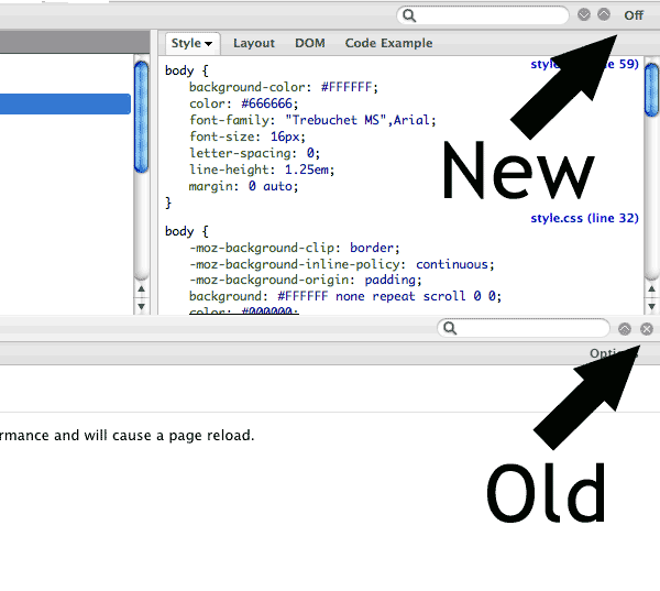
It turns out the Firebug developers made a teeny, tiny tweak to the interface. The screenshot on top is the newer Firebug, version 1.4. The bottom half of the screenshot is from an earlier version. See the difference?

The ‘X’ used to hide the Firebug window in older versions has been replaced with an Off button. Unfortunately the Firebug developers changed the behavior as well. The Off button deactivates Firebug for that website which explains why JavaScript errors disabled in the status icon. The button that I have come to accustomed to for minimizing the Firebug panel is that circular down-ward arrow about 50 pixels away.
This is a usability nightmare!
- The hide Firebug functionality isn’t where the user expects it, especially for long-time users who have developed a muscle memory
- The Off button is ambiguous to what the action does (a better word would be deactivate, though that doesn’t quite fit)
- The Off buttons breaks away from the rest of the paradigm of the interface (icons are for actions like inspect, and pause while words are for different tabs)
- and the Off button is a much larger than the minimize button even though the minimize button is used far more frequently than the off button

I now have to focus in order to minimize Firebug taking mental energy away from my task. If I’m not paying attention I can turn-off Firebug for the site I’m working on and then I would have to reload the page to get it working again. These sound like little things but compounded one hundred times and it can drive you batty.
So while the latest Firebug update is not technically broken, a poor interface decision sure makes it feel like a buggy mess.


I’m 100% in agreement with you on this. It’s a very small loss of time and a minor irritation, BUT when you do it dozens of times every day, it gets quite aggravating.
I’ve also mentioned it in the firebug group. Hopefully, the developers are listening.