Taking Notes With nvAlt And Epistle

I’ve blogged before about productivity tools. GQueues worked for me for a bit but my interest in it eventually faded. I tried running my own wiki with a What You See Is What You Get (WYSIWYG) editor bolted on but that solution wound up being too clunky. But now I’m using a simple text editor for the Mac called nvAlt .

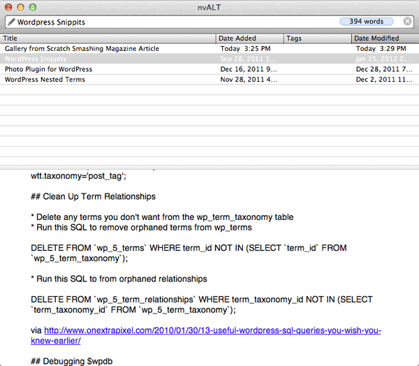
nvALT is a dead-simple application. Just pick a folder to save your notes to and start typing the title of your first note in the Search or Create field at the top. There is no toolbar or buttons or any of the other distractions typically found in a basic word processor. It supports markdown for basic formatting such as creating headlines or lists. The neat thing about markdown is it is easy to read in any editor but when viewing it in editors that understand markdown it can be rendered as valid HTML. nvALT has a rendered preview window if you ever need your notes in HTML or to print them out or just to copy and paste them into an email.

Markdown is just as easy to write as it is to read. To make an unordered list just but an * and a space before the sentence. New lines are translated into new list items. Different level headings are expressed by the number of # symbols in front of the word; one # symbol = heading level 1, 6 # symbols = heading level 6. A lot of the markdown syntax was inspired by simple formatting in plain-text emails. You can read through the complete reference of markdown’s syntax for even more examples.

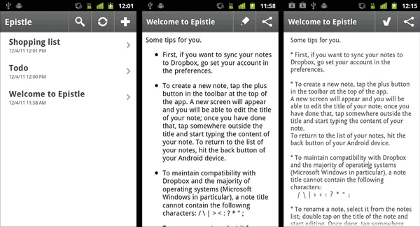
So nvALT is a great little tool for organizing text notes but what else makes it so special? Well, when you save your notes to your Dropbox folder, your notes can go with you wherever you go. Epistle is an awesome free Android app that complements nvALT. It syncs with Dropbox, lets you search through all of your notes the same way nvALT does and it too supports markdown. Now I can make a shopping list on my computer and reference it when I’m at the store. And then I can delete items from the list after I buy them and have the changes sync to my computer automagically.

Previously I would have to email copies of my notes to myself without an easy way to update or make changes to them.

I keep different files for all kinds of different thing: random ideas, WordPress snippets, links and brain dumps for different projects I’m working on, to-do lists, and even rough drafts of blog entries. One time I was at a meet-up and someone was talking to me about a WordPress problem they were having. I thought a plugin I had just read about would come in handy for them and thanks to my notes synced to my phone I pulled up the link and sent it to him.

Since nvALT and Epistle are tied to my Dropbox account one could do really geeky things. It would be so neat if I had an analytics note and every night a script would update it with stats from Google analytics showing me how many unique visitors read my blog yesterday. Or if it aggregated a bunch of simple information that I check often into one place that I could glance at on my way to work.  Using a service like if this then that (ifttt) would be neat for making some simple actions to automatically update notes with new information. Then that information could be in one place no matter where I am.

I’m so happy I found an open-ended system that gives me the flexibility for all kinds of different things while being simple to use without getting in my way.  What do you use for keeping track of to-dos and ideas?

Pinterest Vs. Gimmiebar

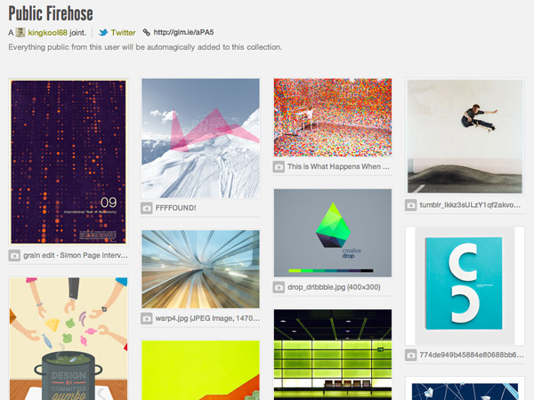
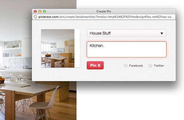
I’ve been on an inspiration curation kick lately. At the end of September, 2011, I signed up for Gimmiebar, a more niche-focused curation site akin to the web 2.0 social bookmarking site del.icio.us. The idea behind the service is when you stumble upon something awesome, be it an image, text, or most videos, you can save it to your gimmiebar using their handy browser extension or bookmarklet. You can find your friends and follow them like any social network and see what they add to their collections in the Discovery section. I must not be following the right people as now and then I will see what others are finding only to come up uninspired. There’s no sitewide search but there is a Notable section that you can peruse.

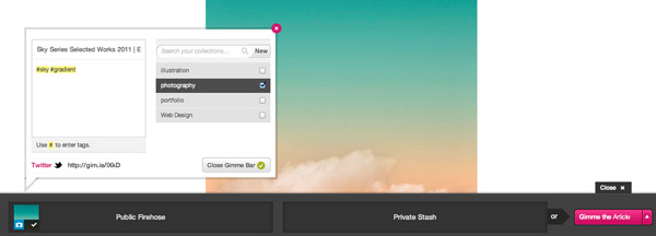
The gimmiebar extension for Chrome or bookmarklet for other browsers (both do the same thing) is slick. Activating your gimmiebar gives you two drop zones for dragging images into: your Public Firehose and Private Stash. Once you add your image you can add it to one or more collections or create a new collection on the fly. You’re given the option to give a description and tagging is done inline by adding a # before a word.

Gimmiebar does a really good job of being quick and painless. I also like how they save a copy of the image or website incase the original source should go offline. You can even hook up your Dropbox account and have your saved images saved to the cloud as another backup.

Overall Gimmiebar has good tools for personal curation but lacks in the social aspect. I’m sure this will get better over time as more and more people start using it.

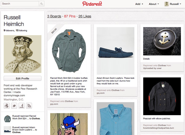
Pinterest, on the other hand, has a huge focus on socially sharing interesting things found on the web. You create boards which you pin different things to. Your friends can see what you have pinned and even repin it to their boards. Repinning is just like reposting on Tumblr or re-tweeting on Twitter.

My favorite feature of Pinterest is their search feature, which works well. Just enter a term and you get back a large swath of different images to pore over. Since the community is so active, you will want to keep checking your favorite searches for new inspiration. Commenting is also there but I don’t see much conversation occurring on pins.

Pinterests audience is heavily female oriented. There is a lot of fashion, do-it-yourself crafts, wedding, recipes and decorating pins going through my stream. But that’s ok because there is also a lot of robots.

With all the buzz surrounding Pinterest and their traffic numbers going up and up every month, it’s no wonder the site can slow down to a crawl from time to time. Ingesting and searching through all of those images is a tough job for any systems engineer at Pinterest’s scale. Hopefully that $27 million in funding will ease some of their growing pains.

So while both invite-only services are based around the same concept, curating inspiration, I’ve found myself using both for different purposes. Gimmiebar is more for my design/photography/art inspiration while Pinterest is for collecting fashion and home ideas. Kristina is also on Pinterest and we share a board which is fun to pin stuff to when I find interesting stuff for her. It’s also neat to learn about your friends based on what things they collect.

Be sure to give both sites a try. I have plenty of invites for both. You can find me on Gimmiebar and on Pinterest.

My Stats From 2011

As we roll into another year I thought it would be a good time to look back on various stats I have collected over the past year. Hopefully I will continue to do this at the beginning of every year as a way to document how things progress over time.

  • I blogged here 9 times for a total of 3,208 words.

  • My blog was visited by 147,151 unique visitors generating 213,800 pageviews. Not bad considering I hardly update it anymore.
  • I scanned 454 receipts and spent at least $346.96 in sales tax.
  • Kristina and I fully funded our IRAs (including starting and fully funding her 2010 IRA at the beginning of 2011). We also contributed to our 401K’s at work and managed to put away some money for a down payment on a house.
  • We visited Paris and London this year.
  • I managed to give 5 presentations (slides) to various DC Tech groups.
  • Attended 7 conferences:
    1. UX Camp DC (1/8/2011)
    2. StartupXLR8R II (6/4 – 6/5/2011)
    3. Converge SE (6/24 – 6/25/2011)
    4. Mobile UX Camp DC (9/17/2011)
    5. Accessibility Camp DC (10/22/2011)
    6. An Event Apart DC (10/24 – 10/26/2011)
    7. WordCamp Philly (11/5 – 11/6/2011)
  • I took 5,589 pictures, 728 of those were star-worthy in Picasa.
  • I posted 111 mobile photos from my phone.
  • 8.61 gigabytes of data used by my Nexus One on T-Mobile.

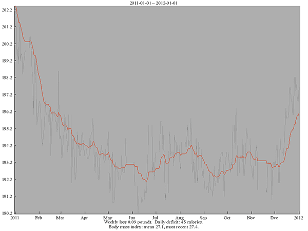
  • My average weight in 2011 was 194.3. My lowest weight was 192.1 (6/8/2011) and my highest was 202.4 (1/1/2011), so I ended the year lower than when I started.

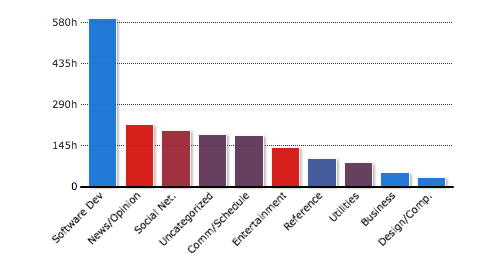
  • I spent 262 hours and 7 minutes in Dreamweaver writing code.
  • 159 hours and 28 minutes reading tweets, 15 hours and 24 minutes viewing Facebook, 6 hours and 4 minutes viewing Google+, and 5 minutes and 17 seconds viewing MySpace.
  • 124 hours and 53 minutes was lost to email: 83 hours and 37 minutes in Outlook for work, 58 hours and 52 minutes in Gmail.
  • 34 hours and 3 minutes searching Google.

Tools used to gather this data:

Here’s to a number-filled 2012!

Replacement Pads For Sony’s MDR-V6 Headphones

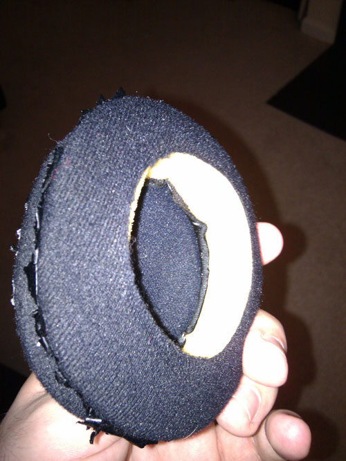
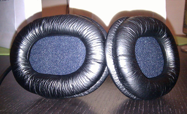
I love my oversize Sony MDR-V6 headphones to death. I wear these things at least 8 hours every single work day. They’re over my ears on my commute in to work, all day while I’m at my computer, and on my ride back home. One would expect the pads to slowly breakdown after almost 2.5 years of heavy use. So I finally broke down and ordered replacement headphone pads.

Amazon has them for about $7 per pad. A little expensive for a round piece of foam but for something that sounds so good and is super comfortable, it’s a small price to pay. Before these I bought a pair of knock-off replacement pads for the low, low price of $4.65. They fit as advertised but after only 4 hours of wearing them, my ears were throbbing. The material was not as soft and a bit smaller so it would actually press against my ears. I ended up going back to the old, falling apart pads.

The moral of the story is if you need to replace something that you use all day everyday, don’t cheap out. At least, in this instance, your ears will thank you.


Unmatched Style’s CSS Off Was Slimey Fun

UnmatchedStyle.com hosted a CSS competition for front-end devs to strut their stuff among their peers. Everyone got the same design and it was up the entrant to come up with the most efficient, pixel-perfect, bleeding-edge, fully functioning interpretation. The deceptively simple looking design was lovingly crafted by the rowdy folks of Paravel and sent out two weeks ago. Entries were due at 5pm today. Here’s the low down on my submission.

First, you should probably play around with my finished design and compare it with the static mockup (linked above). Go check it out… I’ll wait. Did you drag the corner of the browser to check how it responds to different browser sizes? Of course you did you CSS nerd.

  •  Somehow I messed up the colors of the design. My layout has really bright colors while the original design uses more muted colors. I have no idea how this happened.
  • The logo is a background image attached to the element of the section. I was inspired by html5forwebdesigners.com.
  • I forgot to add the blue faded slime splat in the header. I kind of screwed myself by using the <head> and <header> elements in the same section though I could have attached it to the <HTML> element. Oh well.
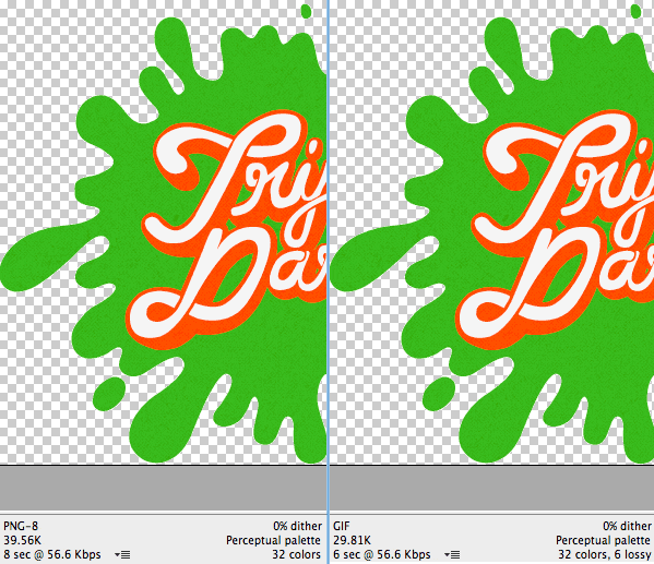
  • Instead of PNGs I used GIFs in some places due to the smaller file size (thanks to increasing the Lossy section in Photoshop’s Save For Web dialog)
  • Navigation links are at the bottom of the page with position:fixed (sticks to the top of the viewport) set for larger screens and an anchor link to the bottom of the page for smaller screens.
  • The obstacles section is built with two sprites using the same background-position offsets. I wanted to just use one sprite for the larger images and use background-size to scale them down for the thumbnails. Performance took a big hit so I simplified.
  • The larger obstacle images are within a
    element with overflow:hidden applied. The thumbnails link to the IDs of the larger version so no JavaScript is required to show/hide them.
  • The labels for the prizes that appear on hover are pulled from the title attribute of the link dynamically using CSS.
  • The form uses required and pattern attributes for validation without any JavaScript. If I had more time I would add a validation script as a fallback.
  • When the countdown reaches zero I “slime” the user using a number of slime splat images already loaded in the design.
  • The two addresses to the studios are marked up with a vCard microformat so machines can easily parse that information.
  • I did not use the <address> element for the studio addresses because that is not what it is for.
  • The custom <select> drop down styles are images with the invisible <select>’s laid overtop. They’re not useable for sighted keyboard users. This is probably my least favorite part of my design.
  • I focused much of my time on making the design accessible and didn’t even bother checking what it looks like in browsers outside of Firefox 7, Chrome 15, and Safari 5 (all Mac versions). I just didn’t have enough time.
  • This layout is sluggish on my Nexus One most likely due to the way I added the semi-transparent grainy texture.
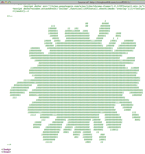
  • I added some ASCII art as an HTML comment at the bottom of the page. I like adding little easter eggs like that.
  • Finding the right element to make a favicon image from was tricky. I settled on the KN from the Knucklelodeon logo because it looked the best at 16×16.
  • You can pin the site to your desktop if you’re using IE9 and Windows 7 since I added a fewelements. Of course I forgot to add the more basic description, keyword and other general elements.
  • Selecting text uses the same colors as the hove styles, yellow background with reddish-orange text and no text shadow.
  • My custom JavaScript code is in a single block at the bottom of the page and not in a separate file. Since it is a single-page site, there is no benefit to externally linking it.

This was also my first responsive design. I started out making the large 1024px version first and then going back to make smaller versions. Big mistake. It’s a lot easier to start with mobile first and then build your design up, larger and larger. Media queries are also a pain in the butt since it requires a ton of going back and forth from the top of the stylesheet to the bottom where the media query styles were. When I changed styles for one target size, I had to double-check that those changes didn’t (or did) cascade into the larger sizes. This also resulted in a lot of duplicate selectors. What would be ideal is to set-up different classes on the HTML element with a class for different resolutions. This would be similar to how we handle conditional styles for Internet Explorer. This way we could group similar styles in the same area which makes it easier to keep track of changes.

Sites I Referenced

Other Noteworthy Entries

So what do people do once the contest comes to an end? Share their work on Twitter for others to comment on of course!  Here are some of the other entries I found searching Twitter for #cssoff.

Finally if you want to show off your entry, @daljo628 is hosting them at http://knucklelodeon.com/ Ping him to have yours added.

Phew! I’m glad I’m not in the judge’s shoes now. Having to go through all the entries and ultimately pick a winner; That’s a tough call.

Update: The top 25 entries have been announced!

I Hope Apple Improves Voice Recognition…

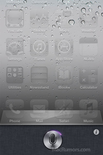
Here we are on the eve of another Apple press event. There are all kinds of rumors and speculation about what the famous electronic maker will unveil but the one I am most looking forward to is the extensive voice controls supposedly built-in to the core of iOS5.

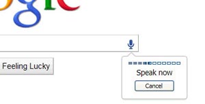
Voice recognition is hard. Google has had the capability built-in to their devices (and even their browser) for some time. The quality of the interpretation is iffy at best. I have never felt like voice commands were worth the effort. When Google guesses wrong you have to go back and correct it’s shoddy work by pecking at the tiny screen to get the text cursor in the right place and delete all of the letters and retype the word you originally meant to input. Like I said, voice recognition is tough.

I believe voice is the next big computer interaction. Smartphones have taken off because it allowed us to have a computer in our pocket. The same way we could query the world’s knowledge for answers to our mundane questions at our desks is now available most anywhere we are. But voice will certainly not become the primary form of computer interaction (just imagine a group of cubicle dwellers yelling over one another so their computers can hear them). Instead voice will become prevalent in more intimate settings like in your car (see Ford SYNC) where your hands aren’t free or in your own home.

Imagine being able to ask your computer a question from your couch and having the computer speak the answer back to you. When you’re getting ready in the morning wouldn’t it be great to simply ask aloud “What’s the weather out today?” and then get your answer spoken back to you? This will lead to a more passive computing experience, where it’s just there in the background. Smartphones are a stepping stone to this reality, but I predict it will be at least 5 years until a voice aware home is even viable.

What’s Available Today?

There are a couple of interesting voice automation projects out there today.

CMU Sphinx is an open source toolkit for speech recognition. It’s a bit too complicated for me to get up and running so I could at least play around with it. The home automation project, MisterHouse, uses it for some basic voice commands (video demo).

Windows users have the add-on Bill’s Voice Commander for the Active Home Pro software to do similar things.

Samir Ahmed created the open source Iris project, a Java app for utilizing Speech Recognition and Synthesis to make a desktop assistant. It looks like a really interesting proof-of-concept.

Google uses a web service to convert speech to text which Mike Pultz reverse engineered for his own purposes.

Dummyimage.com Can Calculate Ratios Now

Thanks to Duncan Stephen’s blog post about dummy images, I was inspired to add a new feature.

All of the customisation options have got us excited, but I can think of a few more features that would improve it even further.

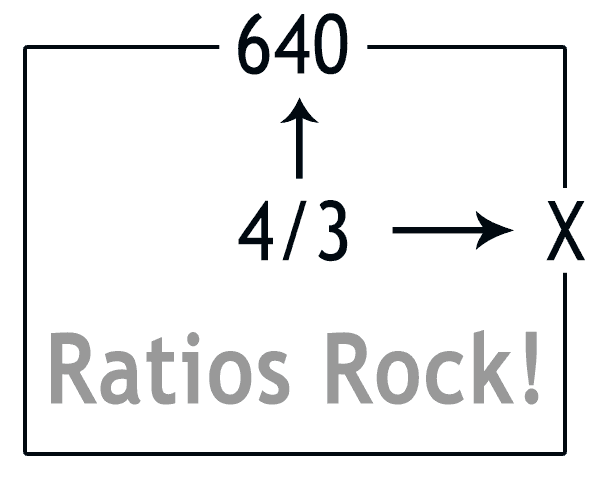
The ability to set a width and an aspect ratio, for those times when you know you need a 16:9 image but just can’t be bothered to get the calculator out.

What a great idea! It took me an hour or two to thoroughly test the new feature to my satisfaction and push it live. I’ve also updated the documentation and source code for anyone who wants to take a look to see how it’s done.

You can use aspect ratios with the width like so:

http://dummyimage.com/640×4:3

or with the height

http://dummyimage.com/16:9×1080

I enjoy adding new features that make a designer/developers life a bit easier. If you have something that you would like to see dummyimage.com do, let me know!

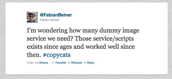
List Of Dummy Image Generators

Ordered by when the domain name was registered.

  1. http://dummyimage.com (2007-07-20)
  2. http://fpoimg.com (2010-01-26)
  3. http://www.ipsumimage.com (2010-02-03)
  4. http://nosrc.net (2010-02-04)
  5. http://placehold.it (2010-02-04)
  6. http://placekitten.com (2010-11-22)
  7. http://placehold.us (2011-01-14)
  8. http://placedog.com (2011-03-01)
  9. http://flickholdr.com (2011-03-05)
  10. http://placesheen.com (2011-03-07)
  11. http://lorempixum.com (2011-03-23)
  12. http://placepuppy.it (2011-04-11)

Other Dummy Image Generators that I couldn’t figure out when they were created

I’m glad dummyimage.com inspired others to build a placeholder image service and expand upon my original idea. You can download my source code and do whatever you want with it.

Thanks to Web Resource Depot for the round-up where I first heard about many of these sites.

My Favorite Twitter Client, Nambu, Is Dead!

In a sea of desktop Twitter clients, Nambu for the Mac stood out to me. It was a native OSX application which means it wasn’t written on top of a bloated, cross-platform platform like Adobe Air. It performed splendidly while not hogging system resources.

But alas, all good things must come to an end. I randomly stumbled across the Nambu homepage and saw this message:

Unfortunately, we are sad to announce that Nambu is no longer being actively developed. There will be no more updates, as everyone on the Nambu team has moved on to other projects.

We would like to thank everyone for their past support and suggestions.

All the best.

Apparently they put this up in the middle of March. Nambu is still available for download (and still works for that matter) but I expect to see it crap out in a spectacular fashion some day down the line. What are some of your favorite Twitter apps for the desktop?

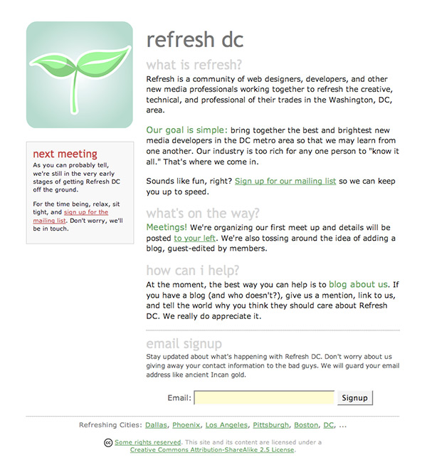
The First Refresh DC Meetup

This month marks the 5 year anniversary of Refresh DC. The first gathering was small and informal at Ireland’s Four Green Fields on Connecticut Avenue, Northwest. I was fortunate enough to make it since I was in my final year at the Art Institute of Philadelphia. It was spring break and I needed to find an internship for the next quarter. I was willing to commute from Philly to DC every week, that’s how dead the web scene was in the spring of 2006 (I also wanted to eventually land back in my hometown of DC, which I did). I didn’t land any internship leads but I did meet Nicholas Tolson and Nguyet Vuong who are still very active in the DC tech scene to this day.

For history’s sake, here is the e-mail for the very first Refresh DC meet-up sent on March 22nd, 2006.

Hi everyone! We’ll keep this short and sweet. Our first meetup is
upon us and we’d like to know how many people are interested in
attending. The details are listed below. If you can make it, hit
the ‘reply’ button and let us know (by the end of this week if
you can)!

There’ll be a little bit of discussion about what Refresh is and
where it came from and some ideas we have for Refresh DC. The
format is pretty loose, so bring your thoughts and ideas, we’ll
be happy to hear them!

Tuesday, March 28th, 6:30-ish to 8:30pm
Ireland’s Four Green Fields (next to the Uptown Theater)
3412 Connecticut Ave NW
Washington, DC 20008
(202) 244-0860

Website: http://www.irelandsfourprovinces.com/
Google Map: http://rubyurl.com/Qpb

Drop us a line at contact@refresh-dc.org if you have any
questions. Hope to see you all Tuesday night!

– The Refresh DC Night Crew

So come be a part of history and come out to the 5 Year Anniversary meet-up of Refresh DC on March 22nd, 2011. Or stay home and look at old photos in the Flickr Pool instead.