Inspiration: Stage 5 Studio & Circle Six
Stage5Studio.com
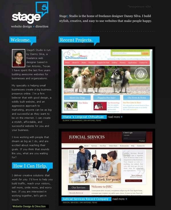
This little site is a nice example of how to do a dark-colored site using bright colors for highlight. I really like the idea of highlighting certain info with a solid background color similar to the rollovers of my links. Best of all, the site is a single page. Straight and to the point.

blog.CircleSixDesign.com
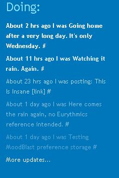
Circle Six uses a killer color combination of orange and blue. I really like the logo which plays with depth by wrapping through the logo and on top of and over the orange nav bar. I’m not a big fan of the fluff at the bottom. The best thing has to be the Twitter status which fades in both size and color as the updates age.


Hey Russell,
Thanks for the kind words. I like the blog…you’ve got some good stuff up. Keep up the good work…
Cheers
Danny