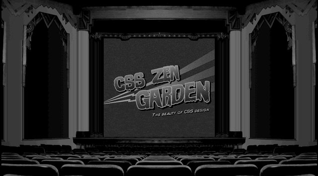
The Retro Theater CSS design by Eric Roge is a perfect example of what can be done with a little creativity. The trick to pull this wffect off was using background images attached to several different extra divs to create the theater. The content is contained in a div with an ID of “container” then centered and set to a width of 450 pixels. Since the other theater elements need to stay in place when a user scrolls, their position is set to fixed which allows the movie screen to scroll without using an “overflow:scroll” on the container div. While it may seem like more work to make the screen scroll this way, the extra effort pays off with a more natural scrolling experience for the audience. No matter where the mouse is on a page the use of the scroll wheel will be consistent. The static seen flickering on the movie screen comes as an animated gif set as a background image on the container div.
I bet there was a lot of trial and error involved in developing this layout but the results speak for themselves. Eric did a spectacular job of capturing the feeling of an old retro theater. If this was a site for a movie theater or film festival the design would separate them from their competition while conveying their message in a unique and interesting way.


