Newsweek.com Redesign: Your Dam For The Flood
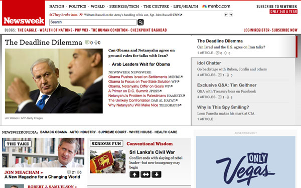
The folks at Newsweek unveiled a new redesign for their website today, nearly one and a half years since their last one. From a post about the new changes, the redesign aims to help visitors sift through the “flood of information on news and events every minute of every day” by “continuously filter[ing] it to find the most important stories and concepts for our audience” while “embrace[ing] the best work of other journalists around the Web and the most thoughtful questions and comments of our readers” in order to “create a forum for a continuous – and continuously worthwhile – conversation about key events and issues”. If only their writing was as simple as their new header.

The new Newsweek header (top) is much cleaner with a softer tone and less emphasis on the bold red associated with the magazine. Simple, clean headers seem to be a rising trend on news sites these days as usability and user experience become more of a focus. The old header (bottom) had a sense of authority while this new header design is toned down, as if to convey a lack of confidence in their place in the world. I am not a fan of the rotating headline ticker which clutters up the otherwise clean navigation.
The content on the homepage is also a cluttered eye sore. There is no clear structure to the information and the auto-rotating carousel of feature stories is distracting. I dig the effort to link out to external sources. This is what the web is all about but it does come off as Newsweek giving up on its quest to be a news leader. This could have been executed better to complement their own content rather than outshine it.
My biggest problem is it is impossible to scan the homepage. The content appears to be laid out in a random order like an amateur scrap book. There is no central focal point except for that ginormous 336×850 ad on the right. Come on Newsweek, don’t you know about the F shaped reading pattern on the web? Why would the headlines be aligned along the right side of the page?
It still appears Newsweek is a print-focused organization with the attitude of “if you put it on the page, readers will read it”. Looking over at the old design, it seems this redesign is a step-back. In it’s efforts to be a guiding hand in filtering the flood of news, Newsweek has become nothing more than a dam clogging the flow of information. My advice: turn Newsweek.com into a repository of articles from the magazine and focus on that. The world doesn’t need an old media publication half-ass its web offerings.
Other Points of View:
- A Web Design Critique of the Newsweek Redesign (Joey Baker)
- Newsweek’s Redesign: Nice Try (BNet Media)
- Newsweek Redesign Coming in Two Weeks (PDNPulse)


