Two Website Makeovers: Barnes & Noble And Newsweek
Watch out web world, two big brands recently gave their sites a new look. Book hawking company Barnes & Noble added some web 2.0 niceties while Newsweek cleaned itself up under the hood and added a bit of polish to the front end.
Barnes & Noble
The old Barnes & Noble site was cramped and flat although not terribly hideous. A little design tweaking and a couple of new features later and what we are left with is a more presentable homepage with large, soft buttons and a larger but better organized navigation bar. The top 10 book list on the right side of the homepage sports an interesting cut-off styling that is pretty cool. The featured books have more information available up front making a more compelling reason to buy them as browsers scroll over them. They even added a tag cloud which is a neat web 2.0 gimmick that lasts about 5 minutes as very few actually navigate that way.
Why anyone buys books online at anywhere except Amazon.com is beyond me, but for those that like to venture off the beaten path, Barnes & Noble is a breath of fresh air.

Newsweek
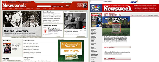
The popular weekly news magazine pushed out it’s new look a couple of days ago and boy did it need it. The old site was table based with tables inside tables inside tables. The redesign introduced clean modern HTML code that is nicely formatted to boot. On the front end, content on the homepage is easier to navigate when skimming through headlines without feeling cluttered by a boxy table layout like before. Newsweek is using a lot more Flash and multimedia components. Those extra touches of sparkle come at a cost though as the site relies on 14 external JavaScript files which surely slow down the loading of the page.
The web wasn’t the only thing getting a face lift, the magazine saw a touch up as well. Newsweek editor Jon Meacham called the magazine redesign a refinement rather than a revolution featuring a cleaner visual presentation with more room for content. Meacham believes the magazine should be less like web content which is generally delivered in short bites with the print edition featuring lengthier columns with more in depth coverage. It will be interesting to see what happens in the print world over the next 18 months as more people become accustomed to getting their news online rather than in a weekly dead tree sent to their mailbox.

Redesigns for big sites is an even bigger challenge but Barnes and Noble and Newsweek did a fine job. Enhancing the user experience is crucial as the web becomes more crowded with competitors biting at the tooth to win away unhappy patrons. So now that they have made the leap to the modern era of websites, it’s time they get cracking on their next iteration which will surely be due sooner rather than later as the web moves on at its blistering pace.


[…] folks at Newsweek unveiled a new redesign for their website today, nearly one and a half years since their last one. From a post about the new changes, the redesign aims to help visitors sift through the […]