Inspiration: SEOStudio.co.uk
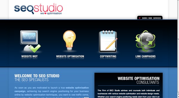
This search engine optimization company has a slick website with a royal blue and white theme. The main category navigation has an interesting roll-over effect where the icons not selected become grayed out. A reader can maximize the reading room by hiding the nav area which slides shut thanks to the animation prowess of the Script.aculo.us library.
The only thing I would change would change about SEOStudio.co.uk would be the color of the type. Blue on blue provides a low contrast and to aide readability I would pick something lighter.
Smooth icons with a soft glow as well as the eye-catching color choice make this a site I’ll keep track of for times when I need some inspiration.


Scriptalicious (too lazy to type it properly) is da bomb. That site has a nice design too, good find. Gonna show this to my visual design students.
This is a nice site layout. I’ve been wanting a new theme, I worked on taking the Kubrick default wordpress theme and turning it black, it ended up tooo…. black. I think I need some darker colors. I do like their use of blues in this. I wish I had design skillz 😀
Icons taken from free pack – Crystal
http://www.google.com/search?h.....tnG=Search