AOL Goes MTV With Latest Rebranding

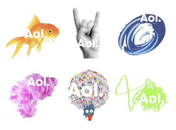
AOL offered a glimpse into their re-branding today and most of the web was left dazed and confused (55% of the respondents to a RedWriteWeb poll hated it). AOL simply decapitalized the “O” and the “L” and added a dot at the end. While the logo itself will stay the same, the background will change continuously foregoing a traditional mark.
It’s certainly an off-kilter strategy but a good fit for a company trying to reinvent itself. I’m a fan of the new look.
The dot part wasn’t really explained well in the media coverage. Aol. plans to brand their various properties like Aol.Shopping and Aol.Mapquest. It’s meant to tie all of Aol.’s vast content together.
As for the random background images, I think it is fun and keeps things interesting. Bing is doing the same thing with their background images on the main search page and Google’s doodle logos are in a similiar vein. MTV, a company outside of the Internet space, is famous for the many variations of it’s logo. Aol.’s re-branding strategy certainly isn’t anything new and in fact feels more like the front end of a trend.

While Aol.’s re-branding efforts are modern and edgy now, I doubt it will have the lasting power of their previous branding. It’s not perfect but it’s just what the company needs as it prepares to go alone as it spins off from Time Warner. Besides, look how many people are talking about the company after so many years of media obscurity.

