KristinaNaude.com: From Comp To Code In 12 Hours
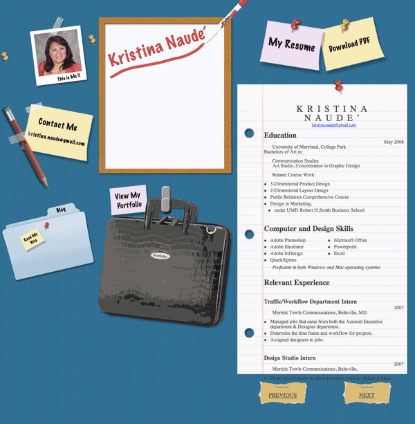
Kristina had been toying with the idea of her own website for a couple weeks now. However, this past weekend, she got around to comping one together. She has been fascinated with the eclectic desk style that seems popular these days. While she was busy in Photoshop, I was setting up the domain and basic file structure. Since it’s a small site, the preparation didn’t take long. In fact the most time consuming task involved cutting images up from the comp and organizing them. Coding was a snap. The site is a basic 3 column layout and most everything is an image.
Creating the carousel to page through her resume was a custom job that took me about 20 minutes using jQuery. I had hoped to just go out to the jQuery community and find a nifty carousel plugin that I could just drop in and be on my way. Unfortunately this wasn’t the case. While there were plenty of options out there, everything was over engineered and too rigid. Most require the content to be an unordered list but I was using a set of divs. This shouldn’t make a lick of difference as any jQuery selector could be used.
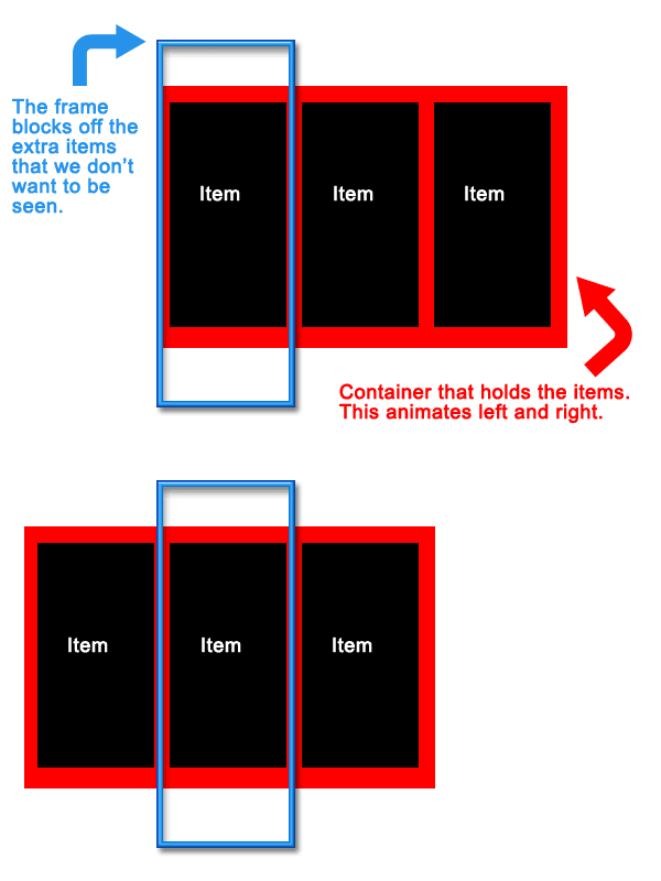
Carousel scripts are pretty basic. You need a set of items to rotate through, a container to hold the items, and a frame to mask off the ugly parts. Some basic styling is used to line the items up in a row. The container is given a postion of absolute so it can be freely moved left and right and a large width to hold all of the items inside. The frame needs the overflow property set to hidden to mask out the items that we don’t want the user to see. To pull off the animation we use jQuery’s handy animate() method for the left and right positioning of the container element. This lets us set a key point and jQuery will handle the interpolation from the current value to the key point. Attach this function to a next and previous button and you’re ready to go with your own custom carousel that works the way you want it to.

It was a lot of fun to create a brand new site from scratch without any legacy content or rigid CMS. Simple websites are fun! And if you haven’t checked out the fruits of both of our labors, then please immediately proceed to KristinaNaude.com.


Right spot now :), I’m going to need you to holla at me about jquery, div tags and some page design elements. When I get some time be prepared 😛
No prob. Let me know what you need help. I’ve got a pretty good grasp on jQuery.
Nice site! What would it take to get the text on her resume to line up with the lines on the paper?
Lots of hours of finnicky tweaking. Actually you could calculate a proper vertical rhythm to make everything sit on the lines using this http://topfunky.com/baseline-rhythm-calculator/
Or read this article from 2006 http://24ways.org/2006/compose.....cal-rhythm