Building Reflection With Clouds

Always wanted to take a picture of this building near my work on L Street in Washington, DC.

Always wanted to take a picture of this building near my work on L Street in Washington, DC.
Every web developer is looking forward to the new HTML spec, HTML 5. The new spec will birth 20 new elements to add more underlying semantic meaning to content. The new elements came out of popular IDs and Class attributes for common situations in web design: <nav> is just like <div id=”nav”>. But these new elements are just a stop gap.
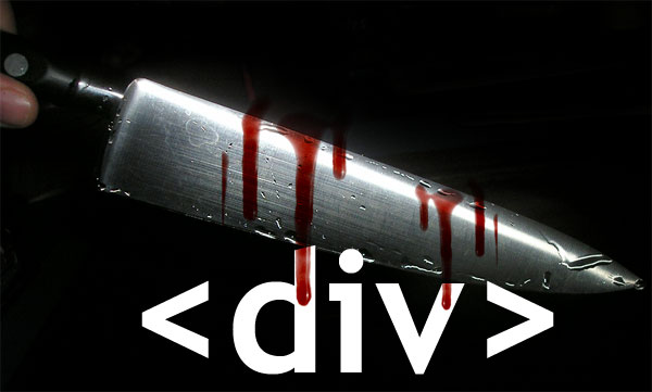
I wish the web community could move beyond pigeon-holing ourselves with specific elements. Why can’t we make our own elements to better describe our content? If I had my way <div>s would be ancient history and any element not already defined in the HTML spec would be treated by browsers like a <div>.
There are many benefits to opening up the element nomenclature like this.
1) It will be much easier to describe content. No longer will we need to shoehorn our content into quasi-relevant elements. Did you know the <address> tag is to define the contact information for the author or owner of a document and not to hold a plain street address?
2) No more div-itis. Web developers will no longer have to wade through a dozen </div> tags. <div> tags are the least-semantic structural elements in a web designers toolbox; it literally means ‘division’ of a page and is used to mark off different sections within a document. Things can get pretty messy when using too many <div>s however as it is hard to tell where they end. Take a look at this code example:
<div id="container">
   <div id="article">
      ...
     <div id="chart">
      ...
     </div>
   </div>
</div> |
Look how much better this markup looks from both a readability and maintainability perspective:
<container>
   <article>
      ...
     <chart>
      ...
     </chart>
   </article>
</container> |
A benefit to free-form elements is the semantic closing tags making it clear where each element begins and ends.
3) Microformats might actually work. The movement to create semantic markup using loosely agreed upon Classes slowly died off due to the extra bloat it introduced to the underlying code. With the ability to create your own tags, Microformats could flourish and we can begin to set-up our own best practices for describing content.
4) Faster JavaScript. Not many browsers support the JavaScript method getElementsByClassName but every browser supports getElementsByTagName. Because of this many libraries have had to write their own implementations which are many times slower than native methods. Faster DOM traversal = faster JavaScript!
We’re already going to have issues with older browsers supporting brand new elements with HTML 5. We might as well go all the way and make sure every browser can support whatever element we can come up with. After all we only have one shot to get HTML right for this generation according to John Allsopp.
Many browsers already support free-form elements both with CSS and JavaScript. To really flesh this out I created the Booger Test and below are my findings.
So as you can see, we are really close to being able to use our own elements. HTML 5 is already going in this direction but it would be a real shame if everyone got hung up on what frivolous new element names we should all agree to use instead of coming up with new functionality to move the capabilities of the web forward.

Got out of work a bit late tonight due to an elevator getting stuck. I was the only one in there but atleast I had cell service. I was out of the elevator after about 10 mins after calling 911. Just glad I’m not stuck on the metro where there are pretty things outside to look at.

This must be where all the motorcyclists park in downtown DC. I really wanted to push them all over like a row of dominoes but I’m not that brave.
My favorite online streaming music service just keeps on getting better. Today Grooveshark gave their VIP members a peek at their new 2.0 release.
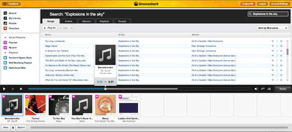
According to their blog post these are a few of the major enhancements.
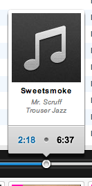
The seek bar lets you jump to any point in a song.
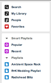
The left side navigation lets you seperate different groups of music for easy access.

Bigger album art puts the current playlist front and center.
The new interface is a joy to use. The new sorting options and the ability to jump around to any point in the song make Grooveshark like an online version of iTunes that has an Internet-wide shared library. Bigger album art is a nice upgrade over the thumbnails used in the old interface. It used to be a pain going through your favorite songs but now you can add them to your library (which has much more robust sorting options) with the click of the music note icon. New themes are interesting to keep things fresh. I imagine there will be dozens more added over the next few months.
One of the new features I stumbled on that wasn’t mentioned everywhere were RSS feeds. Right now there are three: Songs I Favorite, Songs I Listen to, My Zeitgeist (which is empty at the moment). It would be nice to see Grooveshark automatically send song info to your Last.fm account.
The only other feature really missing from Grooveshark is a hook in the player for controlling it with global shortcuts. I would really love to set up a key combo to play/pause, skip tracks, and favorite tracks without ever bringing the app into focus. The best part is how Grooveshark listens to their community through Get Satisfaction.
I’m confident this is only the beginning of improvements and I’m glad I plunked down my $30 for a year of VIP membership.

After spending all day filling out paperwork for a new car, this is what my desk looks like. Lots of papers from the dealership plus old trinkets scooped out of the glove box of my old clunker. Atleast I can organize tomorrow.

I’m sick of the developer community whining and moaning about IE6. It’s amazing how many different campaigns have been created in an attempt to get people to upgrade. From the simple brochure sites like stopie6.com to the unethical IE6 update script which tricks a user into thinking an IE upgrade is a critical update. There was even a CNN story about the anti-IE campaign on the front page (which I think they ran mostly because they stood to benefit from people upgrading). And lets not forget the jovial tweets when news broke that YouTube would be dropping support for IE6.
The only major site that has a valid plan for leaving IE6 behind is Digg.com which was a business decision. According to their stats, IE6 accounts for 10% of visits and 5% of all pageviews. The biggest IE6 headaches for Digg is supporting the functionality to digg a story, bury a story, or leave a comment. IE6 only accounts for a mere 1% of these actions which Digg can’t justify the extra development time needed to support them for such a small group of users. They even conducted a survey to find out why people don’t upgrade their browsers with a majority of the respondents stating they aren’t allowed or they don’t have the proper rights to install new software on their computers.
All of this hoopla so the lives of developers are easier. After all it is the job of developers to build a site and make sure it works across a variety of operating systems, browsers, and devices in order to serve its audience. Martin Ringlein put it best in his post Stop being a dick, support IE6, “We are in the business of creating usable, accessible and intuitive experiences for our users; we are not in the business of changing users, user agents and user behavior all in a pursuit for what we’ve deemed a ‘better’ web.”
I became a developer because I enjoyed solving problems. Internet Explorer is just another obstacle to get over when solving a problem. Rather than wasting energy on things I couldn’t control like trying to persuade the public to upgrade, I dove into learning how to get past the quirks of IE. Here are my 5 tips:
.style { margin-left:15px; //Caught by every browser _margin-left:10px; //Caught by IE 6 & 7 .margin-left:8px; //Only caught by IE6 } |
You can also use conditional stylesheets to serve different stylesheets but that becomes difficult to maintain.
Other tips for taming IE quirks:
So if studying up on these workarounds and techniques sound like too much work, then maybe you shouldn’t be a developer. Perhaps a professional lobbyist is right up your alley. They’re pretty good at ignoring the details of reality.
Here’s a list of some of the more prominent anti-IE6 sites:
And David DeSandro agrees with my attitude towards IE6.
Firebug is the web developer equivalent of a hammer to a carpenter. In other words without this valuable tool hundreds of thousands would not be able to do their job and make the web what it is today. So even small changes to the interface are going to ruffle some feathers.
I spent a good half day trying to figure out why my precious Firebug wasn’t behaving like its usual self. For one thing, it wasn’t showing JavaScript errors in the status bar icon like it usually does. It also displayed a message saying “Reload to activate window console” whenever I would bring it up. This makes debugging impossible if I have to keep refreshing the page everytime.
It turns out the Firebug developers made a teeny, tiny tweak to the interface. The screenshot on top is the newer Firebug, version 1.4. The bottom half of the screenshot is from an earlier version. See the difference?
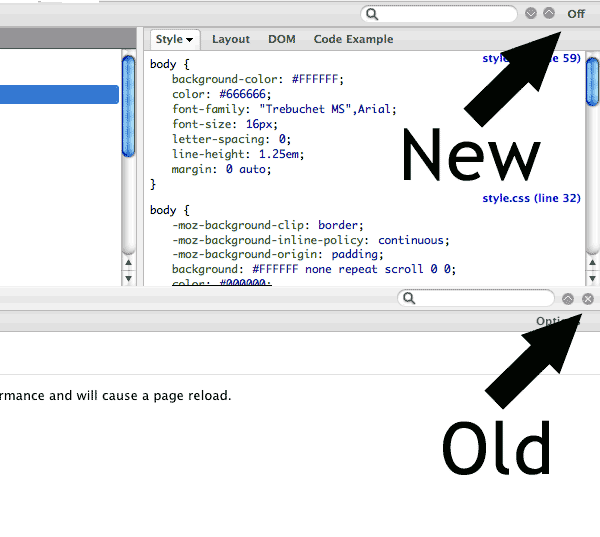
The ‘X’ used to hide the Firebug window in older versions has been replaced with an Off button. Unfortunately the Firebug developers changed the behavior as well. The Off button deactivates Firebug for that website which explains why JavaScript errors disabled in the status icon. The button that I have come to accustomed to for minimizing the Firebug panel is that circular down-ward arrow about 50 pixels away.
This is a usability nightmare!

I now have to focus in order to minimize Firebug taking mental energy away from my task. If I’m not paying attention I can turn-off Firebug for the site I’m working on and then I would have to reload the page to get it working again. These sound like little things but compounded one hundred times and it can drive you batty.
So while the latest Firebug update is not technically broken, a poor interface decision sure makes it feel like a buggy mess.

Guy got on Metro wearing a button-downed shirt, tie, blazer, slacks and open Teva sandals. Must have been a fresh Linux developer on a job interview.
Probably the strangest clip I’ve seen in a good while. If this actually aired somewhere, my guess would be Canada… or California public access. Kudos for doing yoga in those tight jeans though.