Posts tagged 'Coding'

How I Learned JavaScript On Accident

I picked up JavaScript by accident before jQuery, Prototype or any of the other smitten tools that make web developers lives easier. The web was just coming back to life in early 2005 from the dot-com bomb. I was enrolled in the Digital Media Production program at the Art Institute of Philadelphia; a degree encompassing video, web, and multimedia all rolled up into one. Back then almost everything about building websites fell under the term ‘scripting.’ ‘Scripting 1’ was really an introduction to HTML with a little bit of CSS thrown in. I managed to test out of this class with an example site I put together for a friend a week earlier. Logically, Scripting 2 would seem to be more advanced HTML and CSS techniques, but my thinking was wrong. My school deemed ‘Scripting 2’ as a JavaScript class.

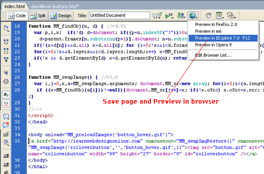
Dreamweaver's horrible rollover JavaScript code

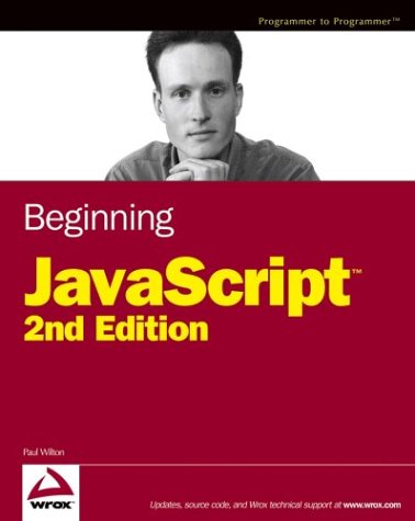
My only experience with JavaScript before ‘Scripting 2’ was the auto-generated cruft from Dreamweaver MX used in rollovers and jumpmenus. I had no idea what it did or how it worked; I only knew not to muck with it or things would break. I also spent most of my Dreamweaver time in design view, not code view. The required reading for the class was Beginning JavaScript by Paul Wilton. It was still a leading book at the time even though it was 5 years old. That’s how stagnant web development was compared to the blistering pace of progress made today. Some of the more advanced topics included dynamic HTML (DHTML) on Internet Explorer 4.0 and Netscape Navigator 4.x. Yea it was that old, but a lot of the basics still hold true even today.

Beginning JavaScript Cover by Paul Wilton

I read that book cover to cover to get a handle of JavaScript and help me complete my projects consisting of things like temperature converters and form validation. After 11 weeks it finally began to make sense. I began thinking about solving problems with it which led me to my personal project Deviant Bordermaker. The simple tool calculated image sizes for specific ratios given an image. It was developed long before Adobe Air as an offline app that people would download and run locally. Ecstatic couldn’t even begin to describe the feeling of bringing an idea to life and overcoming the barriers of learning a new technology. I knew from that day on that JavaScript would be a part of my career.

Fast forward nearly 2 years later when I land my first job at USNews & World Report. My very first task was to develop a quiz-building tool. Since I knew zilch about server-side programming languages, like PHP, I built the app using JavaScript. The final output was the HTML necessary for the quiz to run that a producer could simply copy and paste into the right place. Thinking back on it, the JavaScript was probably overly complex but I certainly learned a lot and continued to push the boundaries of my JavaScript chops.

From there I slowly learned the Prototype JavaScript framework, which was the defacto library at the time. At first I didn’t feel like it was making anything easier as I was struggling to grasp the object oriented model of doing things in Prototype. This hard work paid off as learning jQuery was a breeze; it’s pretty much the same thing but with different names for things.

JavaScript has come a long way since 2005. The language continues to be pushed into new areas thanks to AJAX, web applications, and a rekindled browser war. Learning JavaScript will go a long way in learning other things like PHP and should definitely be a foundation skill for most any frontend developer. How did you come across JavaScript?

Death To The Div

Every web developer is looking forward to the new HTML spec, HTML 5. The new spec will birth 20 new elements to add more underlying semantic meaning to content. The new elements came out of popular IDs and Class attributes for common situations in web design: <nav> is just like <div id=”nav”>. But these new elements are just a stop gap.

Death to the Div Tag

I wish the web community could move beyond pigeon-holing ourselves with specific elements. Why can’t we make our own elements to better describe our content? If I had my way <div>s would be ancient history and any element not already defined in the HTML spec would be treated by browsers like a <div>.

There are many benefits to opening up the element nomenclature like this.

1) It will be much easier to describe content. No longer will we need to shoehorn our content into quasi-relevant elements. Did you know the <address> tag is to define the contact information for the author or owner of a document and not to hold a plain street address?

2) No more div-itis. Web developers will no longer have to wade through a dozen </div> tags. <div> tags are the least-semantic structural elements in a web designers toolbox; it literally means ‘division’ of a page and is used to mark off different sections within a document. Things can get pretty messy when using too many <div>s however as it is hard to tell where they end. Take a look at this code example:

<div id="container">
   <div id="article">
      ...
     <div id="chart">
      ...
     </div>
   </div>
</div>

Look how much better this markup looks from both a readability and maintainability perspective:

<container>
   <article>
      ...
     <chart>
      ...
     </chart>
   </article>
</container>

A benefit to free-form elements is the semantic closing tags making it clear where each element begins and ends.

3) Microformats might actually work. The movement to create semantic markup using loosely agreed upon Classes slowly died off due to the extra bloat it introduced to the underlying code. With the ability to create your own tags, Microformats could flourish and we can begin to set-up our own best practices for describing content.

4) Faster JavaScript. Not many browsers support the JavaScript method getElementsByClassName but every browser supports getElementsByTagName. Because of this many libraries have had to write their own implementations which are many times slower than native methods. Faster DOM traversal = faster JavaScript!

What will it take to make this a reality? Boogers

We’re already going to have issues with older browsers supporting brand new elements with HTML 5. We might as well go all the way and make sure every browser can support whatever element we can come up with. After all we only have one shot to get HTML right for this generation according to John Allsopp.

Many browsers already support free-form elements both with CSS and JavaScript. To really flesh this out I created the Booger Test and below are my findings.

  • Firefox 3+ supports the <booger> tag as if it were a native element but has to be explicitly set to display:block.
  • Firefox 2 has no problem with CSS unless there children elements in which case the <booger> tag collapses. Weird!
  • All versions of Internet Explorer don’t know what to do with the <booger> tag but they do function normally when using a JavaScript shiv
  • Safari and Chrome have no problems.
  • Every browser I tested passed the JavaScript portions (getElementsByTagName(“booger”)) of the booger test with flying colors!

So as you can see, we are really close to being able to use our own elements. HTML 5 is already going in this direction but it would be a real shame if everyone got hung up on what frivolous new element names we should all agree to use instead of coming up with new functionality to move the capabilities of the web forward.

Developers: Stop Whining About IE6

I WANT YOU TO STOP WHINING

I’m sick of the developer community whining and moaning about IE6. It’s amazing how many different campaigns have been created in an attempt to get people to upgrade. From the simple brochure sites like stopie6.com to the unethical IE6 update script which tricks a user into thinking an IE upgrade is a critical update. There was even a CNN story about the anti-IE campaign on the front page (which I think they ran mostly because they stood to benefit from people upgrading). And lets not forget the jovial tweets when news broke that YouTube would be dropping support for IE6.

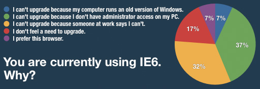
The only major site that has a valid plan for leaving IE6 behind is Digg.com which was a business decision. According to their stats, IE6 accounts for 10% of visits and 5% of all pageviews. The biggest IE6 headaches for Digg is supporting the functionality to digg a story, bury a story, or leave a comment. IE6 only accounts for a mere 1% of these actions which Digg can’t justify the extra development time needed to support them for such a small group of users. They even conducted a survey to find out why people don’t upgrade their browsers with a majority of the respondents stating they aren’t allowed or they don’t have the proper rights to install new software on their computers.

Digg IE6 Survey chart

All of this hoopla so the lives of developers are easier. After all it is the job of developers to build a site and make sure it works across a variety of operating systems, browsers, and devices in order to serve its audience. Martin Ringlein put it best in his post Stop being a dick, support IE6, “We are in the business of creating usable, accessible and intuitive experiences for our users; we are not in the business of changing users, user agents and user behavior all in a pursuit for what we’ve deemed a ‘better’ web.”

I became a developer because I enjoyed solving problems. Internet Explorer is just another obstacle to get over when solving a problem. Rather than wasting energy on things I couldn’t control like trying to persuade the public to upgrade, I dove into learning how to get past the quirks of IE. Here are my 5 tips:

  1. Start with a reset stylesheet – This removes any default styles set by the browser so you can start styling on a consistent base. I prefer Eric Myer’s CSS Reset Reloaded , but there are many to choose from.
  2. Use a strict HTML doctypeDoctypes tell the browser how to interpret the HTML and transitional and loose doctypes introduce rendering quirks known as triggering “quirksmode“. Any XML doctype (including XHTML flavors) triggers quirks mode in IE as well.
  3. Don’t be afraid of CSS conditional hacks – Did you know you can send IE a different property by putting an underscore in front of it? It works like this:
    .style {
    margin-left:15px; //Caught by every browser
    _margin-left:10px; //Caught by IE 6 & 7
    .margin-left:8px; //Only caught by IE6
    }

    You can also use conditional stylesheets to serve different stylesheets but that becomes difficult to maintain.

  4. Learn to love the AlphaImageLoader filter for transparent PNGs – There is no way around it.
  5. Learn to clear floats the simple way – Just set the “overflow” property of the container to auto or hidden and set the width or height to something other than auto. This applies to all browsers not just IE. I hate seeing the overly complicated clearfix solution.

Other tips for taming IE quirks:

So if studying up on these workarounds and techniques sound like too much work, then maybe you shouldn’t be a developer. Perhaps a professional lobbyist is right up your alley. They’re pretty good at ignoring the details of reality.

Here’s a list of some of the more prominent anti-IE6 sites:

And David DeSandro agrees with my attitude towards IE6.

Firebug Gets A Little Buggy

Firebug is the web developer equivalent of a hammer to a carpenter. In other words without this valuable tool hundreds of thousands would not be able to do their job and make the web what it is today. So even small changes to the interface are going to ruffle some feathers.

I spent a good half day trying to figure out why my precious Firebug wasn’t behaving like its usual self. For one thing, it wasn’t showing JavaScript errors in the status bar icon like it usually does. It also displayed a message saying “Reload to activate window console” whenever I would bring it up. This makes debugging impossible if I have to keep refreshing the page everytime.

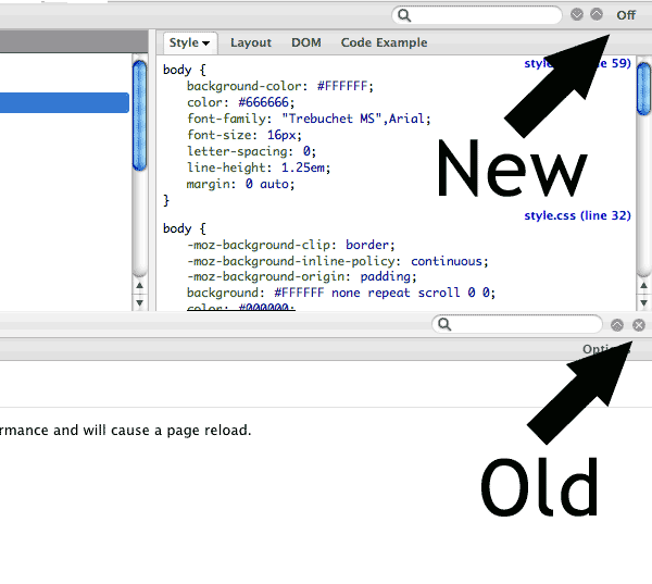
It turns out the Firebug developers made a teeny, tiny tweak to the interface. The screenshot on top is the newer Firebug, version 1.4. The bottom half of the screenshot is from an earlier version. See the difference?

Screenshot of Firebug 1.4 vs the older 1.3 interface.

The ‘X’ used to hide the Firebug window in older versions has been replaced with an Off button. Unfortunately the Firebug developers changed the behavior as well. The Off button deactivates Firebug for that website which explains why JavaScript errors disabled in the status icon. The button that I have come to accustomed to for minimizing the Firebug panel is that circular down-ward arrow about 50 pixels away.

This is a usability nightmare!

  1. The hide Firebug functionality isn’t where the user expects it, especially for long-time users who have developed a muscle memory
  2. The Off button is ambiguous to what the action does (a better word would be deactivate, though that doesn’t quite fit)
  3. The Off buttons breaks away from the rest of the paradigm of the interface (icons are for actions like inspect, and pause while words are for different tabs)
  4. and the Off button is a much larger than the minimize button even though the minimize button is used far more frequently than the off button

Firebug 1.4 interface paradigm

I now have to focus in order to minimize Firebug taking mental energy away from my task. If I’m not paying attention I can turn-off Firebug for the site I’m working on and then I would have to reload the page to get it working again. These sound like little things but compounded one hundred times and it can drive you batty.

So while the latest Firebug update is not technically broken, a poor interface decision sure makes it feel like a buggy mess.

Pure CSS Shapes: Triangles, Delicious Logo, and Hearts

After reading through Smashing Magazine’s latest article, 50 New CSS Techniques For Your Next Web Design, I came across an article glossing over a technique for creating a triangle using pure CSS. A triangle using just CSS? That blew my mind! How is that even possible?

After playing around with the sample CSS I started to get it. Using an empty HTML element and the border properties, you can make all kinds of shapes. Here is how it works.

Note: As expected, Internet Explorer acts a bit wonky especially IE6. These experiments were done in Firefox 3.5 but you can see what they should look like in a screenshot I took.

Per the box model, the border outlines the perimeter of an element. When an element has a width and height of 0px the border-width’s make up the dimensions of the element.The corners of borders meet at a 45° angle which is apparent with larger border widths and what makes pure CSS shapes possible. The final CSS to make a 200 pixel tall red triangle pointing up looks like this:

But let’s see how we got to this conclusion step by step starting with a basic square and borders. Each border will be given a different color so we can tell them apart.

.triangle {
border-color: yellow blue red green;
border-style: solid;
border-width: 200px 200px 200px 200px;
height: 0px;
width: 0px;
}

We won’t need the top border so we can set its width to 0px. This makes our triangle easy to measure without any extra space on top; a border-bottom value of 200px will result in a triangle that is 200px tall.

.triangle {
border-color: yellow blue red green;
border-style: solid;
border-width: 0px 200px 200px 200px;
height: 0px;
width: 0px;
}

To hide the two side triangles we set the border-color to transparent. If we set the border-left and border-right widths to 0px then the whole shape would collapse, leaving us with nothing. Since the top-border has been effectively deleted, we can set the border-top-color to transparent as well.

 .triangle {
border-color: transparent transparent red transparent;
border-style: solid;
border-width: 0px 200px 200px 200px;
height: 0px;
width: 0px;
}

There you have it; a triangle using only a single, empty HTML element and some CSS. The same technique can be applied to the other three sides for different orientations. Where might this come in handy? A JavaScript toggle to indicate a container is visible comes to mind. And using a pure CSS triangle is a lot more convenient than coming up with new images for each variation.

Try playing around with different widths to create different kinds of triangles. You can also get some funky effects by changing the border-style; dotted produces a neat effect on our regular bordered square.

.funkyShape {
border-color: yellow blue red green;
border-style: dotted;
border-width: 200px 200px 200px 200px;
height: 0px;
width: 0px;
}

I even managed to come up with the del.icio.us logo.

.delicious {
border-color:#FFFFFF #3274D0 #D3D2D2 #000000;
border-style:dashed;
border-width:150px;
height:0;
width:0;
}

And a heart shape.

.heart {
border-color:red;
border-style:dotted;
border-width:0 150px 150px 0;
height:0;
margin-left:90px;
margin-top:90px;
width:0;
}

I wasn’t the first one to explore CSS shapes, it turns out Tantek Çelik was playing around with these ideas way back in 2001.

target=”_blank” vs. target=”_new”

Bullseye Target for Archery Practice

The target attribute of a link forces the browser to open the destination page in a new browser window. Using _blank as a target value will spawn a new window every time while using _new will only spawn one new window and every link clicked with a target value of _new will replace the page loaded in the previously spawned window. Try it out for yourself:

Links with target=”_blank”

Google | Yahoo | Bing

Links with target=”_new”

Google | Yahoo | Bing

target=”_new” is not a standard target value. You could use any term you like and any link that has the same target value will open in a previously spawned window. See the target=”booger” example below.

Links with target=”booger”

Google | Yahoo | Bing

How can I force a link to open in a new tab instead of a new window?

There is currently no way to force a window to open in a new tab for browsers with this feature. This functionality can only be set in the preferences of the browser (see other resources section below).

What if I want the new window to display at a certain size?

The only way to do this is by using JavaScript. I recommend the method outlined at Quirksmode.org.

Other Rescources

Of course all of this is moot since opening pages in new windows is a usability annoyance.

Top 5 Firebug Extensions

Firebug started as an indispensable Firefox extension which takes web development to a new level. But after 2 years since it’s initial 1.0 release, Firebug has grown into a platform with a host of extensions built right on top of it. Here are my top 5 Firebug extensions that every web developer should have installed.

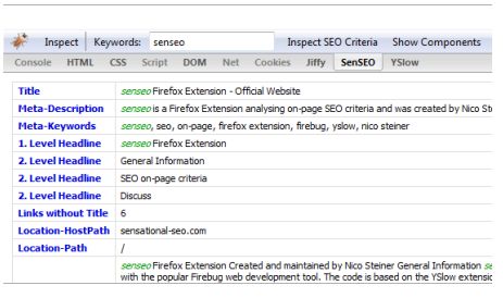
#5 SenSEO – SenSEO is a handy checklist of key SEO criteria. This Firebug extension rates your page on a scale of 100 against Google’s webmaster guidelines. SenSEO is most important right before a big launch to catch any simple tweaks that you may have overlooked during development.

SenSEO Firebug Extension Screenshot

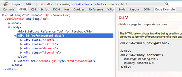
#4 CodeBurner – CodeBurner is an HTML and CSS reference right at your fingertips while you debug. It adds a Code Example tab which gives a brief description of the HTML tag or CSS property you have highlighted as well as a code sample so you can see the recommended usage. If that’s not enough, CodeBurner provides a link to the Sitepoint reference page which has everything you could ever want to know. Man, I wish I had this extension when I was learning HTML and CSS (let alone Firebug).

CodeBurner Firebug Extension Screenshot

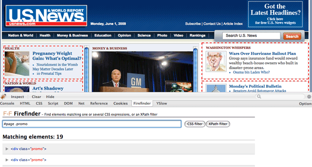
#3 FireFind – FireFind does only one thing but it does it well: finding elements. Using a CSS selector or XPath statement, FireFind will highlight all of the matching elements on the page. This makes it a breeze to test CSS selectors with your site right in front of you. To boot, it also features a count of all the elements found. Even though this is possible through Firebug’s console tab when any popular JavaScript library is included, FireFind makes the process straight-forward and painless.

FireFinder Firebug Extension Screenshot

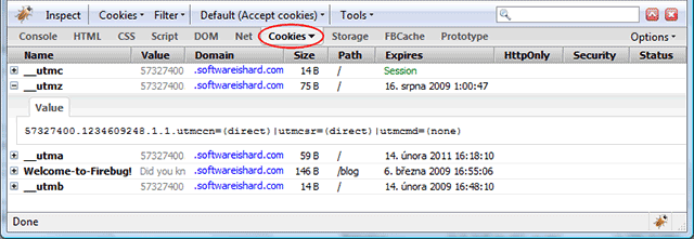
#2 FireCookie – If you have ever had to debug JavaScript cookies then you’ll wonder how you got by without this extension. FireCookie lets you inspect and edit cookies on the fly including permissions, values, and the expiration time. You can even sort all of your cookies as well as filter them out by domain. And when testing a script for your audience that has cookies disabled, FireCookie provides a simple option to disable cookies globally or just for the current domain. Now working with cookies doesn’t have to be such a stale experience.

FireCookie Firebug Extension Screenshot

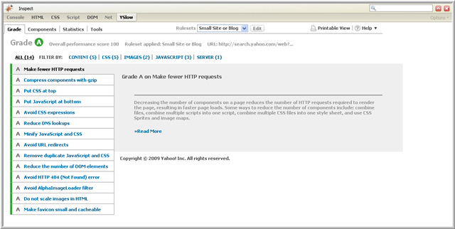
#1 YSlow – Serious web developers are obsessed with performance and YSlow provides a smorgasbord of tools for measuring the speed of a site. YSlow is built around 34 best practices for speeding up a website which is the result of extensive research by the Yahoo Performance team. The extension provides a letter grade of each practice with advice on how to squeeze out every little bit of extra performance.

YSlow Test Grade View

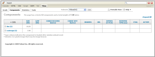
Another handy view is the Components tool which gives you an insight into all of the componets of the page. There are a bevy of stats that can be analyzed to pinpoint bloated waste.

YSlow Components View

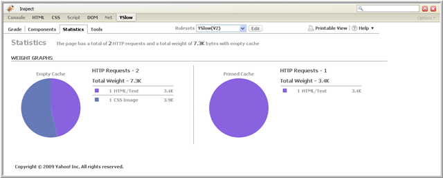
Finally, the statistics tool gives insight into the weight of your page for users with an empty cache and a primed cache.

YSlow Statistics View

If you have never given much thought to the performance of your site, YSlow makes it easy to dive right in.

What are some of your favorite Firefox extensions geared towards web development?

Does The IMG Tag Need A Fullsize Attribute?

Drew Wilson is proposing the HTML IMG tag get a new attribute called fullsize. The fullsize attribute would reference “a larger (or fullsize) version of the SRC image. Browsers could then include native support to display the fullsize image in a [modal] pop-up.” according to addfullsize.com, Wilson’s site dedicated to the effort. Mr. Wilson has even gone to the trouble of creating a jQuery plug-in that simulates how the behavior would work. He hopes the Internet will make enough buzz about it to get the attention of the W3C in order to get the fullsize attribute included in the official HTML spec. As of this writing, the petition to add a fullsize attribute has 185 “signatures”. I am not one of them.

Drew Wilson is proposing the W3C add a new attribute to the IMG tag called fullsize.

I’m not against the idea of including a reference to a larger version of an image right inside the tag. HTML is all about structuring and describing content, and the fullsize attribute is just another piece of meta-data. My biggest problem is this is already possible today by wrapping a link pointing to the fullsize image around the original image. Is it sexy? No. But it is still flexible. It can be customized and jazzed up with JavaScript and CSS but for devices that don’t support those technologies, a link around an image would still be accessible.

What I’m weary wary about is letting the browser manufacturers determine the default pop-up behavior and then relying on them for easier customization options. Take drop down input elements for example. Getting these to look consistent across all of the different browsers and operating systems in the world today is impossible. Roger Johansson went through the effort and documented them on his blog 456bereastreet.com. Any saved time from browsers handling a pop-up would be wasted trying to work around the different limitations for each browser.

To summarize:

  • I’m all for a fullsize attribute for meta-data purposes
  • Browsers handling the pop-up functionality will do more harm than good

KristinaNaude.com: From Comp To Code In 12 Hours

Kristina had been toying with the idea of her own website for a couple weeks now. However, this past weekend, she got around to comping one together. She has been fascinated with the eclectic desk style that seems popular these days. While she was busy in Photoshop, I was setting up the domain and basic file structure. Since it’s a small site, the preparation didn’t take long. In fact the most time consuming task involved cutting images up from the comp and organizing them. Coding was a snap. The site is a basic 3 column layout and most everything is an image.


KristinaNaude.com Screenshot

Creating the carousel to page through her resume was a custom job that took me about 20 minutes using jQuery. I had hoped to just go out to the jQuery community and find a nifty carousel plugin that I could just drop in and be on my way. Unfortunately this wasn’t the case. While there were plenty of options out there, everything was over engineered and too rigid. Most require the content to be an unordered list but I was using a set of divs. This shouldn’t make a lick of difference as any jQuery selector could be used.

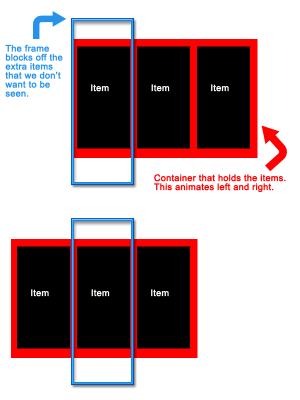
Carousel scripts are pretty basic. You need a set of items to rotate through, a container to hold the items, and a frame to mask off the ugly parts. Some basic styling is used to line the items up in a row. The container is given a postion of absolute so it can be freely moved left and right and a large width to hold all of the items inside. The frame needs the overflow property set to hidden to mask out the items that we don’t want the user to see. To pull off the animation we use jQuery’s handy animate() method for the left and right positioning of the container element. This lets us set a key point and jQuery will handle the interpolation from the current value to the key point. Attach this function to a next and previous button and you’re ready to go with your own custom carousel that works the way you want it to.

How A Carousel Works

It was a lot of fun to create a brand new site from scratch without any legacy content or rigid CMS. Simple websites are fun! And if you haven’t checked out the fruits of both of our labors, then please immediately proceed to KristinaNaude.com.

IE Gets A CSS Rule Right

Web developers like to rag on Microsoft’s Internet Explorer every chance they get due it’s sub-par support for HTML/CSS standards. But one thing Microsoft did get right was support for background-position-x and background-position-y. The background-position property lets you control the placement of the background image of an element. Background-position-x and background-position-y let you control the placement independently.

What are some practical uses of controlling the background position independently? Take a card game, for example. Instead of assigning a separate background image for each card you could make a single image that has all the cards in a grid (see below). To show every card you would only need 18 classes: 1 for the common card styles, 4 for the background position of each suit, and 13 for the background position of each value (Ace, two, three etc.)

The CSS for the image above would look like this…

.card {
height:78px;
width:52px;
display:block;
background-image:url(/foo/card-image.png);
background-repeat:no-repeat;
}
/* Suites */
.clubs { background-position-y:0%; }
.diamonds { background-position-y:25%; }
.hearts { background-position-y:50%; }
.spades { background-position-y:75%; }
/* Values */
.ace { background-position-x:0%; }
.two { background-position-x:7.5%; }
.three { background-position-x:7.5%; }
.four { background-position-x:7.5%; }
.five { background-position-x:7.5%; }
/* etc. */

The HTML would be simple, elegant, and look like this:

<a class="card hearts five">Five of Hearts</a>
 
<a class="card spade jack">Jack of Spades</a>

Alas if only life were that simple. Currently only IE 5.0+ and Safari 1.2+ support background-position-x and background-position-y. Every other browser ignores the properties, defaulting to the upper left position.

Instead this is how the CSS code would look if you were writing it for support with all browsers…

/* clubs */ 
.ace-clubs { background-position:0% 0%; }
.two-clubs { background-position:7.5% 0%; }
.three-clubs { background-position:15% 0%; }
.four-clubs { background-position:22.5% 0%; }
.five-clubs { background-position:30% 0%; }
.six-clubs { background-position:37.5% 0%; }
.seven-clubs { background-position:45% 0%; }
.eight-clubs { background-position:52.5% 0%; }
.nine-clubs { background-position:60% 0%; }
.ten-clubs { background-position:67.5% 0%; }
.jack-clubs { background-position:75% 0%; }
.queen-clubs { background-position:82.5% 0%; }
.king-clubs { background-position:90% 0%; }
 
 
/* spades */ 
.ace-spades { background-position:0% 25%; }
.two-spades { background-position:7.5% 25%; }
.three-spades { background-position:15% 25%; }
.four-spades { background-position:22.5% 25%; }
.five-spades { background-position:30% 25%; }
.six-spades { background-position:37.5% 25%; }
.seven-spades { background-position:45% 25%; }
.eight-spades { background-position:52.5% 25%; }
.nine-spades { background-position:60% 25%; }
.ten-spades { background-position:67.5% 25%; }
.jack-spades { background-position:75% 25%; }
.queen-spades { background-position:82.5% 25%; }
.king-spades { background-position:90% 25%; }
 
 
/* hearts */ 
.ace-hearts { background-position:0% 50%; }
.two-hearts { background-position:7.5% 50%; }
.three-hearts { background-position:15% 50%; }
.four-hearts { background-position:22.5% 50%; }
.five-hearts { background-position:30% 50%; }
.six-hearts { background-position:37.5% 50%; }
.seven-hearts { background-position:45% 50%; }
.eight-hearts { background-position:52.5% 50%; }
.nine-hearts { background-position:60% 50%; }
.ten-hearts { background-position:67.5% 50%; }
.jack-hearts { background-position:75% 50%; }
.queen-hearts { background-position:82.5% 50%; }
.king-hearts { background-position:90% 50%; }
 
 
/* diamonds */ 
.ace-diamonds { background-position:0% 75%; }
.two-diamonds { background-position:7.5% 75%; }
.three-diamonds { background-position:15% 75%; }
.four-diamonds { background-position:22.5% 75%; }
.five-diamonds { background-position:30% 75%; }
.six-diamonds { background-position:37.5% 75%; }
.seven-diamonds { background-position:45% 75%; }
.eight-diamonds { background-position:52.5% 75%; }
.nine-diamonds { background-position:60% 75%; }
.ten-diamonds { background-position:67.5% 75%; }
.jack-diamonds { background-position:75% 75%; }
.queen-diamonds { background-position:82.5% 75%; }
.king-diamonds { background-position:90% 75%; }

That’s a class for each card or 52 for those following along at home. Bloat city.

So kudos to Microsoft for letting developers be flexible in at least one area. Now if all the other CSS properties were as flawless as this we would be in business.