Posts tagged 'Conference'

2nd Annual Accessibility Camp DC
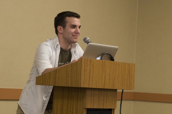
Last October was the first ever Accessibility Camp DC. I learned a lot from the talks last year and had my eyes opened by how the blind navigate the web. This year, on October 9th, I took what I learned and gave a presentation of my own.
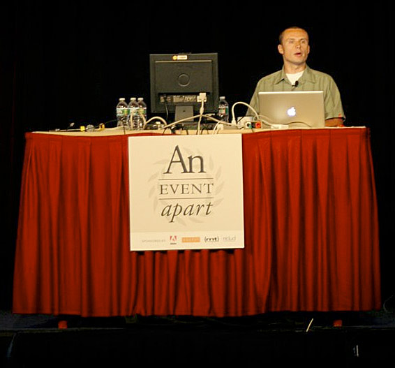
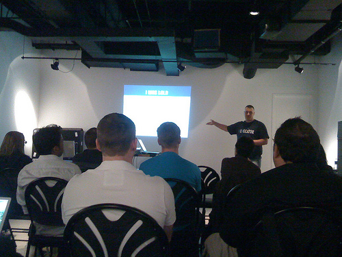
Titled “Building An Accessible Site from the Ground Up” my talk was about making a website accessible from a developers point of view. The audience’s reaction was positive and there were many good questions raised.

See https://www.slideshare.net/kingkool68/building-an-accessible-site-from-the-ground-up

Local PHP developers Andrew Nacin (core contributor to WordPress.org) and Aaron Jorbin (Clearspring Technologies) sat in on my talk. The two were adding accessibility-related patches to WordPress while I was presenting. This is why I love the WordPress community! Afterwards I got to talk with them about WordPress geekiness even though I saw them a couple of weeks ago at WordPress Mid-Atlantic. They even introduced me to another DC-area hacker, Greg Linch, who is passionate about journalism and education.
Lunch was sponsored by Adobe and delicious. While people were munching on sandwiches, Jennison Asuncion demonstrated screen-reading software JAWS and how it works with websites. Like last year, there were many people who were just flabbergasted by what they saw. It’s one thing to read about accessibility issues online, it’s another to see it live, in-person.

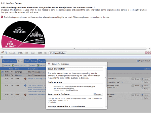
After lunch I saw a demonstration of FireEyes, a Firebug plugin, to uncover accessibility issues from Karl Groves.  The neat thing about the free plugin is, it will detect problems on AJAX events that load new data onto the page without refreshing page.

I also sat in on a talk about adding ARIA live regions to help screenreaders announce dynamic changes on the page such as using AJAX. These techniques are simple to implement and seeing someone demonstrate their advantages really motivates me to incorporate them into my projects.

Mark Barlet from AbleGamers.com was there all day showing off videos games that are accessible. These games run on modern hardware like the Xbox 360 but have special modifications so people with disabilities could be competitive. One game was an audio only game where you’re a monster trying to eat victims that fall into your pit. There are no graphics, mainly because the game designer isn’t a graphic designers. Instead you listen to audible clues about where your next victim is and when you are close enough you press a button to eat them. The game works really well with stereo headphones to help you orient yourself. Other things on display were a racing game that you can control with your face and a sip and puff tube attached to a controller to control a character on-screen.  If you’re into accessible gaming controllers, check out episode 1 of the Ben Heck Show on Revision 3.

After the conference a bunch of us headed to Capital City Brewing Company for some food and continued geeky conversation. There were a lot of people from out-of-town and it was good to get to know them. I met Elle Waters from Louisville, Kentucky; Pratik Patel from New York; and Cliff Tyllick from Austin, Texas. It was a great end to a great day of accessibility.

Other Coverage of Accessibility Camp DC 2010

Summary Of An Event Apart DC Day 1

The Event Apart conference series is the top-notch gathering for people who make websites. Making its way across various cities in the U.S., the Event Apart tour stopped in Washington, D.C., which I was fortunate enough to attend. The speakers themselves were amazing but interacting with the attendees in real-time during the talks opened a whole new level to the experience. Below are some of the best tweets I curated from each of the sessions. All of which came from afeedapart.com, the official feed aggregator for An Event Apart.

Web 2.1: The Medium Comes of Age by Jeffery Zeldman

Zeldman started things off with a presentation covering the history of communication from the printing press to HTML5, and everything in between. In 2010, standards based design is no longer fringe, HTML5/CSS3 are viable technologies, and the mobile web is taking shape.

  • The death of the web is greatly exaggerated. @tomkruk
  • If the web is dead, then print must be mummified. @Merlaak
  • “There are 241 newsgroups on 1986. 240 are porn…” @grum_dot_com
  • Zeldman calls the telegraph The Victorian Internet @eduiconf
  • R. Cailliau – leading man’s best friend. Worked with Tim Berners-Lee to invent the web. @mad_sunshine
  • 1991 AOL… remember 9600 baud modem? = yuck @lavinia
  • “there’s a history of the internet being ugly and being designed by people who can’t design their way out of a paper bag” @ashleyjoost
  • 1993. Mosaic. We’ve come a long way. #aea http://yfrog.com/jcem8mj @eTapWeb
  • I remember using MOSAIC on my Amiga 500, wondering why “forms” are not showing… @tomkruk
  • And you had to PAY for Netscape @cityrider49
  • Netscape Gold FTW! @tomkruk
  • Zeldman breaking down landmark moments in web history: “1995 brings us the tiled background” @mattmediadc
  • “IE no longer sucks, IE is awesome” – Zeldman, #aea … hear it from the man! @franksedivy
  • 1998 — internet traffic doubles every 100 days @ashleyjoost
  • the phrase “best viewed…” should be left to history @cityrider49
  • dot com bust = coming off a coke bender @tonyvia
  • 2000 dot com bubble burst brought us benefits: people were forced to learn standards, improve their skills to make a difference. @mihswat
  • The CSS Zen Garden changed my professional career… Design for the web became a whole different concept @mattmediadc
  • “you can’t burn every house down because we have this new idea for architecture” @TheTroz
  • XHTML 2.0 was burning every house in the world just to propose a new architecture. @mihswat
  • “HTML5. You keep using that word. I do not think it means what you think it means.” @eTapWeb

Object Oriented CSS by Nicole Sullivan

Nicole developed a technique for managing CSS called Object Oriented CSS. The basic premise is to recognize visual patterns and mark them up consistently. Consistent markup results in more compact and efficient CSS code to style which in turn results in more manageable code and faster performing websites.

  • If you write CSS for any site of significant size or traffic you MUST hear @stubbornella talk on OOCSS. This is my second time listen. @aebsr
  • Reason for CSS optimization, CSS Blocks progressive rendering @eduiconf
  • 42% of Alexa’s Top 1000 don’t gzip CSS. 44% have more than 2 files. 56% serve with cookies. 62% don’t minify. 21% have > 100k of CSS. @mihswat
  • “Our sites are choking on the amount of CSS we’re throwing over the wire.” @eTapWeb
  • OOCSS makes me intellectually erect @grum_dot_com
  • Object oriented CSS sound a lot more complicated than it really is. @kingkool68
  • wow around May 2009 FaceBook had over 700 CSS files that totaled more than 1.9Mb @160mph
  • “If you fighting your CSS, your architecture failed” @franksedivy
  • Facebook has all of their headings bold. Non-bolded headings looked weird to users. @kingkool68
  • People aren’t viewing your home page or reading your about section anymore. It’s all Google hit-and-runs, and it’s changing our design. @brian_klaas
  • Css objects were better for humungo sites like Facebook. Seems overkill for smaller, simple sites. @kingkool68
  • Dust-me Selectors to find unused css. http://www.sitepoint.com/dustmeselectors/ @chrismjones
  • A ‘giant pink heading’ should not become a ‘small blue heading’ when placed in another part of the site. @phej
  • Elements should be styled globally, avoiding area-dependent declarations in CSS. Rules should be predictable, avoid overwriting them. @mihswat
  • Love how @stubbornella uses the story of the lady who swallowed a fly in relation to CSS @candiRSX
  • Writing CSS to correct previous bad CSS is the legacy of the old woman who swallowed a fly. It makes sense when @stubbornella says it. @achellios
  • Nicole Sullivan’s Grids on github – http://wiki.github.com/stubbornella/oocss/grids @Merlaak
  • Classing elements with element names (“.h1”) is one step removed from or similar. @jgarber
  • hmmmm…not sure about @stubbornella rec. on eg h3.h6 Isn’t that sort of hacky? Shouldn’t we re-examine design first? @ryanhoonlaverty
  • Among Alexa’s Top 1000, there’s a site with 511 declarations setting styles for h1-h6. Facebook used to have 958. @mihswat
  • After a CSS rewrite, there were only 25 declarations. @mihswat
  • Amen to the underscore hack. I use it all the time. @kingkool68
  • Avoid styling IDs. IDs are for JavaScript. @mihswat
  • styling IDs messes up specificity @eduiconf
  • “You should definitely suffer if you use hacks” @chrismjones
  • Not sure about this ‘not styling IDs’ and have class driven styles .that on top of the things aren’t semantic (.h1, .h2 etc…) … :/ @franksedivy
  • “AVOID !IMPORTANT – except on leaf nodes” Good advice!! @JudyBad
  • “I try to get specificity out-of-the-way so my cascade can really shine.” @andysherry
  • agree with not using !important, disagree with not styling IDs. style IDs if they’re used sparingly or if “lead nodes”. @courcelan
  • Styling using IDs, !importants, and too many nested elements is like fighting whose CSS rules are going to win. @mihswat
  • who knew? the way I wrote CSS as a n00b was on the right path – lots of class selectors and few element/ID selectors! @raelehman
  • I think OO CSS takes the art and craft away from CSS and gets it ready for consumers world! 🙁 @franksedivy
  • The blinking cursor says, “You don’t remember anything.” (Referring to the command line) @Merlaak
  • Find and replace is really why I use Dreamweaver as my coding tool of choice. No need to figure out grep. @kingkool68
  • See how many times a declaration if when your css from command line. grep -r font-size . | wc -l @chrismjones
  • Hmm, @stubbornella‘s OO approach to CSS preso has some good QA tricks, but her philosophy has too much scaffolding for general use @talbs
  • Feeling a little weird about @stubbornella‘s approach to object-oriented CSS, but liking some ideas about finding duplication. @graphicsgirl
  • OOCSS sounds like the best approach for Facebook, but not most sites we design and build. @graphicsgirl
  • afraid newbs will get the wrong idea with @stubbornella‘s methodology and not consider scale/context/semantics @talbs
  • I found taking the general idea from this presentation and building a custom framework for our approach to build sites worked great @aeaattendee
  • Looking at CSS in a way I never have thanks to @stubbornella @TheTroz
  • Facebook reduced CSS size by 19% and HTML size by 44% after optimizations @mihswat
  • * and _ hacks > conditional statements @160mph
  • Been using OOCSS for the past year and a half. Have never found a site that did not benefit. @chrismjones

The CSS3 Experience by Dan Cederholm

Dan emphasizes that sites don’t need to look and behave exactly the same in every browser. Case in point, he owns http://dowebsitesneedtolookexactlythesameineverybrowser.com/ and http://dowebsitesneedtobeexperiencedexactlythesameineverybrowser.com/. CSS3 is available in modern browsers today and suitable for non-critical elements of a design. His presentation consisted of several demos showcasing how CSS3 could be used to sweeten interfaces.

Mobile First! by Luke Wroblewski

Luke covered designing Web applications for mobile platforms first before the desktop. This helps you focus a website down to its bare essentials and functionality. The mobile web is exploding, and in some cases, is the only access someone has to the Internet.

  • “Web products should be designed for mobile first, even if no mobile version is planned.” @eTapWeb
  • desktop internet devices: 1 billion, mobile devices: 10 billion @tonyvia
  • “50% of people who were new to the web last year were on mobile devices.” @eTapWeb
  • Why build mobile first? More growth and future users. @tyrale
  • Mobile Web growth has outpaced desktop Web growth 8x. Smartphone sales will pass PC sales in 2011. @mihswat
  • Mobile is the new black @JudyBad
  • Great mobile products are created never ported. @kingkool68
  • mobile stats from #lukew http://lukew.com/ff/ @eduiconf
  • “27% of searches on Yelp! come from 4% of users (i.e. the users who access Yelp! via iPhone.)” @zeldman
  • “Designing for mobile forces you to focus and prioritize.” @eTapWeb
  • Moving from desktop to mobile… First remove 80% of the crap @tyrale
  • Design for mobile first and you will get down to the things that matter. @mad_sunshine
  • “everything else on this page needs to pixelate and die.” @courcelan
  • Mobile devices’ limited screen size makes you focus on what’s important – main features, straight communication. @mihswat
  • Use vector to design for the web, build with css3 it will scale automagically! @tyrale
  • Mobile design is all about adaption @kingkool68
  • for mobile, make the content the UI @rkunboxed
  • 100ms delay results in 1% sales loss for Amazon ($191 Million) @eduiconf
  • Google says 500ms delay drops search traffic by 20%. Wonder what our 8,000ms server hangs do. Cough. @itmaybejj
  • optimize for mobile:speed eg, eliminate redirects & use app cache for local content storage @dinalew
  • Mobile is quick bursts, and mostly at home on usage. @tyrale
  • Your mobile is with you all the time, so designing for mobile means designing something that can be used all the time. @zeldman
  • Only make content and web apps that are useful to people *all the time @halvorson
  • People spend only about 2 to 4 seconds on a webpage using a mobile device. Optimize your site for this behavior. @mihswat
  • design = constraining until an elegant solution presents itself @lavinia
  • Many users will interact with mobile devices using one hand and one thumb (one-handed touch), so the UI has to be simple. @jessicaivins
  • 1 million per day = touch based phone purchase @lavinia
  • mobile: must accommodate “french fry fingers” @JudyBad
  • wow. ‘1.1 billion consumers with Nokia devices in 2009’ @westerndave
  • 8-10mm = average human finger pad , so design for 9mm touch area @lavinia
  • touch me = Touch Gesture Reference Guide http://www.lukew.com/ff/entry.asp?1071 @westerndave
  • Hovers are not intentional, clicks are @eduiconf
  • great stat: People spend only about 2 to 4 seconds on a webpage using a mobile device. Optimize your site for this behavior. @lavinia
  • Hovers are not intentional. Just because a user’s mouse has paused somewhere doesn’t mean they expect to see a menu. @zeldman
  • most devices use wifi for location (gps is narly indoors) @lavinia
  • Yes! Hover cannot be considered an intentional interaction on a mobile device. I activate them accidentally on my *desktop*. @kissane
  • Yelp’s augmented reality feature boosted their sustained traffic by 40 to 50 percent @mihswat
  • Wonderful presentation from Luke Wroblewski. This really jives with a lot of stuff that get talked about in IxD these days. @iwilsonjr

Message and Medium: Better Content by Design by Kristina Halvorson

Kristina sure knows how to develop a killer content strategy. A website’s message carries through to other places on the web than just the main website. Customer support, social media, and meta data should all echo the tone of the main message. And there is a lot more to a good content strategy than determining what text goes on the front page. How will this content be produced? Who will update it? How often will we add new content?

  • Kristina Halvorson (@halvorson) asked us to sing Happy Birthday to her son. How sweet… @shiota
  • @halvorson on two of my favorite topics: teeth & content strategy! @dinalew
  • haha. User-scented content. “Smells like user.” @ryanhoonlaverty
  • Content strategy plans for the creation, delivery, and governance of content that people care about. @eTapWeb
  • website content: stop talking about what you do and talk about what your users want. hello user-centered content @dinalew
  • content requirements ≠ content strategy @tonyvia
  • content strategy = content (substance + structure) & people (workflow + governance) @tonyvia
  • messaging is not a mission statement, brand promise or tagline @eduiconf
  • nobody cares about your mission statement [so true!] @tonyvia
  • First second visiting a website is an emotional response @kingkool68
  • user forms an impression of your site in ONE SECOND (load time + design) & decides to trust you or not within 10 seconds @tonyvia
  • In 1 second user should have an emotional response. 10 seconds, understand your primary message. 2 minutes, secondary msg. @eTapWeb
  • Reminded of how some of the traditional #ux roles/deliverables can suffocate copywriters’ creativity/skills. Preach on, @havlorson. @talbs
  • Include maintenance requirements for key pages – great content strategy idea @graphicsgirl
  • Consistency inspires trust in your readers. @JudyBad
  • consistency inspires trust in your readers @lavinia
  • Visiting every page of your site with its main message in mind helps to see if you’re communicating it the right way with consistency @mihswat
  • #aea is really driving home the importance to collaboration across roles/disciplines to tackle those important grey areas of an experience! @talbs
  • And your FAQ page is inconsistent. Where’s the fun, Ben & Jerry? @mad_sunshine
  • pet peeve: “contact us” page hiding phone/address 10 layers deep. after all, that’s all we want from “contact us” page 99% of the time @sarahdippity
  • Workflow and governance are crucial for good content strategy. @kingkool68
  • “whats our facebook strategy?” “that depends… what are you trying to do, who’s going to do [keep up with it]?” hear, hear. @courcelan
  • What is your social media strategy? Is it successfully delivering your message? Or do you have a Twitter just for the sake of it? @mihswat
  • Page descriptions. Tweets. Facebook posts. Google results. Your message should be consistently delivered everywhere. @mihswat
  • @halvorson‘s talks on content strategy are ALWAYS timely and poignant. Maybe because content strategy is a never-ending struggle… @ryanhoonlaverty

Anatomy of a Design Decision by Jared Spool

Jared pointed out that every site on the web came to be from a series of decisions. He has identified 5 styles to design decisions and when each style might be appropriate for a given project. Oh and university homepages feature images of girls under trees way too much.

  • Seen it before, but it’s easy to forget just how awesome http://havenworks.com/ is… @davidocoulter
  • “it validates” – Jared Spool (sarcastically referring to havenworks.com) @SethBlanchard
  • “Someone actually designed this on purpose. This way.” – @jmspool on a particularly egregious web design specimen. @alykat
  • Sites like havenworks.com or arngren.net went over design decisions. Now that’s something to think about. @shiota
  • Jared is talking about the famous 37signals vs. Donald Norman “celebrity deathmatch”. @shiota
  • “Self design works great when you’re designing something for your own use, or for use by people just like you.” @eTapWeb
  • Crappy and unhelpful error messages are the perfect way to frustrate your user. @shiota
  • Unintentional design happens on its own. Works great if user will put up with whatever or we don’t care about support costs. @eTapWeb
  • Airline websites: helping AEA speakers make their point since 2005 @ryanhoonlaverty
  • “Genius design: when we’ve previously learned what users need. We’re solving the same problems repeatedly.” @eTapWeb
  • “Activity Focused Design: designing for new activities unfamiliar to us.” @eTapWeb
  • Well @jmspool‘s talk includes a reference to @lingscars‘ website www.lingscars.com… and well, just check it out. @hellogeri
  • Jared is comparing Six Flags map to Disney World’s map. Both amusement parks, yet totally different maps. Each with its own focus. @mihswat
  • Disney. Someone has thought about what happens between the rides. Thinking about the experience. @mad_sunshine
  • experience is the stuff that happens around usage. @lavinia
  • “User experience is what happens in between activities” @simplebits
  • University website traps — girl under trees. WOW! So many of them… @mad_sunshine
  • OMG I can’t search – the search box is on the left [side]! @raelehman
  • Rule #17: Always put the search box in the upper right @grum_dot_com
  • Hmm. design style guides and guidelines never work. @mad_sunshine
  • Informed Decisions > Rule-based Decisions @160mph
  • Rule-based decisions prevent thinking. Informed decisions require thinking. @sarahdippity
  • Design is about the exception cases. If everything was always the same, we would not be interested in this work. @beep
  • Instead of spreading dogmas/methodologies, try spreading tricks/techniques. People will learn, think, and won’t struggle with rules @mihswat

WordCamp Mid-Atlantic

This past weekend I got to attend WordCamp Mid-Atlantic, my first WordCamp ever. This years conference took place at Johns Hopkins University in Baltimore City. The venue was a little tricky to get to and the parking situation was a bit limited, but once I got there I had a great time. The place was packed with all kinds of different people who shared one common interest — they all love WordPress.

The camp was divided into two tracks; beginner and pro. I spent the whole day in the pro track and my summary of the talks are below.

Scott Kingsley Clark – WordPress as a CMS


Scott Kingsley Clark led off the first session of the pro track with WordPress as a CMS. His talk covered how to add more fields to the edit screen besides the usual title, post, tags, and categories we’re all used to seeing. He walked through using a plugin called Pods CMS, which he is a co-author of. To me, it seems a little over complicated. I like to use custom meta fields to extend the data contained in posts or pages. For a non-technical user who isn’t comfortable writing PHP, Pods CMS seems like an acceptable solution to get them up and running.

Brad Williams – WordPress Security


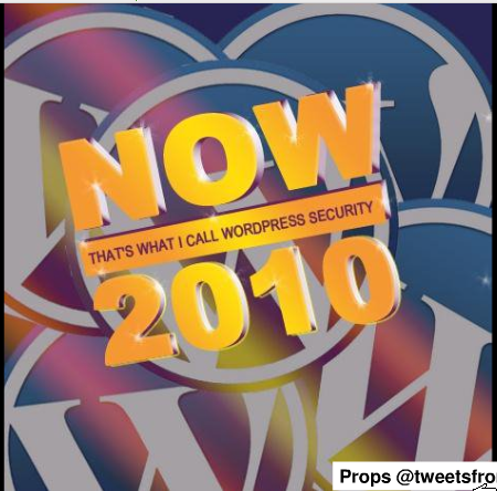
I’ve listened to Brad many times as a regular on the SitePoint podcast so it was good to actually meet him in person. His talk (slides available) on WordPress security was well attended as securing a WordPress install is applicable to every blogger. The tips Brad dished out would help anyone lock down their blog with such methods as checking your file permissions, deleting the admin user, changing the prefix on your database tables, and (most importantly) staying up to date with plugins and core updates.

At the end of his talk he mentioned a list of plugins to help with WordPress security.

  • WP Security Scan – Scans your WordPress installation for security vulnerabilities and suggests corrective actions.
  • WP-MalWatch – performs a security scan of your WordPress installation nightly looking for evidence of foul play and if WP-MalWatch finds it, a dashboard widget will tell you were you should take a closer look.
  • ServerBuddy – a plugin that tests server configuration to analyze the quality of your hosting & server configuration, and seek out problems with compatibility with various WordPress themes and plugins.
  • Exploit Scanner – searches the files on your website, and the posts and comments tables of your database for anything suspicious.
  • WordPress File Monitor – Monitor files under your WordPress installation for changes. When a change occurs, be notified via email.
  • Login Lockdown – records the IP address and timestamp of every failed login attempt. If more than a certain number of attempts are detected within a short period of time from the same IP range, then the login function is disabled for all requests from that range.

For lunch a group of us went across the street to Tambers, an indian burger place. Their burgers are perfectly normal but the last page of the menu had indian dishes. Weird. I also got a chance to meet Lokesh Dhakar, the author of the original lightbox script. He’s a smart guy.

Andrew Nacin – Undiscovered APIs

Photo by Nick Whitmoyer

After lunch, Andrew Nacin gave a talk (slides available) about functions and APIs that aren’t as well known about among developers. Since they aren’t well documented, the only way to learn about them is reading the source. I really got a kick out of his talk because I had been looking at some of these functions for a project of mine. Some neat functions include

  • wp_remote_request – to download files to your server from the web. WordPress uses this internally to download updates, themes, and plugins from within the admin screen.
  • wp_handle_sideload – lets you add a file to the media library that is already located somewhere else on your server.
  • oEmbed – allows the embedding of media by simply including the URL in a post. WordPress makes it easy to add your own oEmbed providers.
  • add_feed – lets you make your own feed. Andrew demonstrated how to make a JSON feed of your blog posts with just a few lines of code.

It is no wonder Andrew knows all of this stuff, he’s one of the seven core contributors for the WordPress project.

I liked in-depth technical talks like this. I was probably one of the few people who this didn’t go over their head.

Jacob Goldman – Customizing WordPress Admin

Photo by Nick Whitmoyer

Customizing the back-end admin screen of WordPress is a big selling-point for Jacob’s consulting business. He feels the admin screen should be as simplified and tailored to the clients need as possible. And contrary to what others might say, WordPress makes it simple to tweak the admin screens.

Much of what Jacob talked about was removing sections like menu items that aren’t used and the default widgets on the dashboard. He added his own custom widgets to the dashboard to point to a contact form if the clients need more help. Speaking of help, you can also customize the contextual help menu tab that appears on practically every page. Adding your own help text is a great way to avoid people asking you the same questions over and over. At the least, you can tell them to check the help tab on the page you have a question with. WordPress also lets you customize the look and feel by adding your own stylesheet and overriding the default styles.

Jacob’s talk was inspiring for cleaning up the backend. He put a sample theme file that you can copy and paste from into your own theme.

Jane Wells – Closing Keynote

Photo by Nick Whitmoyer

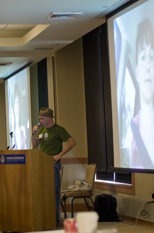
To wrap up WordCamp Mid-Atlantic, we had the opportunity to hear from the head user experience leader for WordPress, Jane Wells. The keynote was delivered over Skype… from within a moving car! The video was a little blocky, but given the circumstances it was easily forgiven. Some of Jane’s keynote was about the upcoming improvements to WordPress. But most of the talk was gossipy Gnu Public License cruft. It wasn’t that interesting to re-hash the same stuff every other blog was blabbering about a month ago.

So that was WordCamp Mid-Atlantic. A huge thanks goes out to Aaron Brazell for organizing the whole thing and all of the sponsors for making the event possible. I look forward to attending other WordCamps in the future and maybe even hosting a talk of my own.

BarCampDC 3 Recap

This past Saturday, November 14th, a hundred DC tech enthusiasts gathered at the Martin Luther King Library to create their own conference. Topics were suggested by participants and the group at large determined the schedule. It was a BarCamp at it’s best!

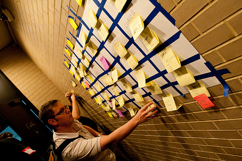
The final schedule as picked by the particpants at BarCamp DC

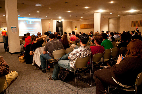
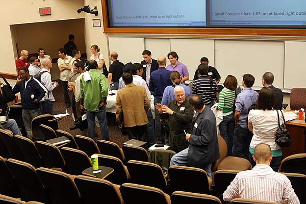
Large crowd at BarCamp DC 3

This year’s BarCamp had a few twists. The word ‘Twitter’ was banned and anyone violating that rule had to pay a dollar to the Twitter swear jar which was donated to charity. The other rule was no PowerPoint slides which was an effort to promote group discussions and participation over lectures.

I got to catch up with former co-workers from USNews as well as other DC tech-heads I met at other local events. The entire event including lunch was free of charge thanks to the generous sponsors who helped make BarCampDC possible. The pizza was quite good.

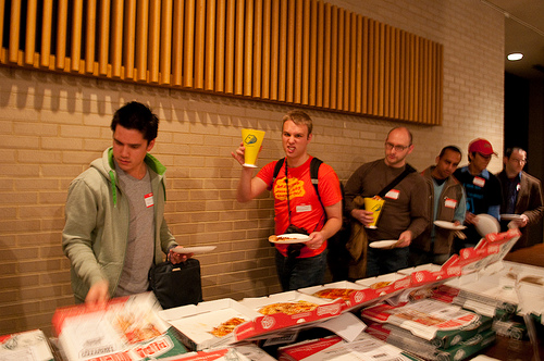
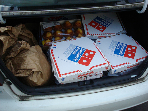
Typical techie BarCamp food: PIZZA!

Some of the talks I went to included:

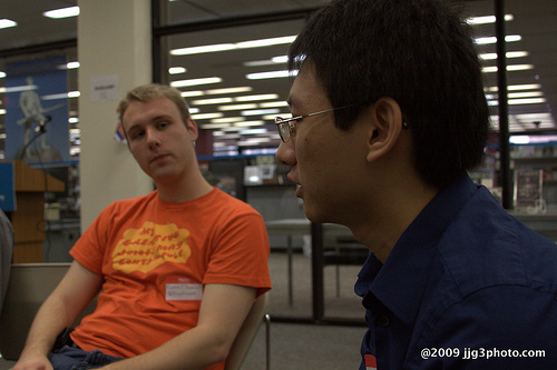
Russell Heimlich and John Chen during the How To Play Tetris talk at BarCamp DC 3.

How To Play Tetris led by John Chen. John didn’t actually think anyone was interested in his talk but we had a good-size group talking about video game politics, strategies for Tetris, and the fact that there are Tetris pros making US$100k per year in Korea. The key takeaway was being good at Tetris takes practice, practice, and more practice. And after you’ve practiced some more, you wake up one day and realize you’re good at Tetris.

An Introduction to the Android Platform Gyuri Grell and Zvi Band led an introduction to the Android mobile OS platform. The talk was a little over my head as it was mostly about Java, which I know nothing about. The source code for Meetro DC, the DC Metro app demoed, can be found on GitHub for anyone to poke around and play with. I did enjoy seeing from a high level how Android apps work and shedding some light on the magic running behind the scenes. I’m really excited to see where Android goes in the future.

The most thought-provoking talk I sat in was Generalist vs. Specialist led by Kelly Gifford. It was such an open-ended topic that spurred a healthy debate. From my point of view you are both a generalist and specialist depending on what level you are comparing to. For example, in your company you might be the only “web person”, making you a specialist but with so many different hats to wear in a sole-developer position, you have to do many different things making you a generalist. Like most anything in life, nothing is cut and dry black and white but a lot of gray areas.

Ryan McGrath is in a unique situation at his job at Webs.com.  He is in charge of Improving the Performance of the Frontend for millions of sites hosted there.  Crufty code, too much JavaScript, and a less-than-ideal backend issue are some of the problems plaguing his pursuit for excellence. An engineer from Clearspring, which distributes billions of page views of widgets all across the web,  was in the room and provided some great insight into tuning performance for large-scale sites. They talked about some geeky stuff like serving images as base64 strings instead of binary data which can yield some performance gains. I was pretty much lost after that.

The final talk of the day was about TemlarPHP, a cascading template framework built with PHP. It separates presentation from content to create websites that are easy to maintain and standards complaint with the need for a database. It was created by Shawn Brown and looked like a lighter alternative compared to the other feature-packed, and somewhat bloated, web frameworks out there.

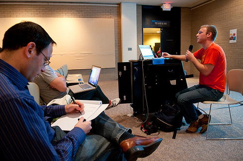
Russell Heimlich discussing frontend tips at BarCamp DC

Like the past two DC BarCamps, I gave a talk. The topic was HTML/CSS/JavaScript Tips & Tricks which I have picked up over the past few years and thought were worth sharing. I felt it was one of my best presentations as my talking points came to me naturally with code details to back up what I was saying. I was stoked to see so many people show up to hear what I had to say as well as contribute a few points of their own. Shaun Farrell managed to capture video from a part of my talk.

So as you can see there was a lot going on. There were so many other presentations I wanted to see and people I wanted to meet and chat with but there just wasn’t enough time. A big thanks goes out to the organizers (@jfc3 , @thorpus, @corbett3000, @farrelley, @patricktimony & all the others) that helped put on another great DC tech event.

Other BarCamp DC Resources

Top 5 Talks At TEDxMidAtlantic

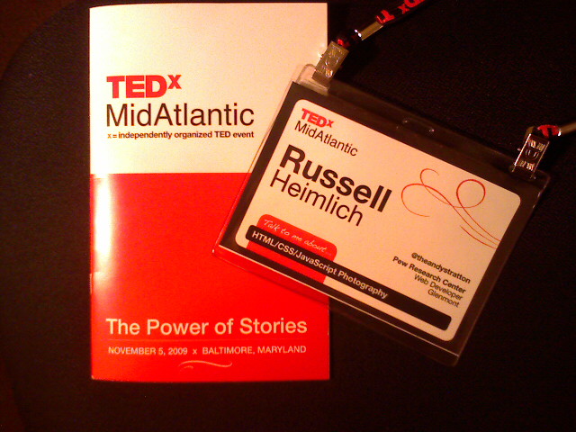
TEDxMidAtlantic Badge And Program

Today was a long but enjoyable day at TEDxMidAtlantic. It’s refreshing seeing so many different perspectives and open minds converge on a single stage at the Maryland Institute College of Art. Perhaps even more mind blowing is videos from every talk are already online for anyone to view. Here are 5 of my favorite, must-see TEDxMidAtlantic talks from today (sorry no direct links yet, you’ll have to scroll through and find their names):

  1. Will Noel – Talked about restoring a book from Archimedes and sharing it with the world under a Creative Commons license.
  2. Scott Simon – Talked about his most memorable story that he covered in Sarajevo in the 1990s.
  3. Peter Agre – Story about his career in science and winning the Nobel Prize in 2003. Very funny guy.
  4. Tony Geraci – Talked about how he transformed school lunches in Baltimore City Public Schools.
  5. Marcus Ranum – Talked about how everyone on the Internet is using TCP/IP and how upgrading the whole planet earth would be hard to do.

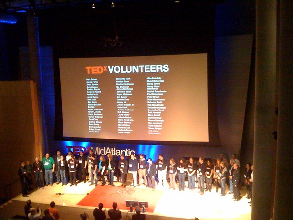
A big thanks goes out to the hundreds of volunteers who made this event even possible. Here’s a picture from @sengseng of their standing ovation.

TEDxMidAtlantic Volunteers Standing Ovation

Other coverage of TEDxMidAtlantic:

Accessibility Camp DC Recap

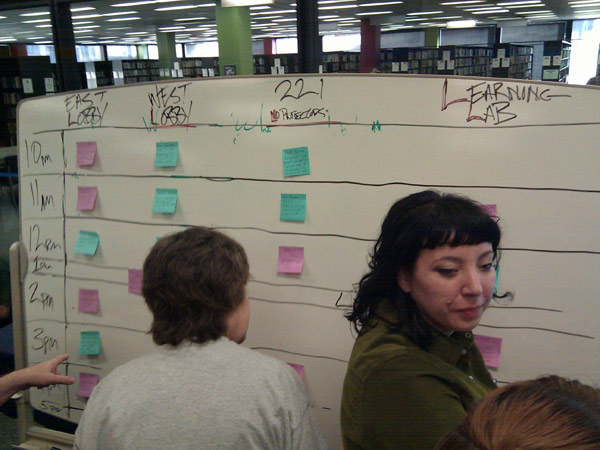
The schedule as determined by participants of Accessibility Camp DC.

Accessibility Camp really opened my eyes to how people with disabilities experience the web. The Martin Luther King Library in downtown DC was the perfect venue for this barcamp style event. The adaptive services department has all sorts of assistive technology that anyone can use and learn more about.

A braile printout using a special printer at the Martin Luther King Library in Washington, DC.

I met a lot of diverse people like Patrick Timony (Adaptive Technology Librarian at MLK library), Jennison Asuncion (IT Accessibility Consultant from Toronto), Jamal Mazrui (a visually impaired software developer) and about 100 others who were passionate about sharing what they know to make the web a better, and more accessible, place. Here are some of my take aways.

Carolyn Klinger reviews tips for making PDFs more accessible at Accessibility Camp DC

Carolyn Kelley Klinger talked about making PDFs more accessible (PDF) by structuring documents with headers (using Headline 1, Headline 2 etc. styles instead of making the text bold and bumping up the font), adding column/row headers for data tables, supplying alternative text to describe images, and making sure anyone links are within context (no “Click Here” or “Read More” links). I was surprised at how similar preparing an accessible PDF is to preparing an accessible website.

Jamal Mazrui is a blind software developer who wants to make sure accessibility isn't forgotten in emerging technology.

Jamal Mazrui wants to build web apps to benefit disabled netizens. He’s afraid that as broadband speeds increase over the next few years we will see an influx of visually oriented interfaces with no accessibility in mind. The same thing happened in the mid 90’s with the move from an entirely text based DOS operating system, to a graphical interface driven OS like Windows. Today, emerging technologies like Adobe Air, Adobe Flash, Microsoft Silverlight, Google Wave, Google Android, Second Life, and the Amazon Kindle have little to help handicapped users. Apple’s iPhone is fairly good when it comes to accessibility as evident by all the people who had one at Accessibility Camp. Hopefully the tech industry will learn from its prior mistake of ignoring the needs of handicapped users.

All of the Accessibility Camp DC participants got a hearty lunch free of charge.

For lunch everyone got as many Potbelly sandwiches as they could fit in their bellies. Thanks to the generous sponsors who made the event not only possible, but free for everyone we were able to enjoy a scrumptious meal.

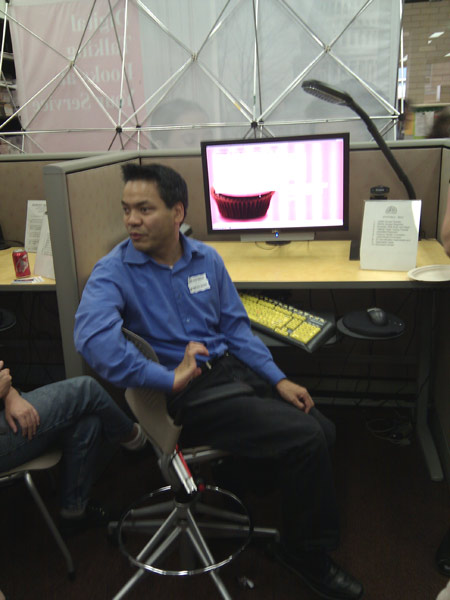
Jennison Asuncion demonstrates surfing the web with JAWS.

After lunch I got to see a live demonstration of Jennison using the screen reading application, JAWS, to navigate the web. Holy Cow! I can’t believe how different the web is when you can’t see where you’re browsing. It takes a while for a visually impaired user to get acquainted with a new website since every site has a different set of pitfalls. The source-order of your website, that is the order of your content with no styles applied, makes a huge difference to the experience of a blind user. If you’re fortunate enough to be able to user test your project, make sure to get feedback from a visually impaired person using a screen reader too.

Other events that were going on throughout the day included Practical Ways to make Your Site More Accessible, Making Mapping More Accessible, eLearning Tools, and Online Gaming for Persons with Disabilities. It seems like everyone there had something to share.

Accessibility Camp DC was the brainchild of John F. Croston, a web developer for the US Army.

A big thank you goes out to John Croston and Patrick Timony for organizing, the staff at the MLK library for providing an awesome venue, all of the sponsors who made the event even possible, and everyone who attended with something to share. This event really opened my eyes to accessibility and the web.

Other Accessibility Camp DC links:

Next up is Bar Camp DC 3 on November 14th.

DC Tech Events For Fall

The DC tech scene is just bursting at the seams with interesting (and free) tech events and un-conferences coming up this fall. I don’t know If I will be able to attend them all but here are a few that made it on to my radar.

Accessibility Camp DC Logo
Accessibility Camp DC is taking place at Martin Luther King Library on October 10, 2009. The event will cover topics and discussions about making the web more accessible.

Public Media Camp Logo
PublicMediaCamp will be at American University on October 17 and 18, 2009. The event aims to put 100 developers, 100 public media supporters, and 100 people who work for public broadcasting companies in a room and see what comes of it.

TedX MidAtlantic Logo
TEDx Midatlantic will be held on November 5, 2009, at the Maryland Institute College of Art in Baltimore, MD.  The event will feature presentations by many of the leading thinkers and doers in the MidAtlantic Region.

BarCampDC Logo
BarCamp3 is the grand daddy of all DC tech events. It will be at the Martin Luther King Library on November 14, 2009. This is always my favorite event of the year.

Bootstrap Maryland: A Conference For Entrepreneurs

Bootstrap Maryland

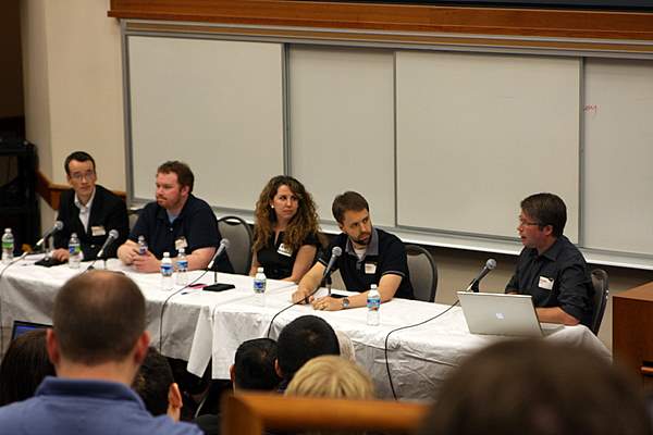
A group of technopreneurs made it out to the University of Maryland campus for Bootstrap Maryland.The aim of the conference is to teach budding entrepreneurs “the necessary tools for running a lean and successful technology business.” The event had 4 main panels covering a variety of topics from marketing and public relations to picking the right technology. I learned a lot from the anecdotes of the local entrepreneur panelists. While I ‘m more HTML than MBA, the event inspired me to keep thinking about the business angle on the projects I take on.

Panelists of the third session at Bootstrap Maryland

Panelists of the third session at Bootstrap Maryland

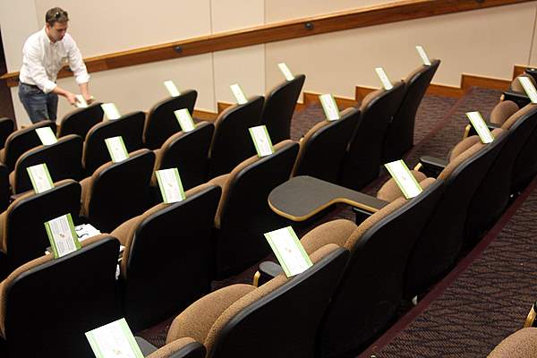
Since every seat in the business school lecture hall had a power plug and the WiFi was strong throughout the entire event, I managed to take a copious amount of notes on my wiki. Here are some of the highlights:

  • When it comes to a business plan, do you need one? Whole panel answers “Meehh… not really.”
  • Recessions are a great time to start a business because everything is cheaper and there is a ton of talent available.
  • Businesses don’t fail because of the technology, businesses fail because they don’t understand their market.
  • How to better understand your market: Experiment, Evaluate, adapt.
  • MYTH: Experience in the corporate world translates to the start-up world. The start up world is a totally different beast.
  • Want to get rich quickly? Rob a bank. Sell crack. Don’t start a company.
  • Best brand right now is “swine flu”, “susan boyle”
  • If considering outsourcing, go with a brand name firm.
  • Don’t under-estimate the value of play.
  • The MD/DC/VA area has tons of groups and events

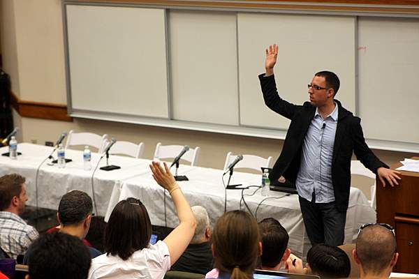
That last point is big. If you are looking for a local group of people who are interested in media/technology/business, the DC metropolitan area has something for you. After all, where else would 200 people get together to share ideas and stories about starting businesses on the cheap on a Saturday. Jared Goralnick did a great job organizing everything and I would expect the attendance to double for the next one.

Jared Goralnick polls the audience of Bootstrap MD

Jared Goralnick polls the audience of Bootstrap MD

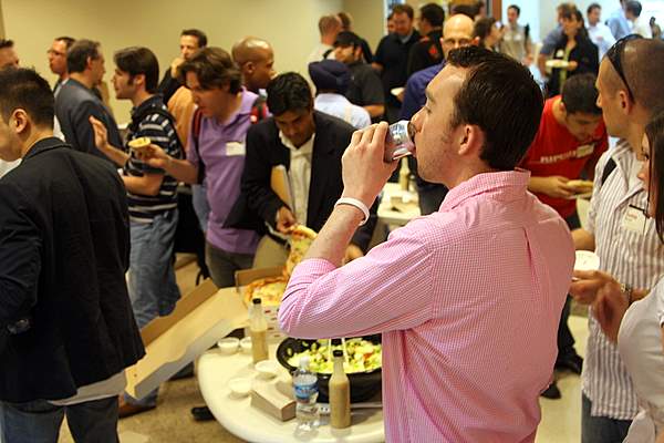
Drinking a Diet Coke with pizza and salad for lunch.

Drinking a Diet Coke with pizza and salad for lunch.

Genius Rocket (lunch sponsor) distributes fliers while everyone is out in the hallway eating pizza.

Genius Rocket (lunch sponsor) distributes fliers while everyone is out in the hallway eating pizza.

Panelists mingle with the audience after the 2nd session at Bootstrap MD

Panelists mingle with the audience after the 2nd session at Bootstrap MD

More of my photos from Bootstrap MD: Picasa / Flickr / Facebook

Other coverage of Bootstrap MD:

BarCampDC2: Bigger, Geekier, And More Food

This past weekend the second DC area BarCamp took place. Like last year’s event, a horde of local techies came out to teach one another and collaborate on new ideas.

My favorite presentation was from Jeff Brown, a high school teacher who considers himself a webucator. His talk was about how he is teaching proper, standards-compliant web development techniques at Damascus High School in Montgomery County. Here’s a picture of the back of my head (I’m in the blue shirt) taken by kenyaoa during the session.

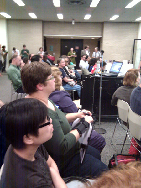
Jeff Brown is a Webucator

Another memorable event was an impromptu session about Expression Engine, a flexible CMS. I was so inspired from the small group that the next day I tried the free version out myself.

The Washington Post was there covering the event and there was a small write up in the business section this morning. They interviewed Charlie Park, a friend of mine I met at the first BarCamp, who started an online budgeting app. The reporter called the space where we were meeting a “Georgetown basement” but it was actually generously donated by the Center for Digital Imaging Arts, which is a part of Boston University.

When you get over a hundred developers together all day, they’re going to get hungry. Thankfully this Barcamp was loaded with food. A full breakfast was provided including an assortment of bagels, muffins, and coffee. Candy, nutrigrain bars, and granola bars were available for snacking on throughout the day. And for lunch, the organizers ordered 100 pizzas for everyone! I think that ended up to be half a pizza for every attendee. As you might guess there was some extra food leftover at the end of the day so the Barcamp organizers donated 40 pizzas, 60 bagels, and a heap of muffins to a local homeless shelter.

Donating Extra Pizza

The after party took place at McFadden’s and since there was extra money left over in the budget we got to blow it on free drinks and food. Our waitress did a great job of keeping the group’s glasses and bellies full.

Overall it was another great DC tech event. A big thanks to all the people who helped organize the event and deal with the logistics. Another big thanks goes to all the sponsors who made BarCamp possible. Their donations went a long way so everyone could have a great time.

Other posts from around the interwebs:

BarCamp DC 2 Is Coming


It seems like just yesterday I was telling you guys about SocialDevCamp East. But the other day I got word that the 2nd DC area BarCamp is happening on Saturday, October 18th. This time it will be at the Center for Digital Imaging Arts at Boston University in Georgetown. Why there is a Boston University in DC is beyond me. But lucky for me, the conference is right across the street from my work so I’ll be familiar with the area.

Last year’s BarCamp was the first technology conference I had ever been to and I had a great time meeting other like-minded web folks like myself. I gave a presentation about Firebug which was pretty much by the seat of my pants. This time I hope to present again except this time around I will come better prepared.

I hope to see you there on October 18th for BarCamp DC 2! More details can be found at the official website and wiki.

Location:

Center for Digital Imaging Arts at Boston University
1055 Thomas Jefferson Street NW
Washington, DC 20007