Posts tagged 'Design'

A Design A Day Everyday In 2008

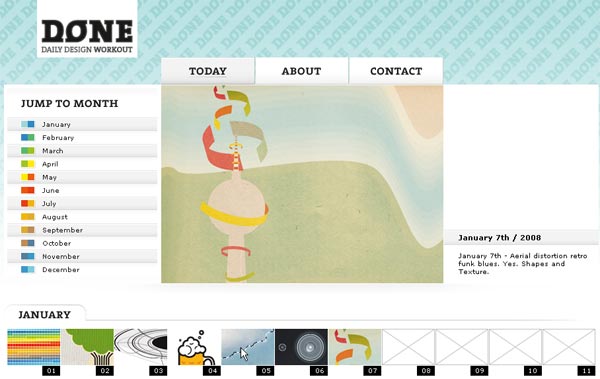
Daily Design Workout

With every New Year comes new resolutions. Jonas Buntenbruch is a designer with a pretty hefty goal for 2008. Jonas will complete and post a new design everyday for 366 days straight (remember it’s a leap year). He set a time limit of 30 – 60 minutes for each day’s design and mediums can range from “scrap and sketches to photos, typographic experiments and random creative masturbation.” It is pretty much like an online sketchbook, open for all to see and comment on. I especially like his January 5th photomanipulation pictured below.


January 5th Photomanipulation By Jonas Buntenbruch

Good luck Jonas, I hope you make it through the whole year!

Trajan Is The Default Movie Font

Font geeks really hate it when a particular typeface reaches the point of passé. Prime examples include Papyrus, Arial, Times New Roman, and the dreaded Comic Sans. Kirby Ferguson despises a font used in most of the big-time Hollywood movies, Trajan. Like Times New Roman is the default font for Microsoft Word, Trajan is the default font for movies. It never really hit me before until Kirby put a bunch of movie posters side-by-side where it became painfully obvious. Watch the video below for a better idea:

It’s bad enough that movie plot lines are lacking creativity and freshness, but does movie typography have to follow suit?

Add Hex Colors To Mac Color Picker

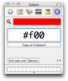
The default color picker in OS X offers a variety of ways for selecting a color. Sliders, color wheels, pallets, and even crayons are used for dialing the general hue you might have in mind. But what if you know exactly what color you want? And what if you like Hex format colors like #CCCCCC (Gray) or #FF0000 (Pure Red)? You might think Apple left you high and dry, and they totally did. But Waffle Software has you covered with their free Hex color picker plugin.

Waffle Software Hex Color Picker

Installing it is a cinch. Just copy the component to the ‘colorPickers’ folder in your ‘Library’ folder. Now when you need a specific color just enter in the appropriate 6-digit value and you’re good to go. I’m glad to have stumbled on to this little gem.

Google Releases API For Charts

Google has impressive, interactive charts incorporated into many of their products. The best place to see them in action is Google Finance where stock prices are graphed over time allowing the user to zoom in or out, stretch or expand the selected view, and other fancy interactions. The result is a rich experience for viewing and manipulating data.

Today Google unveiled the public application programming interface to interact with their chart engine. While not as rich as Google Finance charts, this public charting tool is extremely flexible in
creating line charts, scatter plots, bar graphs, Venn diagrams, and even pie charts. Charts are generated by constructing a URL with various parameters, or options, to customize a chart dynamically. Making a URL request returns a PNG image which can be saved to disk or embedded on any web page. Some examples of the charts are shown below.


Documentation for charts can be found at http://code.google.com/apis/chart/ which provides a smattering of examples.

I am very excited by this release as there are a ton of different applications these could be used in. Using some simple JavaScript, you could take these charts a step further and create animated charts using various URLS with one incrementing data parameter. Kind of like this (JavaScript code borrowed from Chip Chapin).

I would like to see a user-friendly interface built on top of the API so those who are less developer inclined can make charts and graphs easily. It wouldn’t be too hard to make a simple JavaScript program to construct the URLs. I will try to crank something out tomorrow at work, because this is simply too cool to pass up.

Making A Tango-Style Icon Step By Step

Tango Icons

I have a heap of respect for the icon designers out there. These people start with a blank page and after several hours they end with a tiny graphic that communicates a heck of a lot of information. It takes a lot of talent and clever thinking to simplify an idea or concept into an understandable graphic.

Von. R. Glitschka created a step by step walk through detailing the process he uses to design an icon. The zipped download (1.8 Mb) has a set of images from each step with related notes in a separate text file. You can learn a lot about design by studying the processes of others.

More about the Tango icon library can be found at http://tango.freedesktop.org/Tango_Desktop_Project

Survey Results About The Web Industry

The popular online web magazine, A List Apart, conducted a survey of web professionals in April 2007 via their website. This week they finally released the results in a massive, though well designed, 80+ page PDF.

Being the first major survey of the web industry, I, and many others I’m sure, was anxious to see how I stacked up. The survey focused on the core areas of classification (gender, ethnicity, location etc.), education, work and job titles, and money. There are too many findings to even begin listing here but the PDF does a great job at explaining their conclusions with many, many graphs. Speaking of data, A List Apart is giving away all of the anonymized raw data for people to dig through and reach their own conclusions.

A List Apart 2007 Web Survey

I can’t wait to see the results from the next survey to compare the changes in the industry from this year.

Steve Gibson’s E-Commerce System

Security fanatic and host of the #1 Tech Podcast (Security Now) Steve Gibson, built his own e-commerce system in assembly language. This came from a need and lack of a 3rd party product that offered the features Steve needed. What really intrigued me while listening to Steve on Security Now #109 was how accessible he made his e-commerce system.

The web was designed with a server-client model in mind. This means a server has no means for keeping state, or what information you have previously sent to it. A server spits out pages and has no means to keep track of who sent what. The classic model to solving this problem involved setting client-side cookies using JavaScript to write and read information specific to that user that can be sent back to the server. Steve is a firm believer that scripting is inheritly evil and didn’t want to rely on his potential customers having JavaScript enabled in order to complete a transaction. Instead, Steve came up with a pretty clever method of keeping track of customers as they go through the checkout process.

Steve’s system collects the basic info on the first page of the process and then sends it to the server for validation like does the provided e-mail address look like an e-mail address and is the credit card number properly entered. Steve then takes the customer to a second page where he asks to confirm their e-mail as well as gathering additional data. The trick to keeping track of the previous data entered without using cookies is the use of a hidden field which Steve fills with the previous data encrypted using a secret key on the server and then digitally signed using a cryptographic hash. The result is all of the users data that is essentially useless outside of the server which can then be sent back to Steve, decrypted, and used to fulfill the order.

Now this might sound a little fishy if it weren’t coming from Steve Gibson himself. But this is the guy who wrote the Ultra High Security Password Generator, which is guaranteed to never give the same password twice and is truly random.

I have always had this idea of creating my own e-commerce site to sell my photography and hearing Steve talk about designing and building his own e-commerce solution was really inspiring. You can listen to the 95 minute podcast or read the complete transcript over at GRC.com/securitynow.

Stripes, Stripes, And More Stripes

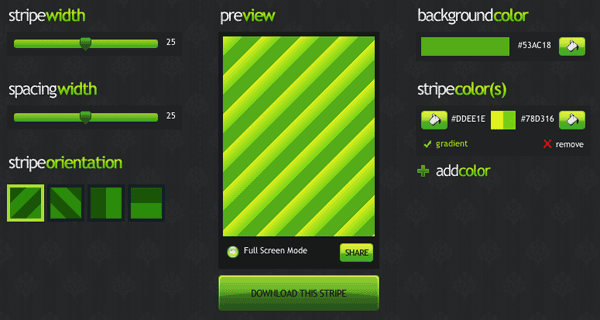
It is stripe mania over at Stripemania.com. There they have a stripe generator to help you make slick, striped backgrounds in web 2.0 or web 1.0 flavors.

Stripemania Screenshot

Need some stripe inspiration? Check out Stripe.licious, Stripe Mania’s collection of user created stripes in all types of colors and widths. Whichever method you chose to get your stripe, you can download it in either a transparent background or regular gif. The images come ready to be tiled as a seamless background for your next web or graphics project.

Pretty self explanatory but very well executed.

Behind The Scenes Of An E-Commercer Start-Up

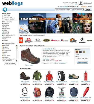
Setting up an e-business is a heck of a lot easier than a traditional brick and mortar store. Customers are now accustomed to buying things online and the online world requires much less capital, and therefore much less risk, to get started. Online web magazine Vitamin had a feature story about following a small outdoor clothing startup as it tweaked it’s store front in hopes of converting more visitors into sales.

The beauty of online stores is they can offer a wide range of products that are easy to search for and compare. Offering as many options to sort through the potential offerings is just as vital as the amount of goods you have available. The online start up found it was imperative to offer navigation by brand as customers were drawn more to brand names than categories of goods. They also started out with a design that focused too much on up selling instead of displaying the available merchandise.


Webtogs Online Store Front

If you’re planning to set-up your own little online shop, this article will give you insight into some of the pitfalls that could arise while developing your online store front.

Inspiration: Srown Design Group

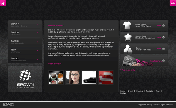
Srown.com Screenshot

Srown.com is the home of the stylish Srown Design Group. If you are a design group you most certainly have to look good and the team has pulled it off with this slick black and pink website. I like how the background draws the attention to the middle of the page where all of the content is as well as use of the upper corners for the most important navigation: Home and Contact. Srown has even used a bit of pizazz by fading up new content after you click a link.

Looks aside though, and this site has two big problems. For one, the site doesn’t use separate web pages for each section, instead everything is loaded up front and using JavaScript, Srown replaces the middle container with the content. This is bad design as it prevents linking to specific content. There are ways to incorporate a bookmarkable history of pages using JavaScript like the jQuery history plugin. Also, users with scripting disabled will be limited to the first screen of content since the navigation relies entirely on JavaScript.

Ultimately Srown used the wrong technology for the job. Instead, the team should have used Flash which would be more flexible in developing visual effects. There is also a higher chance of a user having Flash installed compared to having JavaScript enabled since the Adobe plugin is installed in 99% of computers worldwide. Instead, Srown settled for the middle of usability (and the middle is the worst) without taking advantage of the extra benefits Flash had to offer.

As you can see a site can be visually stellar but utter crap in usability. Before ever starting a project it is important to sit down and think things through from a technical stand point to see what different technologies have to offer. So while Srown looks awesome it suffers in usability which brings up the important point that substance beats style out any day.