Twitter Launches Blocks… And I Am Confused
Twitter has been pumping out new features these past couple of weeks. Their latest, which just launched this evening, is Blocks.
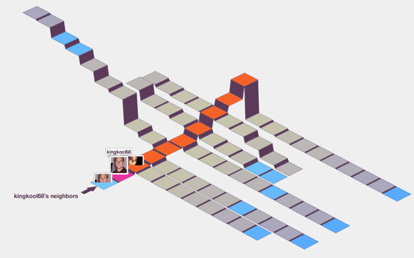
This is what it looks like and so far all I can figure out is blue squares are you, orange are your friends, and gray are um.. gray. You can click on squares to see the tweets of others. What is the point? Beats me.
Twitter Blocks was created by Stamen Design, the same folks who brought us those neat Digg visualizations.
Twitter also launched something a little more useful. Have you ever wanted to see a list of all the third party twitter apps in existence all in one spot? Then check out the Twitter Fan Wiki which categorizes apps into distinct categories for your exploration. I guess that is why they launched everything mentioned in this post at http://explore.twitter.com


[…] jenseits von just another eyecandy wird mir nicht ganz klar (aber da bin ich anscheinend nicht der einzige). Mitgründer Biz Stones Erklärung dazu: »It’s a crazy, interactive, animated 3D […]
Oh these silly toys, where will it end? Yeah, it is a bit confusing.
[…] this is anything other than an interesting folly.†Tom Coates “What is the point? Beats me.†Russel Heimlich “I have to say I was absolutely gobsmacked by how utterly pointless it is.†[…]
[…] aesthetic, but was largely panned for its utility. Popular web personalities like Dave Winer and Russell Heimlich were quick to brand the application as useless or pointless. On the other hand, I thought Twitter […]
[…] aesthetic, but was largely panned for its utility. Popular web personalities like Dave Winer and Russell Heimlich were quick to brand the application as useless or pointless. On the other hand, I thought Twitter […]