Unmatched Style’s CSS Off Was Slimey Fun
UnmatchedStyle.com hosted a CSS competition for front-end devs to strut their stuff among their peers. Everyone got the same design and it was up the entrant to come up with the most efficient, pixel-perfect, bleeding-edge, fully functioning interpretation. The deceptively simple looking design was lovingly crafted by the rowdy folks of Paravel and sent out two weeks ago. Entries were due at 5pm today. Here’s the low down on my submission.
First, you should probably play around with my finished design and compare it with the static mockup (linked above). Go check it out… I’ll wait. Did you drag the corner of the browser to check how it responds to different browser sizes? Of course you did you CSS nerd.
- Somehow I messed up the colors of the design. My layout has really bright colors while the original design uses more muted colors. I have no idea how this happened.
- The logo is a background image attached to the element of the section. I was inspired by html5forwebdesigners.com.
- I forgot to add the blue faded slime splat in the header. I kind of screwed myself by using the <head> and <header> elements in the same section though I could have attached it to the <HTML> element. Oh well.
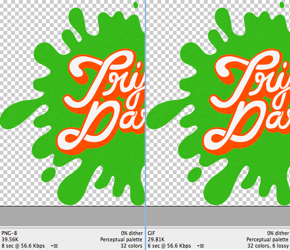
- Instead of PNGs I used GIFs in some places due to the smaller file size (thanks to increasing the Lossy section in Photoshop’s Save For Web dialog)

- Navigation links are at the bottom of the page with position:fixed (sticks to the top of the viewport) set for larger screens and an anchor link to the bottom of the page for smaller screens.
- The obstacles section is built with two sprites using the same background-position offsets. I wanted to just use one sprite for the larger images and use background-size to scale them down for the thumbnails. Performance took a big hit so I simplified.
- The larger obstacle images are within a
element with overflow:hidden applied. The thumbnails link to the IDs of the larger version so no JavaScript is required to show/hide them. - The labels for the prizes that appear on hover are pulled from the title attribute of the link dynamically using CSS.
- The form uses required and pattern attributes for validation without any JavaScript. If I had more time I would add a validation script as a fallback.
- When the countdown reaches zero I “slime” the user using a number of slime splat images already loaded in the design.
- The two addresses to the studios are marked up with a vCard microformat so machines can easily parse that information.
- I did not use the <address> element for the studio addresses because that is not what it is for.
- The custom <select> drop down styles are images with the invisible <select>’s laid overtop. They’re not useable for sighted keyboard users. This is probably my least favorite part of my design.
- I focused much of my time on making the design accessible and didn’t even bother checking what it looks like in browsers outside of Firefox 7, Chrome 15, and Safari 5 (all Mac versions). I just didn’t have enough time.
- This layout is sluggish on my Nexus One most likely due to the way I added the semi-transparent grainy texture.
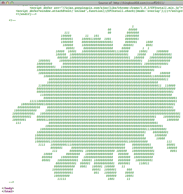
- I added some ASCII art as an HTML comment at the bottom of the page. I like adding little easter eggs like that.

- Finding the right element to make a favicon image from was tricky. I settled on the KN from the Knucklelodeon logo because it looked the best at 16×16.
- You can pin the site to your desktop if you’re using IE9 and Windows 7 since I added a fewelements. Of course I forgot to add the more basic description, keyword and other general elements.
- Selecting text uses the same colors as the hove styles, yellow background with reddish-orange text and no text shadow.
- My custom JavaScript code is in a single block at the bottom of the page and not in a separate file. Since it is a single-page site, there is no benefit to externally linking it.
This was also my first responsive design. I started out making the large 1024px version first and then going back to make smaller versions. Big mistake. It’s a lot easier to start with mobile first and then build your design up, larger and larger. Media queries are also a pain in the butt since it requires a ton of going back and forth from the top of the stylesheet to the bottom where the media query styles were. When I changed styles for one target size, I had to double-check that those changes didn’t (or did) cascade into the larger sizes. This also resulted in a lot of duplicate selectors. What would be ideal is to set-up different classes on the HTML element with a class for different resolutions. This would be similar to how we handle conditional styles for Internet Explorer. This way we could group similar styles in the same area which makes it easier to keep track of changes.
Sites I Referenced
- Custom styling of select boxes
- Handy CSS Sprite Generator
- Converting kerning to letter-spacing
- background-sizing CSS property
- Support background properties among browsers
- HTML5 Placeholder
- Using pseudo elements to add texture
- HTML5 Boiler Plate
- Responsive Design Testing
- HTML5 Form Validation
- HTML5 Patterns for Validation
- CSS3 Content from Attributes
- HTML5 For Web Designers
- The <address> element
- Everything You Wanted To Know About Touch Icons
- Photo2Text.com for Generating ASCII Art
Other Noteworthy Entries
So what do people do once the contest comes to an end? Share their work on Twitter for others to comment on of course! Here are some of the other entries I found searching Twitter for #cssoff.
- The Triple Dare logo follows your mouse @timhetter
- Slick color picker for Select Team Color @spacedawwwg
- Creative way for showing the Obstacles section at different browser resolutions @mbmufffin
- Vertical parallax effect that breaks on my 27 inch iMac @brandonewoldt
- Interesting Signup Form Animation @leonuh
- Awesome sliming at the end of the countdown @loganfranken
- Lots of different animations @strTRK
Finally if you want to show off your entry, @daljo628 is hosting them at http://knucklelodeon.com/ Ping him to have yours added.
Phew! I’m glad I’m not in the judge’s shoes now. Having to go through all the entries and ultimately pick a winner; That’s a tough call.
Update: The top 25 entries have been announced!


Hi Russel,
great work, but I think the element is correct as it is “… to mark-up the contact details for the document (or document section) maintainer … ” and the Studio is the maintainer of this site.
Additionally your vcards do not validate: http://hcard.geekhood.net/?url.....%2F#result
Greetings,
Robert
That’s fuzzy though. I wish the element was for marking up anything that would be considered an address. It would make things so much easier.
And thanks for calling out my invalid microformat. I realized my mistake after seeing other people’s submissions once the deadline passed. Cheers.