First Impressions Of Wii Sports Resort

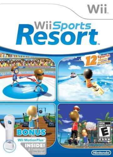
Wii-Sports-Resort-box-art

My roommate, Josh, picked up a copy of Wii Sports Resort today and he let me take the first crack at it. Here are my first impressions.

Swordplay

  • Duel – Swing your sword at your opponent and try to knock him off a tall platform American Gladiators style. Pretty fun but too easy. I made it to the Pro status in about 30minutes.
  • Speed Slice – Be the fastest to slice objects in a certain direction. I really liked this mini-game. Requires a lot of focus and quick reactions.

Wakeboarding – Try to get big air while being dragged behind a boat. I haven’t figured out how to tweak the tricks but it’s dull.

Frisbee

  • Frisbee Dog – Throw a Frisbee at a target for points similiar to darts and your dog fetches the Frisbee for you. The controls are really hard to get the hang of. Totally doesn’t feel like throwing a Frisbee.

Archery – Shoot arrows at a bulls eye. The controls feel just like pulling back on a bow using the nun-chuck. Easy to pick up but difficult to master.

Basketball

  • 3-Point Contest – Take 3-point shots from various places on the court. The controls are a bit awkward as you have to reach down to grip the ball (holding the B button) then you have to do a tricep extension behind your head to simulate a shot while releasing the B button at the right time. My arm started to ache after the first round.

Table Tennis

  • Match – Just like table tennis from the original Wii Sports except you can add spin. It’s not as easy as regular tennis.

Golf – Much expanded from the previous version with 3 new courses, 3 classic courses and an option for 3, 9, or 18 holes. Josh is super excited for golf.

Bowling

  • Standard Game – Exact same thing as bowling from original Wii Sports.

Power Cruising (Jet Skiing)

  • Slalom Course – The controls are just like riding a bike and are very responsive. The mini-game itself was ok. There’s not much more to it.

Canoeing

  • Speed Challenge – Paddle around the course as fast as you can. The controls are just like paddling a canoe where you have to keep switching sides in order to go straight. Technically it’s a kayak, not a canoe.

Cycling

  • Road Race – Try to finish first place in a bike race around WuHu island with different types of terrain. It’s just like the Tour de France. You have to manage your stamina as you can quickly run out of breath from sprinting too much. The controls are just like running in other Wii games. You also have to steer but it’s as simple as leaning left or right while pumping your arms up and down to make you pedal. I can see this mini-game being the most challenging of the bunch.

Air Sports

  • Skydiving – As you’re free falling you have to grab on to other Mii’s and rotate your body so a picture can be taken of you smiling. Points are rewarded for the number of smiles captured on film. At the end you make a formation and have to maneuver through rings. This was fun once but then quickly got boring.
  • Island Flyover – You fly around in an airplane trying to fly through information icons. The format of the mini-game is like a treasure hunt. This concept was a lot of fun. Nintendo should make an entire flight game just like this. It was neat being able to zip around above the island doing barrel roles, and loops for 5-minutes. It’s totally free-form and crashing is kid friendly where the plane bounces. Watching this on a big screen can really make you nauseous.

Note: Some sports have other variations that I haven’t unlocked yet, so I left them out of this review.

Conclusion
If you were a big fan of the original Wii Sports game, then this will be a no-brainer for you. The new games are fun and most look challenging, especially for parties.

My biggest frustration was the 3 minute video Nintendo forced you to watch the first time you played Wii Sports Resort. It was akin to an airplane safety video but instead of talking about features of an airplane designed to save your life, the Nintendo video went into excruciating detail on how to attach the MotionPlus attachment to your Wiimote. Hint: It snaps right into the bottom just like the nun-chuck.

The game is $44.95 on Amazon.com and available now.

Scaredy Cat

0_IMAGE_652.jpeg

Whenever it is storming out, Puck scurries into our bedroom for a place to hide. I guess the green plastic pig wearing a rabbit costume keeps him company.

The New Car Conundrum: What Should I Get?

Russell's 1994 Mercury Villager

My 1994 Mercury Villager mini-van has served me well over the years but it has to go according to the U.S. Government. Since it gets a measly 17 combined miles per gallon according to fueleconomy.gov, my van is a certified clunker and eligible for the Cash for Clunkers program. This means I can get $3,500 off a new car purchase that gets at least 4 more miles per gallon or a $4,500 discount for a car that gets at least 10 more miles per gallon. That’s a sweet deal considering the Kelley Blue Book trade-in value is at most $1,550.

The thing is I don’t really need a new car. I get to work using public transportation leaving the van only for small errands. Once a year we will take it on a road trip to Ocean City but that’s about the extent of my driving. I fill it up maybe once a month and according to FuelFrog (my review) I’m getting about 22 miles per gallon.

FuelFrog Miles per Gallon for my 1994 Mercury Villager

Because it has 130,000 miles on it, the tune-ups can be a bit costly about every other year. I have started noticing a high-pitched squeal whenever the accelerator is depressed and one of these days it will die.

With this opportunity I decided to do a bit of research on Yahoo! Autos. I found 21 cars that fit my criteria including the 2010 Honda Insight, 2009 Honda Fit, and 2009 Honda Civic hybrid which all caught my eye. Kristina doesn’t like any of these because she already has a small sedan and strategically it would make sense to get another type of vehicle. I can agree with that, but bigger cars are more expensive.

Three Honda cars to replace my van.

There is also the option of brokering a deal with my dad for his Toyota Rav-4 with 100,000 miles on it in exchange for a car with the discount. He was the one who bought the van 15 years ago and paid it off before handing it over to me but such a deal sounds complicated.

I just feel a little weird about getting a new car and then having it sit at home for most of its early life. So this is where I seek advice from the wisdom of the interwebz. What should I do?

On the plus side an auto loan would help me build my credit score for when we eventually buy a house 🙂

Downpour At Glenmont

0_IMAGE_650.jpeg

It’s been raining on and off all day, downpuring at times, here in the DC area.

Perhaps The Greatest T-Shirt Ever Made

Threadless.com, the user submitted/public chosen t-shirt store, is my favorite source for shirts. I’ve built up quite a collection over the years; 19 to be exact. But this shirt tops them all…


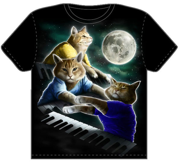
Three Keyboard Cat Moon T-shirt from Threadless.com

Now if you’re not up to date with the latest Internet meme’s you might be a bit perplexed right about now. Allow me to explain. This shirt is a combination of two viral Internet sensations.

The first is a YouTube video of a cat playing the electronic keyboard dubbed “Keyboard Cat

The video has nearly two-million views and has become even more popular by people splicing it to the end of blooper clips as if to “play” that person offstage after a goof or follie. These have become known as Play Him Off, Keyboard Cat videos and PlayHimOffKeyboardCat.com has the best collection of all of them.

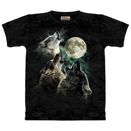
The second meme in this shirt is from the Three Wolf Moon t-shirt

Three Wolf Moon T-shirt

The shirt became popular for it’s sarcastic reviews promoting the great things that have happened to the people who bought the shirt. Hundres of comments were posted like this one, making the shirt an Amazon best seller

“I admit it, I’m a ladies’ man. And when you put this shirt on a ladies’ man, it’s like giving an AK-47 to a ninja.”
– T. Huynh “photo bum”, Amazon reviewer

The shirt managed to get over 9,000 diggs and a dedicated song thanks to CollegeHumor.com.

So now you can see how that is one of the best t-shirts ever made. But this shirt also made history of it’s own by being the fastest trending t-shirt in Threadless.com’s 9 years of operation.

“This design was submitted, and before we even noticed we saw it start to trend on Reddit. We put it up for scoring and it started gathering up 5’s faster than we could ever imagine. Over just one weekend Three Keyboard Cat Moon accumulated more scores than any other design in 9 years of Threadless history and the highest average score to boot. We listened and put it up for sale immediately. This is the first time we’ve actually ended scoring early in favor of printing the design.”
– Jake Nickell, Threadless founder

The shirt is $20 and I just ordered mine using a gift certificate from a former colleague. Don’t be surprised if they sell out faster than the keyboard cat can play you off. Satirical irony FTW!

Pure CSS Shapes: Triangles, Delicious Logo, and Hearts

After reading through Smashing Magazine’s latest article, 50 New CSS Techniques For Your Next Web Design, I came across an article glossing over a technique for creating a triangle using pure CSS. A triangle using just CSS? That blew my mind! How is that even possible?

After playing around with the sample CSS I started to get it. Using an empty HTML element and the border properties, you can make all kinds of shapes. Here is how it works.

Note: As expected, Internet Explorer acts a bit wonky especially IE6. These experiments were done in Firefox 3.5 but you can see what they should look like in a screenshot I took.

Per the box model, the border outlines the perimeter of an element. When an element has a width and height of 0px the border-width’s make up the dimensions of the element.The corners of borders meet at a 45° angle which is apparent with larger border widths and what makes pure CSS shapes possible. The final CSS to make a 200 pixel tall red triangle pointing up looks like this:

But let’s see how we got to this conclusion step by step starting with a basic square and borders. Each border will be given a different color so we can tell them apart.

.triangle {
border-color: yellow blue red green;
border-style: solid;
border-width: 200px 200px 200px 200px;
height: 0px;
width: 0px;
}

We won’t need the top border so we can set its width to 0px. This makes our triangle easy to measure without any extra space on top; a border-bottom value of 200px will result in a triangle that is 200px tall.

.triangle {
border-color: yellow blue red green;
border-style: solid;
border-width: 0px 200px 200px 200px;
height: 0px;
width: 0px;
}

To hide the two side triangles we set the border-color to transparent. If we set the border-left and border-right widths to 0px then the whole shape would collapse, leaving us with nothing. Since the top-border has been effectively deleted, we can set the border-top-color to transparent as well.

 .triangle {
border-color: transparent transparent red transparent;
border-style: solid;
border-width: 0px 200px 200px 200px;
height: 0px;
width: 0px;
}

There you have it; a triangle using only a single, empty HTML element and some CSS. The same technique can be applied to the other three sides for different orientations. Where might this come in handy? A JavaScript toggle to indicate a container is visible comes to mind. And using a pure CSS triangle is a lot more convenient than coming up with new images for each variation.

Try playing around with different widths to create different kinds of triangles. You can also get some funky effects by changing the border-style; dotted produces a neat effect on our regular bordered square.

.funkyShape {
border-color: yellow blue red green;
border-style: dotted;
border-width: 200px 200px 200px 200px;
height: 0px;
width: 0px;
}

I even managed to come up with the del.icio.us logo.

.delicious {
border-color:#FFFFFF #3274D0 #D3D2D2 #000000;
border-style:dashed;
border-width:150px;
height:0;
width:0;
}

And a heart shape.

.heart {
border-color:red;
border-style:dotted;
border-width:0 150px 150px 0;
height:0;
margin-left:90px;
margin-top:90px;
width:0;
}

I wasn’t the first one to explore CSS shapes, it turns out Tantek Çelik was playing around with these ideas way back in 2001.

This Could Be A Bad Idea

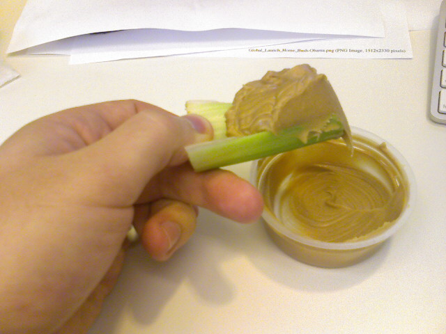
0_IMAGE_648.jpeg

I clearly suck at rationg celery to peanut butter. UPDATE: I was wrong, that was actually a good idea.

Review Of Sony MDR-V6 Headphones

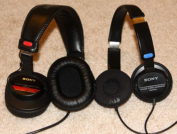
Sony MDR-V6 and Sony MDR7502 headphones side by side.

I’ve been using Sony MDR7502 Headphones (right in the image above) for the past six years. They came with my supply kit that I received before my first year at the Art Institute of Philadelphia. For the last two and a half years I have put 2 hours of a day, 5 days a week of use into them as they were an integral part of my commute. The pads started deteriorating and the end of the cable started to fray. But what pushed me to buy a new pair of cans was my new job.

When I was at U.S.News & World Report I had my own office so I could listen to music through speakers. My new job at the Pew Research Center has me in a cubicle, so headphones are a necessity.

My old headphones sit right on top of my ears so after about 2 hours of use, my ears begin to throb. The Sony MDR-V6 appealed to me because they fit over the ear which should be more comfortable to wear for longer periods of time.

Sony MDR-V6 headphones fit over the ear for added comfort.

And the $75 price tag is a bargain considering I would need to wear these for eight hours every work day. I’ve been using them for the past week and here are some take-aways:

  • The bigger cups are a lot more comfortable than headphones that sit right on the ear. They also block out more noise which is a big plus while riding the Metro.
  • My old headphones sound a bit better with a fuller, deeper sound especially for speech like podcasts. To be fair the MDR-V6’s still need a couple hundred more hours to break in properly.
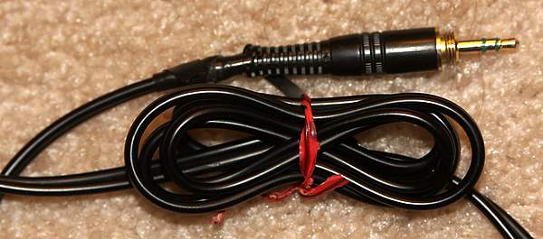
  • The coiled-cord of the MDR-V6’s is a heck of a lot easier to manage than the straight cable of the MDR7502’s. Straight cables tend to get twisted easily. Both headphones have super long cords that can catch on things when walking around. I would tie up the straight cable into a figure 8 with a twisty tie to take up some of the slack. Sony MDR7502 connector and coiled cable
    The coiled cord can be gathered up in my pocket with my Zune without a problem.
  • The plug of the MDR7502 headphones is connected to the cable with a plastic webbing. When the webbing breaks, the connection can loosen which requires a bit of fiddling with to keep the connection sounding good. The MDR-V6 fixes that problem (hopefully) with a flexible, rubber tube at the base of the connector.
  • The MDR-V6’s fold up for easy storage. It doesn’t take much effort to make the headphones collapse and as a result I found them configured in weird positions when carrying them in my backpack. It’s a little annoying to have to untwist and unfold everything before you can use them. Sony MDR-V6 collapsed
  • More comfortable headphones come at the price of fashion. The MDR-V6 headphones are a bit bulky which is a fair trade-off for the superior comfort and build quality. If looking like a DJ on your morning commute isn’t your thing, then studio headphones in general aren’t for you.

Overall I am very happy with my bigger, sturdier headphones. Even though they don’t sound as good as my Sony MDR7502’s they still sound better than most any other headphones out there. I didn’t buy these with sound quality being the number one deciding factor; I bought them for comfort. There are probably much better sounding headphones that cost a heck of a lot more money. The Sony MDR-V6 headphones are great for my everyday listening needs at work and on my commute.

Sony MDR-V6 ear cup

Other Reviews of Sony MDR-V6 headphones:

Roasted Pig Head

0_IMAGE_647.jpeg

The pigs head is all that’s left from the feast at this Guamanian party that Kristina and I have been at all day. We’re watching traditional Haiwaiian performances as this event winds down.

Astronaut In Bathroom

astronaut-in-bathroom-by-Scott-Listfield

Painting by Scott Listfield who owns the awesome domain astronautdinosaur.com.

(via BOOOOOOOM)