Posts tagged 'Design'

Tinman Threadless Vs. Tinman Shirt.Woot!

I’m a fan of funny t-shirts which is why I obsessivly follow Threadless.com and Shirts.Woot.com . Just a few moments ago, Threadless announced their new shirts for this week and the one titled I [X] Tinman (1st picture) is similar to 404 Heart Not Found (2nd picture) on Shirts.Woot.com from 2008. I already own the 404 Heart Not Found shirt, now I just need to buy the Threadless one!

Yahoo Borrows Microsoft’s Blade Interface

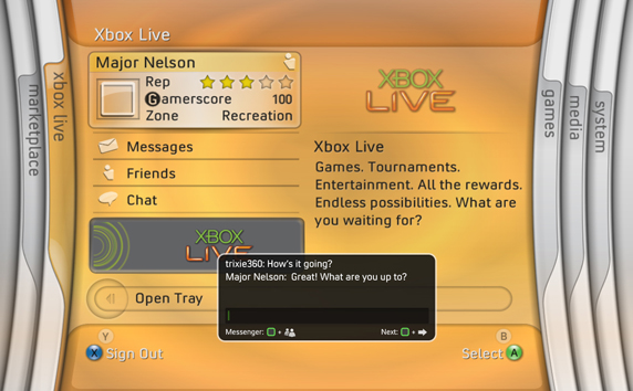
Yahoo is toying with the idea of adding a “blade” (or more commonly known as a horizontal accordion) interface to some of it’s search results. The blade interface’s claim to fame was its use in the original Xbox 360 dashboard (2005-2008).  I’m not confident this feature will last very long. Microsoft moved away from it with subsequent dashboard updates for the Xbox 360. Maybe Yahoo will have better luck.

Journalism In The Age Of Data

As data is becoming a medium itself, journalists need to figure out how to tell a story with overwhelming data. This 50 minute documentary explores data visualization as a storytelling medium.

The full version with annotations and links is available at datajournalism.stanford.edu.

Dark Design Patterns

Those same design patterns that designers use to make things easy for visitors can be flipped around to trick visitors resulting in profits for the companies that employ them. Harry Brignull goes over some of these “Dark Patterns” in his talk at UX Brighton 2010. He also runs the site darkpatterns.org to catalog various common types of Dark Pattern, and to name and shame organizations that use them.

See https://www.slideshare.net/harrybr/ux-brighton-dark-patterns?next_slideshow=true

(via Engadget)

MapQuest Gets A Fresh Coat Of Paint

Remember when MapQuest was the online map site? Then Google came along and rained on their parade in 2005 with their dynamic-loading AJAX secret sauce which enabled you to infinitely pan around the map. Ever since then, MapQuest has been dead to me – until now.

The AOL-owned site unveiled their new look today and it is a complete revamp. Their logo took a turn from a comic typeface to a more serious, sans-serif one. Reddish-marroon, out! Green and purple, in! The new branding will certainly take some time but there is more to this re-launch than a new log0.

MapQuest has made their maps look more like paper maps. Well what do I mean by that? The color choices by the MapQuest team are really spot on. You might not really think about it, but the distinct colors used by MapQuest make their maps easier to read. Major interstate highways are blue, secondary highways are an orange color, and streets are yellow. This visual hierarchy of most important roads to least important helps focus your attention as your looking around. Compare this to Google Maps where the colors are so similiar that the roads kind of blend together.

The label style on Google Maps is a bit easier to read than MapQuest as I think Google Maps is better for locating city names and MapQuest is geared more towards a visual search of a map. For a more in-depth analysis about map design, see A Brief Comparison of Google Maps, Bing Maps, & Yahoo! Maps by 41Latitude.
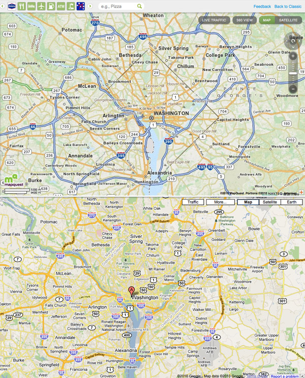
The new MapQuest layout is akin to Google Maps with two-thirds of the screen dedicated to the map and the left third of the page for search and directions. Along the top of the map is a carousel navigation featuring groupings of locations like grocery stores, bars, and gas stations. It’s a well done interface for finding nearby attractions on the map.

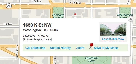
Most people stick with MapQuest because they trust their directions over others. After a couple of test searches, I prefer the directions from Google better. But MapQuest is more enjoyable to just browse around. One feature MapQuest did really well is right clicking anywhere on the map will bring up the address of that location. Sure the address is an approximation, but the map bubble that pops up gives the house number, street, city, and zip. Sometimes there is even a 360 degree view just like Google’s Street view. MapQuest’s street view feature is more basic but I find it more intuitive to pan around. It doesn’t take up the whole screen and its easy to just pop in, pop out and continue on your way.
Will I’ll drop Google Maps and make MapQuest my dedicated online mapping service? Probably not. Google Maps has too many extra features for a power user like me (auto complete, public transportation, scroll wheel to zoom in/out). But for those people that feel Google Maps is too complicated and  hard to use MapQuest provides a clean, easy to use mapping site that is geared for people like them. I would easily recommend MapQuest to an average computer user while Google is for people who want more features.

The more competition the better for all of us. MapQuest has certainly stepped up it’s game and I can’t wait to see what else they have in store.

5 Links Of Interestingness

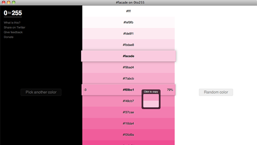
http://0to255.com/ – “0to255 cures your color manipulation woes. Simply pick the color that you want to start with and 0to255 gives you a range of colors from black to white using an interval optimized for web design. Then, just click the variation you want to use and the hex code is automatically copied to your clipboard.” My favorite part is that it uses a RESTful API so you can do things like http://0to255.com/0099ff You know I just love things that you can manipulate with a url.

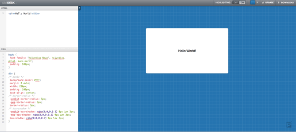
http://cssdesk.com/ – A tool for quickly mocking up snippets of HTML/CSS. I would prefer to just create a new HTML file in Dreamweaver and play with it using Firebug, but this could work too. I found the cursor in the HTML/CSS box to be a little off when hitting return. CSSdesk has a nice interface which is almost like a desktop application. And since you can download it and run it locally, I guess it qualifies as a genuine application.


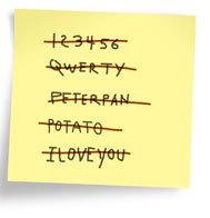
Please Do Not Change Your Password – Alot of security’s best practices cause more problems than they solve. “At countless conferences and seminars, experts have consistently called for more education and outreach as the answer to user apathy or ignorance. But the research of Herley and others is causing many to realize most of the blame for noncompliance rests not with users, but with the experts themselves — the pros aren’t able to make a strong case for all their recommendations.”

Holistic Web Browsing: Trends Of The Future – “The future of the Web is not at your desk. It’s not necessarily in your pocket, either. It’s everywhere.” How do we design for a Web that was only intended to be used in a single context?

WTF? (Video) – “This clip comes from Hard Ticket to Hawaii, possibly the worst 1980’s movie made (though to be fair, it’s tagline of Bombs, Babes, and Beaches is quite… radical).” At first I thought the acting was WTF, then I saw the ending.

“How many SEO copywriters does it take to change a lightbulb, light bulb, light, bulb, lamp, bulbs, flowers, flour…?” — Chris Rowe

Digg Bing Logo Mashup

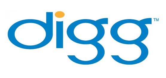
typophile.com had a type battle for members to design a new logotype for digg.User aluminum posted this fine Bing version of the digg logo.

It’s a clever idea since both brands are 4 letters and the second letter is an “i”.

(via dburka, the creator of the digg logo)

A Selection Of Free Fonts

I’ve been thinking about redoing my personal brand with a new site design, a new logo, and a whole new Russell Heimlich. Design isn’t exactly my strong suit, or maybe your hardest client is yourself, but this could be a long process. So my first step is to do lots and lots of research including perusing some fonts. Below are some of the more interesting ones I’ve found.

3dumb font russell heimlich

3Dumb & 2Dumb – A hand-drawn 2d and 3d block letter san-serif font. It kinda reminds me of the movie Juno.

lefty dave font russell heimlich

Lefty Dave – Another hand-drawn font but this one looks just like the writing from a lefty which, as a southpaw myself, attracted me to it.

zitti font russell heimlich

Zitti – A rounded font with no counters (the empty space in R’s, D’s, and O’s).

jabjai font russell heimlich

Jabjai – Another cartoony, 3D block letter font. Only uppercase letters available.

val font

Val – A big fluffy-like-a-cloud font.

None of these really say me, but I thought they were interesting and worth sharing. I hope to make another update about my personal redesign after this weekend  when I work on this some more.

AOL Goes MTV With Latest Rebranding

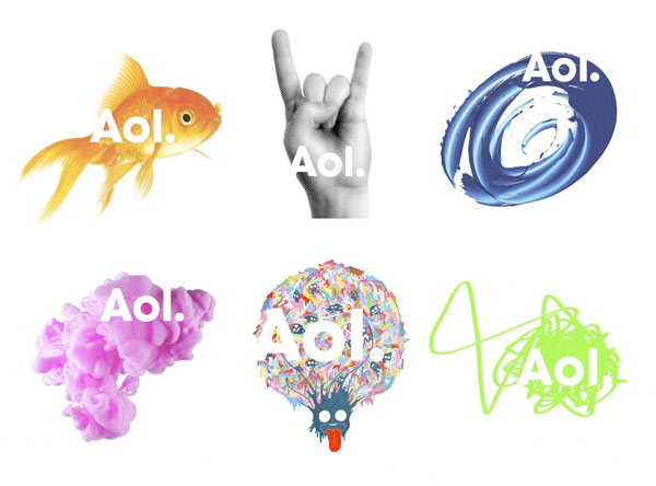
Aol rebranding logos

AOL offered a glimpse into their re-branding today and most of the web was left dazed and confused (55% of the respondents to a RedWriteWeb poll hated it). AOL simply decapitalized the “O” and the “L” and added a dot at the end. While the logo itself will stay the same, the background will change continuously foregoing a traditional mark.

It’s certainly an off-kilter strategy but a good fit for a company trying to reinvent itself. I’m a fan of the new look.

The dot part wasn’t really explained well in the media coverage. Aol. plans to brand their various properties like Aol.Shopping and Aol.Mapquest. It’s meant to tie all of Aol.’s vast content together.

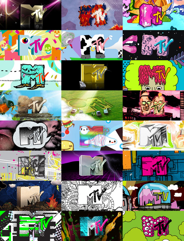
As for the random background images, I think it is fun and keeps things interesting. Bing is doing the same thing with their background images on the main search page and Google’s doodle logos are in a similiar vein. MTV, a company outside of the Internet space, is famous for the many variations of it’s logo. Aol.’s re-branding strategy certainly isn’t anything new and in fact feels more like the front end of a trend.

Various MTV logos

While Aol.’s re-branding efforts are modern and edgy now, I doubt it will have the lasting power of their previous branding.  It’s not perfect but it’s just what the company needs as it prepares to go alone as it spins off from Time Warner. Besides, look how many people are talking about the company after so many years of media obscurity.

Inspiration From Vintage Childrens Books

I forgot how children’s books can really stir up the imagination. The other night I was looking for a book that I had when I was a kid but couldn’t remember anything about the title, author, or publication date. What really stuck out at me was the illustration style. Along the way I discovered these illustrations from vintage children’s books.

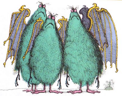
space monsters
Is There Life in Outer Space? Franklyn M. Branley ~ Don Madden ~ Thomas Y. Crowell, 1984

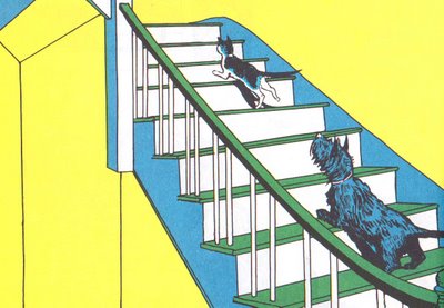
Angus and Cat
Angus and the Cat Marjorie Flack ~ Doubleday, 1931

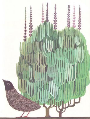
Tico and the golden wing
Tico and the Golden Wings Leo Lionni ~ Knopf, 1964

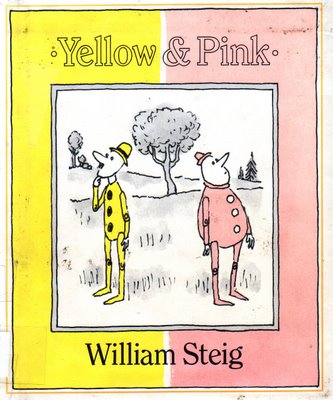
Yellow and Pink book cover
Yellow & Pink William Steig ~ Farrar, Straus and Giroux, 1984

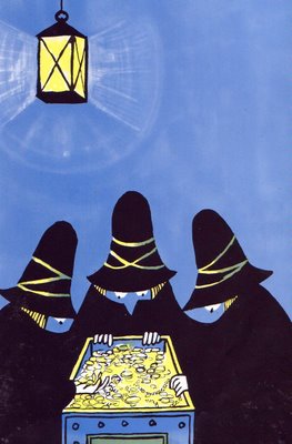
The Three Robbers
The Three Robbers Tomi Ungerer ~ Atheneum, 1962

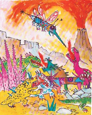
Rotten Island
Rotten Island William Steig ~ Godine, 1984

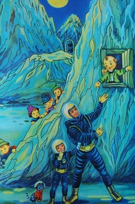
Tommys trip to the moon
Tommy’s Trip to the Moon Illustrated by Elisabeth Halfdaner ~ English text by John Cotton ~ c.1950s (book is not dated)

More sources for vintage children’s books inspiration:

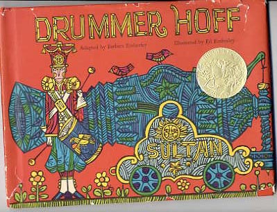
And the book that I was looking for was Drummer Hoff from 1968 illustrated by Ed Emberley. I love this book so much that I bought a signed copy on eBay after figuring out what I was looking for.

Drummer Hoff Cover