Scratch Off Lottery Retirement Plan

Wired ran a story about a man who cracked the scratch-off lottery algorithm. It turns out it wasn’t as hard as some believed. The article featured this little gem…

In a 2006 survey, 30 percent of people without a high school degree said that playing the lottery was a wealth-building strategy.

Holy cow! That’s not a good sign. Of course if they spent a couple of minutes with the Incredibly Depressing Mega Millions Lottery Simulator they might be singing a different tune. If they took the money that they would have spent on lottery tickets and instead invested it in something like the stock market, they would end up with something more substantial.

Imagine again that you are age thirty and you plan to retire at age 65. If you save the $156 you spend on lotto tickets annually and place that money in an investment that tracks the S&P 500 index, which has produced an annual rate of return of 10.4% over the last 80 years, at the end of each year for 35 years, you will have approximately $46,000 at the end of that time period.

MoneyWiseWomenBlog.net

That’s something you can really take to the bank.

750 Words A Day

Go to the site, login, and stare at an empty screen looking back at me with a tiny word counter in the lower right corner. This is what I have seen every day for the past 39 days that I have been using 750words.com

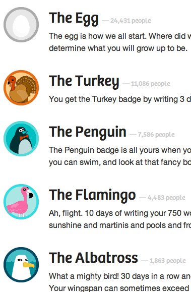
The site encourages you to write at least 750 words every single day. The idea is not like blogging which is intended to be published and read by the public. 750words.com is private and more inline with journaling and stream of consciousness writing. There are different badges you can collect based on how long your streak goes. Each badge is based on a bird. One day is an egg representing you’re new, three days gives you a turkey (just like bowling), all the way up to a Pterodactyl for 200 days written in a row. One day I hope to get the famed flying dino badge!

The Turkey, The Penguin, The Flamingo badges

Besides collecting all of your words, the site gathers an array of stats. Things like words typed per minute, feelings & concerns, most used words, and even the weather in the city where you wrote that entry. These can all be aggregated over time thanks to a feature called “Enter your subconscious.” The stuff you can derive from these statistics is revealing and it compares you to the site average.

Each month they hold a contest to see who can write something every single day of the month. Members sign up for the challenge and are asked what they will do if they succeed the challenge and what they would do if they were to fail the challenge. I completed the January challenge and as a result my name was added to the Wall of Awesomeness. Some people who fail promise to donate money to the site which is run single-handily by Buster Benson from a Seattle coffee shop.

What originally attracted me to the site is the freedom to just write something with no rhyme or reason. My entries are pretty random and jump around all over the place. Most of my 750words.com writings will never ever see the light of day. Blogging can be a drag to write something interesting. My goal with 750words.com was to just write more. Simple as that.

After nearly a month of writing everyday I started to get burned out. Making my 750 word quota felt more like a chore than a therapeutic release. Luckily I powered through and plan to only write if I have something on my mind. Forcing something that just isn’t there defeats the purpose.

39 days of writing later and I’m getting back in to blogging. 750words.com is a great exercise for anyone wanting to get into the habit of writing more. It helps you get over the hump of writing something stupid because it doesn’t matter. You should sign-up for it and challenge yourself to write more today.

The History Of Dummyimage.com

As 2010 is wrapping up, I decided to take some time to chronicle the history of one of my biggest web development milestones of the year.

In December of 2006, I started my first real job out of college as a frontend developer at USNews.com. My first big project was to turn a new site design from a collection of Photoshop documents into functioning HTML and CSS code. I had to slice up dummy images to put into the layouts. As the redesign process wore on, sizes of elements changed ever so slightly meaning I needed to make new images with each iteration. I had wished there was a way to conjure up these placeholder images on the fly. I ended up tucking that idea away in the back of mind.

For whatever reason I decided to purchase the domain dummyimage.com on the 20th of July, 2007. I can’t remember if I had some early prototype version working by then but I had made up my mind that I was going to do something with this idea. Like most tinkering web devs, I have a stable of domains for other ideas sitting around until one day when I can get around to them. Dummyimage.com was not like those other ideas.

Fast forward to August 11th, 2007, when I attended my first Bar Camp in Washington DC. I had mentioned my dummy image idea to Jason Garber and Jeremy Carbaugh in passing. They said it was a cool idea and should be pretty easy to do.

From then on, I was determined to figure out how to make my idea work. Aside from toying around in WordPress (which resulted in this blog you’re reading now) I had zero experience with PHP. I was quite comfortable with JavaScript however and found PHP easy to pickup. On August 26th, 2007, I had launched my first version of dummyimage.com.
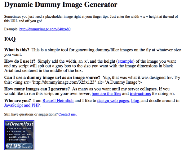
The first release was as simple as could be. The only thing you could change were the dimensions of the images. Everything was a gray background with the size of the image in centered black Arial text. I released the source code via a no-frills zip archive for anyone to take it and do what they wanted. I didn’t even bother with a design for the site itself thinking only a handful of people would even see it.

Around December of 2009 I began toying with some new capabilities for dummyimage.com. The biggest request I got was for the ability to change the colors of the background and text. I didn’t really see the point so I sat around on the new changes. Then on January 25th, 2010. My friend Charlie Park (whom I met at the first DC Bar Camp in 2007) tweeted out a link mentioning dummyimage.com My site made its way through the developer community like wildfire thanks to HackerNews, and Twitter. Suddenly I felt the need to get working on new features and a redesign for dummyimage.com based on the feedback that was pouring in.

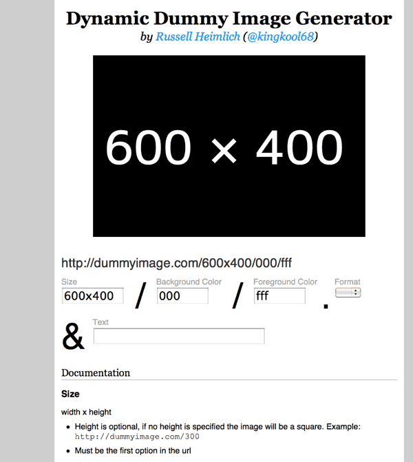
On March 10th, 2010, (Chuck Norris’ Birthday & International Day of Awesomeness) I launched version 2 of dummyimage.com.This added color options, the ability to customize the text displayed on the image, and a simple form on the homepage to make generating custom dummy images easier. I switched the typeface from Arial to a completely free and open font called M+. I also released the source code under the liberal MIT license based on feedback I had gotten.

I wanted the new dummyimage.com look to be a little rebellious. Most sites are centered align in relation to the browser. I deliberately made the dummyimage.com homepage align to the right. You can really notice this the larger your monitor’s resolution is. One person even sent me an e-mail providing a CSS tweak to make it center align. He thought I had made a mistake.
Since other people were doing other things with the dummyimage idea like making plugins for text editors and different platforms, I decided to curate those and link to them from dummyimage.com I was happy to see my idea taking hold with the community, even spreading to non-english areas of the web. I guess the simplicity of my little project transcends language barriers.

Dummyimage.com gets about 10,000 unique visits to it’s one and only page. It’s single largest day of traffic was January 26th, 2010, with 15,766 unique visits. Of course most of the traffic comes from people embedding images into their pages. I get about 5.8 million requests (pageviews essentially) for a total of 11.4 gigabytes of bandwidth in a typical month. I have gigs and gigs of server logs to analyze if I really wanted specifics but I leave dummyimage.com’s server stats open for anyone to take a look at.

With the redesign I aimed to make a little extra change by placing 3 ad units to the left. They probably bring in a couple dollars a month via Amazon.com referrals. I don’t really pay attention to that stuff.

So all in all I’m happy with where dummyimage.com has come and it makes for a great milestone in 2010. Hopefully in 2011 I can manage to launch even bigger projects I have in mind.

U.S.News & World Report Needs To Bet On The Web

Disclaimer: I worked as a developer at U.S.News & World Report from 2006 – 2009.

News broke late on Friday that U.S.News & World Report was ending the monthly print version of it’s magazine. The focus going forward will be “a predominantly digital publishing model” according to editor Brian Kelly. The leaked  e-mail mentioned shifting their focus to emerging platforms, specifically tablet computers.

“…these latest moves will accelerate our ability to grow our online businesses and position ourselves to take advantage of the emerging platforms for distributing information such as the iPad and Android tablets.”

I’m generally a fan of this position but I really hope USNews executes their strategy the right way. When it comes to mobile platforms, their are two options: web apps and native apps. When most people think of apps on phones and tablets they are thinking about native apps. Apple’s App Store and the Android Marketplace distribute and sell native apps; apps which need to be built specifically for each platform and need to be downloaded and installed. Web apps, on the other hand, are open to anything running a web browser.

Mobile web apps are what USNews should be focused on. Chances are they don’t have anyone in-house with knowledge of building native apps, so that task would have to be outsourced at an additional cost. Meanwhile the stable of talented in-house web developers could start work on building a platform-independent experience as soon as possible. In the meantime they should read this online book, Building iPhone Apps with HTML, CSS, and JavaScript: Making App Store Apps Without Objective-C or Cocoa.

But development talent aside, building on top of the open web is flexible. Updates can be pushed out nearly instantly without the need to go through a gatekeeper or approval process. As new platforms emerge, you’re brand is covered so long as it can connect to the web. Much of the functionality of native apps can be accomplished in non-desktop browsers like those found on phones and tablets. See check.in, iphone.netvibes.com, and even Apple’s own webapps catalog for examples of apps built on the web. For content publishers, native apps present far more problems than they appear to solve.

But what about money? Perhaps the biggest allure of native apps is the fact that they are attached to marketplaces where everyone browsing has a credit card attached to their account and purchases can happen with a single click. But do you get direct contact with your customers? Apps that want to span many platforms need their own payment process that they can be in control of. That way regardless of how or what platform your audience uses to accesses your content, they will get a consistent experience. And if you want to charge a recurring subscription for premium access your only option is to run your own payment platform. USNews already has this up and running with their Best Colleges and Digital Weekly products so why not extend that?

And judging from the past releases of magazine brands on the iPad, the industry is getting it wrong. They can’t just shove their traditional print product onto a touchscreen device with a few gestural interactions and call it a day. Jeffery Zeldman sums it up best in his post iPad as the new Flash

“Everything we’ve learned in the past decade about preferring open standards to proprietary platforms and user-focused interfaces to masturbatory ones is forgotten as designers and publishers once again scramble to create novelty interfaces no one but them cares about.”

So usnews.com is at a pivotal point where the company can focus on building a proprietary native app or an open web app. Today, it just seems so obvious to me to go the web app route. Native apps may seem like the answer today in the short term, but in the long term, their fragmentation overhead will hold them back for publishers while the open web will reign supreme.

I hope U.S.News & World Report doesn’t fuck this up.

The King Of Multitasking While Driving

Driving is a piece of cake for this guy. Just take a look at all of the things he can get done while traveling 60 miles per hour on the highway.

(via word theory)

Cell Phone Lady Time Travels To Charlie Chaplin Film

Freaky stuff. Or maybe it was just a 1920’s hearing aid?

Tinman Threadless Vs. Tinman Shirt.Woot!

I’m a fan of funny t-shirts which is why I obsessivly follow Threadless.com and Shirts.Woot.com . Just a few moments ago, Threadless announced their new shirts for this week and the one titled I [X] Tinman (1st picture) is similar to 404 Heart Not Found (2nd picture) on Shirts.Woot.com from 2008. I already own the 404 Heart Not Found shirt, now I just need to buy the Threadless one!

CloudFlare Can Boost Sites Performance For Free

Website performance is a big deal. Experiments conducted by the biggest websites on the net conclude page performance is directly related to revenue. Bing.com found a 2 second slow down equals a 4.3% reduction in revenue per user. A 400 millisecond delay on Google search pages led to 0.59% fewer searches per user. Aol found users who experience the fastest Web page load times view 50% more pages per visit than users experiencing the slowest page load times.

Content Delivery Networks (CDN) can be a big boost in page speed by 1) saving a copy of the fully-rendered page and 2) serving that copy from a server as close to the user as possible. Big CDNs like Akamai and CacheFly charge hundreds of dollars a month at the minimum. CloudFlare, a new  start-up, is hoping to change that by offering a CDN for free. I tried it out with two of my sites, this blog and dummyimage.com, and below are my findings.

Setting up CloudFlare with my sites was a breeze. All you have to do is change some DNS settings to route your traffic through their servers. Since I use Dreamhost as a host, CloudFlare made it even easier by hooking into Dreamhost’s system to make the changes for me. An e-mail with the original DNS settings was also sent as a backup in case I wanted to revert back. Within 5 minutes, I was up and running.

Dummyimage.com saw the most benefit from CloudFlare as it serves up dynamically generated images. Once that image was cached, any subsequent requests for that URL would be for a static image without needing PHP to create it. Dummyimage is popular and the reduced load on my measly shared servers was noticeable.

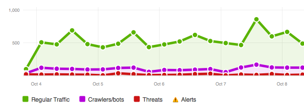
CloudFlare provides a bunch of stats for monitoring the amount of traffic going through their network as well as the bandwidth saved.  In my case, for both of my sites, I’ve saved 11.5 gigbytes of bandwidth on 23,985,639 requests in 14 days.

Another advantage of CloudFlare is the security aspect. The network will identify and block threats ranging from botnet zombies to web spammers. CloudFlare presents suspected threats with a captcha and a chance for the user to leave a message if they might have been falsely accused. Part of their stats lets you see all of the threats including ones that passed the captcha and/or left a message. So far I have seen no false positives.

So while things have been mostly great, there are a couple of drawbacks. For one, the service is still figuring things out. There was about 50 minutes of downtime when all sites running through CloudFlare were inaccessible. It didn’t irk me too much. I figure I can’t really complain when the price is free. Another issue is the stats take forever to load. The stats for the free version are delayed 24 hours on purpose, but several times when trying to access the statistics dashboard the site would timeout.

Because all of the traffic is now coming from the CloudFlare servers, any code on your end that relies on the IP address of the end user will need to tweak their code. CloudFlare has a simple guide for how to do this on their wiki.

So if you’ve made it this far you’re probably wondering, “should I run my site through CloudFlare?” If you run a personal site and can live with a little downtime here and there, then absolutely. If your site is your sole means of income and any downtime causes your blood to boil, then you should probably find a more trusted CDN (and expect to pay for it). You could always experiment with it over the weekend for a couple of days and then switch back if you run into problems.

Content Delivery Networks bring a big performance boost to a site and with a free one out there like CloudFlare, there’s no excuse to not be using one.

2nd Annual Accessibility Camp DC

Last October was the first ever Accessibility Camp DC. I learned a lot from the talks last year and had my eyes opened by how the blind navigate the web. This year, on October 9th, I took what I learned and gave a presentation of my own.

Titled “Building An Accessible Site from the Ground Up” my talk was about making a website accessible from a developers point of view. The audience’s reaction was positive and there were many good questions raised.

See https://www.slideshare.net/kingkool68/building-an-accessible-site-from-the-ground-up

Local PHP developers Andrew Nacin (core contributor to WordPress.org) and Aaron Jorbin (Clearspring Technologies) sat in on my talk. The two were adding accessibility-related patches to WordPress while I was presenting. This is why I love the WordPress community! Afterwards I got to talk with them about WordPress geekiness even though I saw them a couple of weeks ago at WordPress Mid-Atlantic. They even introduced me to another DC-area hacker, Greg Linch, who is passionate about journalism and education.

Lunch was sponsored by Adobe and delicious. While people were munching on sandwiches, Jennison Asuncion demonstrated screen-reading software JAWS and how it works with websites. Like last year, there were many people who were just flabbergasted by what they saw. It’s one thing to read about accessibility issues online, it’s another to see it live, in-person.

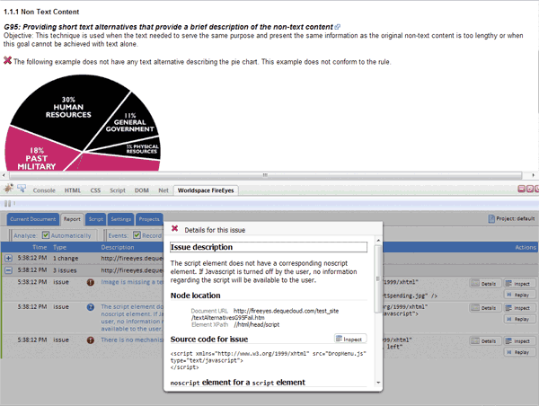
After lunch I saw a demonstration of FireEyes, a Firebug plugin, to uncover accessibility issues from Karl Groves.  The neat thing about the free plugin is, it will detect problems on AJAX events that load new data onto the page without refreshing page.

I also sat in on a talk about adding ARIA live regions to help screenreaders announce dynamic changes on the page such as using AJAX. These techniques are simple to implement and seeing someone demonstrate their advantages really motivates me to incorporate them into my projects.

Mark Barlet from AbleGamers.com was there all day showing off videos games that are accessible. These games run on modern hardware like the Xbox 360 but have special modifications so people with disabilities could be competitive. One game was an audio only game where you’re a monster trying to eat victims that fall into your pit. There are no graphics, mainly because the game designer isn’t a graphic designers. Instead you listen to audible clues about where your next victim is and when you are close enough you press a button to eat them. The game works really well with stereo headphones to help you orient yourself. Other things on display were a racing game that you can control with your face and a sip and puff tube attached to a controller to control a character on-screen.  If you’re into accessible gaming controllers, check out episode 1 of the Ben Heck Show on Revision 3.

After the conference a bunch of us headed to Capital City Brewing Company for some food and continued geeky conversation. There were a lot of people from out-of-town and it was good to get to know them. I met Elle Waters from Louisville, Kentucky; Pratik Patel from New York; and Cliff Tyllick from Austin, Texas. It was a great end to a great day of accessibility.

Other Coverage of Accessibility Camp DC 2010

Google’s Self-Driving Car Is For Real-Life Crawling

Google revealed a secret project it was working on to make cars that can drive themselves without any human intervention. These aren’t just experiments in a controlled environment either. The cars have “driven 1,000 miles without human intervention and more than 140,000 miles with only occasional human control” on real highways, streets, intersections, and even Lombard street in San Fransisco.

The media has picked up on the theme that Google is doing it to improve society with the goal of reducing automobile fatalities and freeing up time spent commuting. These would be very positive things to come from this research but could take several years to come to fruition. I have a feeling Google is doing this for its own reasons.

The Google search engine has web crawlers that follow every link it can find, slurping down the HTML which Google can analyze to determine where that page ranks in its index. These autonomous cars can be the start to real-life crawlers.

Google Street View started when a bunch of cameras were strapped to a car continuously taking photos as it drove through an area. The photos that appear online are several months old at the earliest. If it could make gathering these photos more efficient, it could update the images faster, making Street View more relevant.

Imagine if Google could send out these automated cars to collect data in the physical world that Google could use in it’s local search product. Some of the more practical applications include updating maps when roads are closed, continuously updating stores in Street View that might have changed ownership, or even determining the popularity of a place based on the number of people seen around it at various times of day.

Google wants to start ranking real-life data in conjunction with online data. This is a clear step in that direction. And it should be no surprise that the self driving car project was led by Sebastian Thrun, co-inventor of the Street View mapping product.