I rode my exercise bike yesterday for 15 minutes and 30 seconds. That is 30 seconds more than I planned and I only took one 30 second break. I guess I am slowly building stamina for this.
I came in last night at 208.4 pounds which I hope doesn’t reverse anytime soon. I head to the beach next week for some rest and relaxation.
My goal is to be under 200 by the end of Summer (beginning of September) which should be easily achieved at this rate.
I just finished participating in the first Jason Calacanis and Friends live show on Operator 11. You’ve probably seen UStream.tv and Stickam.com for streaming live video and heard about Talkshoe.com for live audio casts; Well Operator 11 is like both of those things combined and it makes for a whole lot of fun.
If you ever wanted to have your own show live with user participation, than Operator 11 is the way to go. The Flash controls are intuitive and the quality isn’t too bad. As the director you can determine who is live and it lets you switch to different people with a click of the button. Participants can request they be put on camera via a simple button which shakes their video on the directors screen. Everyone in the live area can participate in the text chat that also gets displayed across the bottom of the video screen so people on the outside of the studio can see what the comments from the peanut gallery too. Other cool features include drag and drop video sources which let you switch to lpre-recorded clips and the whole show is recorded, saved and viewable to anyone who wasn’t there during the live recording.
Back to the CalacanisCast, things were going smooth at first and then Jason managed to crash the servers causing everyone to go into a spin-off room. After that, mayhem ensued and Jason began playing clips live off of YouTube and switching to shots of his dog Toro. Other highlights included Jay Adelson, CEO of Digg.com, and Robert Scoble who did a mighty fine Steve Ballmer impression (check the video at -21:15). I even got to say a few words but I was feeling shy in front of all the A-List bloggers; Afterall I am a nobody in the blogging world just like everyone else.
At the end of it all I had a lot of fun interacting with a bunch of different people from all over the world live and with video and sound. Operator 11 is sure to take off once more people start playing around with it. If you do go over and sign up add me as a friend and let’s get together and chat face to face sometime.
I’m a right clicka and a PowerBook flippa. Best line goes to the Mac for “Pay attention, I’ve got a new invention. Steal your next idea at the MacWorld convention.”
A regular expression is a powerful tool for matching or manipulating strings. You might be unfamiliar with the term but I bet you have used a regular expression before. Most search and replace tools in text editors use regular expressions to match the text you are looking for and replace it with the text you specify. Using regular expressions might not be that hard but understanding the syntax for writing your own can be quite a chore.
Lucky for us Design215.com has an excellent regular expression testing tool complete with a list of syntax properties and detailed examples. Just construct your regular expression, enter some input text to test against and hit the test button. The output code will tell you if your regular expression worked or not so you can make further tweaks.
This little tool can save a lot of time when you need to develop a regular expression for your code.
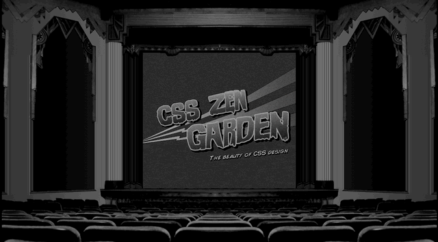
The Retro Theater CSS design by Eric Roge is a perfect example of what can be done with a little creativity. The trick to pull this wffect off was using background images attached to several different extra divs to create the theater. The content is contained in a div with an ID of “container” then centered and set to a width of 450 pixels. Since the other theater elements need to stay in place when a user scrolls, their position is set to fixed which allows the movie screen to scroll without using an “overflow:scroll” on the container div. While it may seem like more work to make the screen scroll this way, the extra effort pays off with a more natural scrolling experience for the audience. No matter where the mouse is on a page the use of the scroll wheel will be consistent. The static seen flickering on the movie screen comes as an animated gif set as a background image on the container div.
I bet there was a lot of trial and error involved in developing this layout but the results speak for themselves. Eric did a spectacular job of capturing the feeling of an old retro theater. If this was a site for a movie theater or film festival the design would separate them from their competition while conveying their message in a unique and interesting way.
Here is a thumbdrive that really represents what it is by it’s shape; A physical folder for all of your digital files. This stylish creation comes from the same guy who thought up the Optimus Maximus keyboard, Art Lebedev.
Check out more cool products from Art at his online store.
I haven’t exercised in nearly 8 days and I’m at my lowest weight point yet at 208.0. It must be the hot weather causing me to sweat more as most of the weight changes I see on the scale seem related to body water.
Since I am making progress there is no use in straining myself working out. I’ll get on the ball again next week to see if I can give my self a little weight-loss boost.
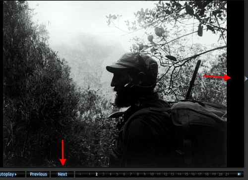
The web has created new ways to organize and display information. When designing an online slide show there are a slew of techniques one could employ to guide the user through the presentation. Should there be thumbnails? A next/previous button? Arrows? Should it be linear? Non-linear? Both? The list could go on and on.
Nora Paul and Laura Ruel decided to probe these questions a little further using an eye tracking machine and 34 volunteers during a brief experiment. The participants were asked to view a Washington Post slide show titled “Cuba by Korda” which utilized all of the navigational elements mentioned above. There were no specific instructions given to the users and their only task was to navigate through the slide show for as long as they wished. Some of the interesting findings…
A majority of the participants relied on the Next button to progress through the slide.
People who used the Next button or right-hand arrow viewed twice as many slides as those clicking on the numbers below the photo.
Participants Using the arrows viewed the slides for the longest average time (3:31) followed by the Next button (2:34) with the Numbers people staying the shortest (2:16).
Viewers who chose to view the presentation linearly viewed an average of 20.75 slides while non-linear viewers saw only 6.5
As you can see, the web audience is a lazy bunch and it is unreasonable to expect them to view your content if it is hard for them to navigate through it. Hunting and pecking for numbers or thumbnails requires much more work than clicking a button that stays in the same place the whole time and because of the extra work the audience loses interest and gives up faster. Same goes for the linear vs. non-linear approach where non-linear requires more thinking and ultimately more work. This brief study only confirms the sayings of Steve Krug in his book Don’t Make Me Think: A Common Sense Approach to Web Usability.