Posts tagged 'Design'

Stylish Lamps Made Out Of Old Bulbs

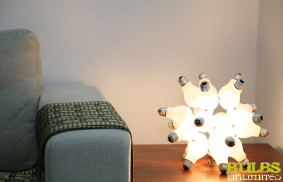
Every time a light bulb burns out I feel a little uneasy about throwing it away. I find the simple design of a light bulb is a great source of inspiration. Bulbs Unlimited must have felt the same way so they created a kit that lets you creacycle (creative recycle) those dead bulbs and turn them into a functional new lighting piece yourself.

Lamp Virus

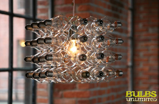
These look so cool and there are four different patterns to choose from: Virus, Cube, Corona, and Circle. You can purchase a kit in the price range from about 12,95€ ($18) all the way up to 89,95€ ($122), depending on the complexity of the design.

Lamp Cube

(via Technabob)

Name That Color

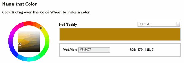
Name That Color

Every color has a name but up until now it has been quite a task to separate the Periwinkles from the Mischkas from the Thistle Green. Name That Color lets you select the a color via RGB value, HEX number, or a simple color picker. From there, the handy little web app will let you know the appropriate name for that certain hue. Feeling a bit lazy? Then use the drop down menu to sort through the zillions of names and find ones like Rangitoto, Wattle, or Hot Toddy. Seriously those are all valid color names.

Apparently this guy has been spending way too much time over at COLOURlovers.

(via DownloadSquad)

Inspiration: Stage 5 Studio & Circle Six

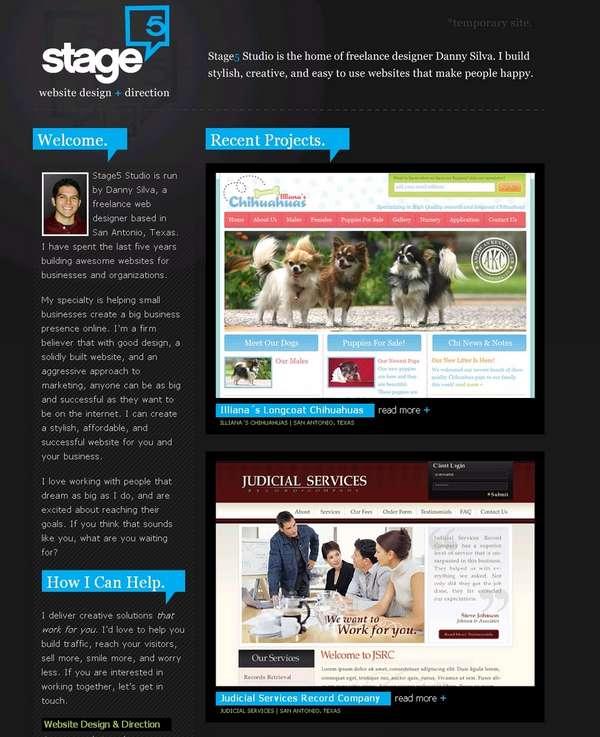
Stage 5 Studio Screenshot

Stage5Studio.com

This little site is a nice example of how to do a dark-colored site using bright colors for highlight. I really like the idea of highlighting certain info with a solid background color similar to the rollovers of my links. Best of all, the site is a single page. Straight and to the point.

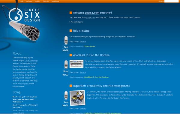
Circle Six Design Screenshot

blog.CircleSixDesign.com

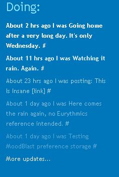
Circle Six uses a killer color combination of orange and blue. I really like the logo which plays with depth by wrapping through the logo and on top of and over the orange nav bar. I’m not a big fan of the fluff at the bottom. The best thing has to be the Twitter status which fades in both size and color as the updates age.

Circle Six Design Twitter Screenshot

Inspiration: SEOStudio.co.uk

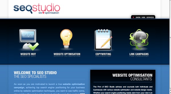
This search engine optimization company has a slick website with a royal blue and white theme. The main category navigation has an interesting roll-over effect where the icons not selected become grayed out. A reader can maximize the reading room by hiding the nav area which slides shut thanks to the animation prowess of the Script.aculo.us library.

The only thing I would change would change about SEOStudio.co.uk would be the color of the type. Blue on blue provides a low contrast and to aide readability I would pick something lighter.

Smooth icons with a soft glow as well as the eye-catching color choice make this a site I’ll keep track of for times when I need some inspiration.

seostudio.co.uk Screenshot