Posts tagged 'Media'

U.S.News & World Report Needs To Bet On The Web

Disclaimer: I worked as a developer at U.S.News & World Report from 2006 – 2009.

News broke late on Friday that U.S.News & World Report was ending the monthly print version of it’s magazine. The focus going forward will be “a predominantly digital publishing model” according to editor Brian Kelly. The leaked  e-mail mentioned shifting their focus to emerging platforms, specifically tablet computers.

“…these latest moves will accelerate our ability to grow our online businesses and position ourselves to take advantage of the emerging platforms for distributing information such as the iPad and Android tablets.”

I’m generally a fan of this position but I really hope USNews executes their strategy the right way. When it comes to mobile platforms, their are two options: web apps and native apps. When most people think of apps on phones and tablets they are thinking about native apps. Apple’s App Store and the Android Marketplace distribute and sell native apps; apps which need to be built specifically for each platform and need to be downloaded and installed. Web apps, on the other hand, are open to anything running a web browser.
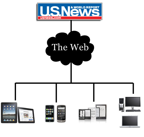
Mobile web apps are what USNews should be focused on. Chances are they don’t have anyone in-house with knowledge of building native apps, so that task would have to be outsourced at an additional cost. Meanwhile the stable of talented in-house web developers could start work on building a platform-independent experience as soon as possible. In the meantime they should read this online book, Building iPhone Apps with HTML, CSS, and JavaScript: Making App Store Apps Without Objective-C or Cocoa.

But development talent aside, building on top of the open web is flexible. Updates can be pushed out nearly instantly without the need to go through a gatekeeper or approval process. As new platforms emerge, you’re brand is covered so long as it can connect to the web. Much of the functionality of native apps can be accomplished in non-desktop browsers like those found on phones and tablets. See check.in, iphone.netvibes.com, and even Apple’s own webapps catalog for examples of apps built on the web. For content publishers, native apps present far more problems than they appear to solve.

But what about money? Perhaps the biggest allure of native apps is the fact that they are attached to marketplaces where everyone browsing has a credit card attached to their account and purchases can happen with a single click. But do you get direct contact with your customers? Apps that want to span many platforms need their own payment process that they can be in control of. That way regardless of how or what platform your audience uses to accesses your content, they will get a consistent experience. And if you want to charge a recurring subscription for premium access your only option is to run your own payment platform. USNews already has this up and running with their Best Colleges and Digital Weekly products so why not extend that?

And judging from the past releases of magazine brands on the iPad, the industry is getting it wrong. They can’t just shove their traditional print product onto a touchscreen device with a few gestural interactions and call it a day. Jeffery Zeldman sums it up best in his post iPad as the new Flash

“Everything we’ve learned in the past decade about preferring open standards to proprietary platforms and user-focused interfaces to masturbatory ones is forgotten as designers and publishers once again scramble to create novelty interfaces no one but them cares about.”

So usnews.com is at a pivotal point where the company can focus on building a proprietary native app or an open web app. Today, it just seems so obvious to me to go the web app route. Native apps may seem like the answer today in the short term, but in the long term, their fragmentation overhead will hold them back for publishers while the open web will reign supreme.

I hope U.S.News & World Report doesn’t fuck this up.

Ultimate List Of Mega Man Songs

The Mega Man series of video games has a distinctive soundtrack. The music from the games is so influential that a bunch of cover bands have incorporated the melodies into their own versions of the popular songs.

Mega Man 1 -10 soundtracks – This is the full collection featuring music from Mega Man 1 for the original NES all the way through the recently released Mega Man 10. It weighs in at 684 MB and you will need 7 Zip for the PC or keka for OS X. The password for the archive is reddit.

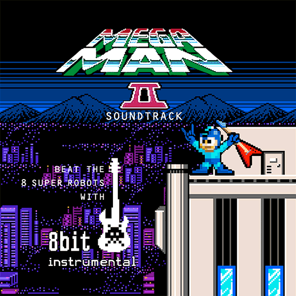
8-Bit Instrumental is a video game-focused instrumental band from Brazil popular for their covers of Contra, Super Mario Bros, Street Fighter II, Altered Beast and others. They have an entire album dedicated to Mega Man 2 songs available for free on their website. The release was so popular that a hacked version of Mega Man 2 was released replacing the original soundtrack with the cover songs by 8-Bit Instrumental.

Project X has a 14-track album based on Mega Man 2 available for download in one 33 MB zip file. The Boston-based band produces guitar/electronica music.

Overclocked Remix has several remixes (mostly techno) based on Mega Man songs. The songs can be streamed via YouTube or downloaded for free.

Game Over, a Swedish Nintendo metal band, has three songs based on Mega Man. They’re kind of catchy.

Finally, thepulperizer.com breaks down the top 25 Mega Man songs. It is a pretty thorough list that I mostly agree with except I think the Bubble Man theme song should be number one, not number two.

So there you have it, the ultimate list of Mega Man songs for any video game aficionado. After all, the best thing to do when you’re not playing video games, is to rock out to their soundtracks until you can.

Move Over Pandora, Hello Grooveshark

I’ve been a long time fan of Pandora, an automated music recommendation and Internet radio service. Users enter a song or artist that they like, and Pandora responds by playing similiar music. The recommendations come from the Music Genome Project, a complex mathematical algorithm to organize songs using more than 400 attributes. You can give a song a thumbs up or thumbs down to help tweak the station to your liking. Pandora has been my sole source of music while at work. Programs like PandoraBoy for the Mac and Open Pandora for Windows turn the web player into a standalone desktop app complete with keyboard shortcuts. Pandora offers it’s own standalone application with higher quality sound and no ads for $36 a year.

While the musical recommendations have been very good, my radio stations quickly become stale. The same songs keep coming up again and again and the only way to rectify it is to create a new station. You also can’t search out a song and play it on demand. You give Pandora a song or artist to use as a seed for generating similiar songs that make up your station.

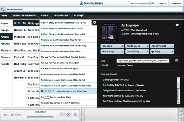
Compare this with Grooveshark which provides the ability to listen to single songs from the 7-million song catalog on demand, save playlists, and embed both on other sites; all for free. The user interface borrows heavily from the iPhone with sliding menus and a minimalist design. The application is a cinch to use.

Grooveshark interface screenshot

Hovering over a song brings up four small icons: play, add to queue, more info, and embed. The more info menu brings up more options like browsing the artist or song, adding it to a playlist or your favorite list that you can recall later, and a list of similiar songs. After you get tired of looking up every song you can think of, make use of the autoplay feature which keeps the songs coming based on your listening history. You can also like/dislike songs which Grooveshark suggests to further tune your song list. You can see it in action below thanks to ben westermann-clark:

Grooveshark is reminiscent of the golden age of Napster where nearly every song was available at your fingertips only without downloading anything. What’s the legality of Grooveshark? I’m not really sure, but the company claims to have license agreements with a long list of record labels. It doesn’t really matter since you can use the site without signing up, which you only have to do if you want to save songs or playlists.

The only thing Grooveshark is missing is a desktop client with keyboard shortcuts though it sounds like that is coming sometime real soon. In the meantime I’ll just use Fluid or Mozilla Prism with a nice custom icon to complete the effect. It seems crazy to use any other online or offline music client now that I’ve gotten to know Grooveshark.

Newspapers vs. the Internet (Cartoon)

It’s not the medium, it’s the content.

(via Slate)

Newsweek.com Redesign: Your Dam For The Flood

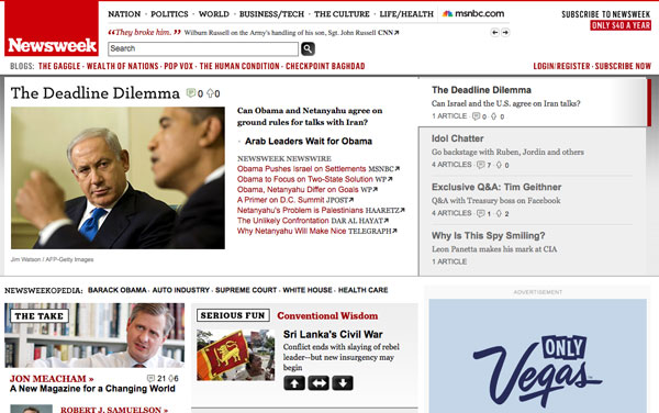
Newsweek.com Redesign

The folks at Newsweek unveiled a new redesign for their website today, nearly one and a half years since their last one. From a post about the new changes, the redesign aims to help visitors sift through the “flood of information on news and events every minute of every day” by “continuously filter[ing] it to find the most important stories and concepts for our audience” while “embrace[ing] the best work of other journalists around the Web and the most thoughtful questions and comments of our readers” in order to “create a forum for a continuous – and continuously worthwhile – conversation about key events and issues”. If only their writing was as simple as their new header.

Newsweek Header: New vs Old

The new Newsweek header (top) is much cleaner with a softer tone and less emphasis on the bold red associated with the magazine. Simple, clean headers seem to be a rising trend on news sites these days as usability and user experience become more of a focus. The old header (bottom) had a sense of authority while this new header design is toned down, as if to convey a lack of confidence in their place in the world. I am not a fan of the rotating headline ticker which clutters up the otherwise clean navigation.

The content on the homepage is also a cluttered eye sore. There is no clear structure to the information and the auto-rotating carousel of feature stories is distracting. I dig the effort to link out to external sources. This is what the web is all about but it does come off as Newsweek giving up on its quest to be a news leader. This could have been executed better to complement their own content rather than outshine it.

My biggest problem is it is impossible to scan the homepage. The content appears to be laid out in a random order like an amateur scrap book. There is no central focal point except for that ginormous 336×850 ad on the right. Come on Newsweek, don’t you know about the F shaped reading pattern on the web? Why would the headlines be aligned along the right side of the page?

It still appears Newsweek is a print-focused organization with the attitude of “if you put it on the page, readers will read it”. Looking over at the old design, it seems this redesign is a step-back. In it’s efforts to be a guiding hand in filtering the flood of news, Newsweek has become nothing more than a dam clogging the flow of information. My advice: turn Newsweek.com into a repository of articles from the magazine and focus on that. The world doesn’t need an old media publication half-ass its web offerings.

Other Points of View:

The New York Times Is Preparing For The Future

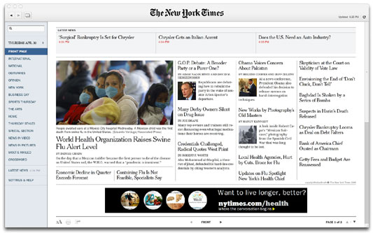
With all of the turmoil about the future of journalism, the New York Times is taking a proactive role in staking out it’s future in what might be a newspaper-less world. Today the company released a downloadable Adobe Air application that brings together the immediacy of the online world with the serendipity and browsing of the physical world. See a video demo of the application in action.

Times Reader 2.0 Front Page

The Times Reader 2.0 is a slick product with an advertising and freemium business model. The tool offers some sections for free, like the front page, while charging $14.95 a month for access to others. John Biggs from Techcrunch is thinking about making the switch to all digital from paper delivery which is costing him $40 a month in Brooklyn. I’m curious as to how many people will put up with a seperate app dedicated to news sitting next to their web browser and e-mail client. And how many will be willing to shell out $15 a month for the same content that is already available for free on their website.

I think this is the first step to the New York Times setting up a pay wall like the Wall Street Journal. Unlike the Wall Street Journal, The New York Times looks to be pushing a monthly fee over a micro-payment business model which will ultimately fail.

The other interesting idea involved the Research and Development group at the newspaper. First off, the fact that a large media company has a R&D group boggles my mind but it totally makes sense to tackle the new technology that will be shaping their business in the coming years head on. Second, the New York Times is very interested in making their content work on the slew of portable media devices that are popping up everywhere like netbooks, the Kindle, and mobile phones. The video below taken by the Nieman Journalism Lab shows how they’re experimenting with e-ink readers and figuring out how their content will work on devices that aren’t even invented yet.

The future of media is not a single medium with one or two supporting business models, but one with many outlets tailored to different devices with just as many different ways to monetize it. The New York Times is building the infrastructure to handle this, it’s the smaller news outlets that are going to have a tough time adopting to this new, fragmented world.

Seesmic Desktop Takes Twhirl To The Next Level

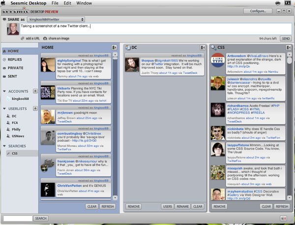
Screenshot of Seesmic Desktop Preview with columns.

Twhirl has been my favorite Twitter client until today when the Seesmic Desktop preview launched. Seesmic, who bought the Twhirl client a year ago, has taken the product to the next level. Taking a few hints from Tweetdeck, this update brings the ability to create groups for who you follow as well as display multiple columns to help cut through the stream of noise. The grouping feature is a nice addition but is a little bit clunky without a way to see all the people you are following in one place so you can easily sort people into groups. The only way to add someone is clicking an icon over their avatar. In addition to people you can also add columns for search terms. People with multiple Twitter accounts will be happy to know that you can manage different usernames from one interface with the option to view them combined or separate.

URL shortners include bit.ly, digg.com (with their new DiggBar), is.gd, snurl.com, tr.im, and twurl.nl. You can also post pictures but the only service available is the dominant TwitPic.

Like any new release, there are a few things that can be improved. Customization features are sparse. Things missing are the ability to adjust font size and styling (important when you want to optimize scanability) as well as colors of the interface. The notification pop-up (my favorite part of Twhirl) no longer shows a preview of the incoming tweets but merely indicates what type of tweet has arrived (reply, direct message, or “friend update”) and for which account that tweet was sent to. I hope in future releases they add this functionality.

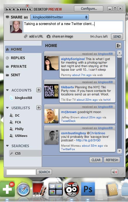
Seesmic Desktop Preview application in a single column mode.

For people who use Twitter as an information fire hose, the Seesmic Desktop client will be a handy tool for managing the information overload. I always liked Twhirl for it’s lightweight memory usage which really turned me off to the sluggish Tweetdeck. We’ll see how well this tool performs after a couple days of usage. And I’ll continue to follow the developments as Seesmic brings their video-conversation service into the mix with Twitter updates. Just imagine how cool that would be to view and respond to video comments Twitter style in a dedicated application like this!

YouTube Brings Choose-Your-Own Adventure Videos To The Web

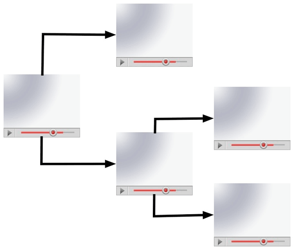
NewTeeVee ran a post over the weekend about choose-your-own adventure videos on YouTube. The creators used the Video Annotation feature allowing them to place a link over a certain part of the video in order to string multiple clips together in a unique sequence. Through careful planning, an engaging, interactive experience can be created just like those old choose-your-own adventure books that were all the rage when you were a kid. Bboy Joker, a stop-motion animation film, is my favorite example of this genre.

Annotations make it possible to link multiple YouTube videos together creating interactive experiences.

I had a similiar idea for a DVD just before I went to college. I failed to act on it however due to the less than stellar experience navigating a DVD menu and the sheer idea of planning a comprehensive story with multiple plot branches. I’m more of a techno wizard than a storyteller. I vaguely remember reading about a professional DVD that pushed the boundaries of DVD interaction by including transparent cut-outs over live video so when you clicked one of them it would take you to a video glossary. I can’t seem to find the link, but it sounded like a ton of work just to author it back in the day.

Adding a bit of interactivity to video is better suited to the Internet, which is considered a lean-forward or engaging experience, as opposed to the traditional TV which is a lean-back or passive experience. While this format isn’t applicable to most of the videos published on the web, for the ones where it does work, it takes the experience to a whole new level.

I Saw A Marriage Proposal On Twitter

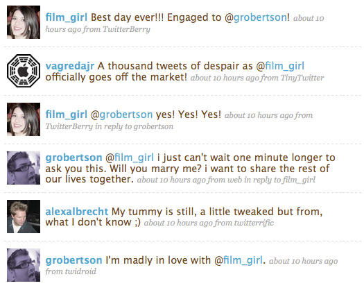
grobertson proposes to film_girl via Twitter

Grant Robertson and Christina Warren are both Weblogsinc (now AOL) bloggers and new media junkies. So it shouldn’t be any surprise when the couple got engaged via Twitter today (her reaction). Now this is obviously something Grant had been planning and he just couldn’t wait for his precious Christina to return home to Atlanta from San Fransisco where she is covering the Macworld Expo. But come on dude! At least wait to do it in person and record it on video (like a certain someone). Just imagine the grand kids reaction when you tell them you popped the question on Twitter:

“Twitter? Only old farts used Twitter”

“You whippersnappers! It’s what we did back then!”

Here was my reaction after the news.

Now this isn’t the first Twitter proposal but by golly it sure is sweet to witness it first hand. Now let’s just hope the happy couple doesn’t hold the wedding in Second Life.

P.S. I’m sure alexalbrecht‘s tweaked stomach was just a coincidence.

Twitter Hackings Make Mainstream News

Screenshot of Twitter Hacking News on CNN.com

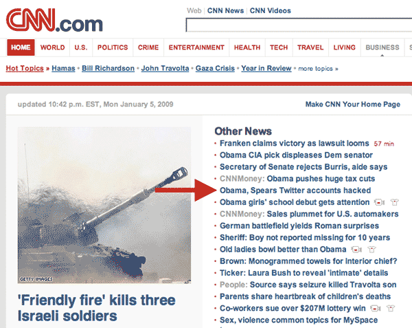
It seems like just yesterday that Twitter was an unknown start-up with a quirky idea. Now Twitter is definitely mainstream. News of the recent account hackings made the headlines of CNN.com. Apparently someone hacked into internal support tools used by Twitter to help their users. The hacker then tweeted from 33 prominent accounts including foxnews, barackobama, britneyspears and even CNN’s own ricksanchezcnn.

Screenshots of the defaced accounts can be seen in this Flickr pool.

This is in addition to a Twitter phishing attempt that happened over the weekend. When your site becomes the target of nefarious attacks then you know you have reached the big time.