Posts tagged 'Reviews'

5 MP3 Related Freeware Apps

I recently spent a weekend ripping all of my old CDs to my music hard drive and got me thinking about all of the great MP3 freeware that is out there. Here are my five must have freeware apps for MP3 nirvana.

Audiograbber – This CD ripper is the easiest way to convert your CDs to MP3s. While it may look like any other CD rippers, Audiograbber has lots of tweakable options to make your ripping session more flexible. Features worth noting are per track checksums to ensure each file was duplicated exactly, normalizing to prevent jarring sound levels from track to track, delete silence from the end and/or start of a track, encode to a variety of formats including WAV, MP3, or WMA (other encoders can be set up in the Settings menu), and automatically load track information from the freedb CD database.

Picard (from MusicBrainz) – Gigabytes upon gigabytes of MP3 files collected from various sources can lead to some wacky, hodgepodge ID3 tags. ID3 tags are MP3 metadata that describe things like the album title, artist, track, and genre. The MusicBrainz service aggregates metadata from various community members in an attempt to house the largest music information database in the world. Songs can be uniquely identified by their sonic pattern which is used to match up the MP3 file with the correct metadata. Picard is a piece of software which lets you easily drag a bunch of files to batch process all at once. When the program is done you can overwrite the ID3 tags and live in MP3 organization utopia for the time being.

MediaMonkey – Lots of people rave about the brilliance of iTunes but I just don’t see it. Winamp was my player of choice for years until it became too system resource greedy. Then I found MediaMonkey which is fast, flexible, and incredibly organized. Remember all that talk about properly tagging MP3 files with MusicBrainz? MediaMonkey uses that information for searching. In addition you can edit the ID3 tags right in the interface as well as download album covers from Amazon. A bunch of Internet radio stations can be streamed from the player when your days of MP3s become repetitive. If that is not enough you can also batch rename the filenames of your music files matching their ID3 tags, connect and sync with a variety of MP3 players, and generate reports and statistics based on your listening habits. The MediaMonkey system also supports an open plugin architecture as well as scripting support to extend the functionality. All of this from a lightweight music player that won’t bog your system down without skimping out on features.

Music IP Mixer – Do you find it hard to come up with a good play list to listen to? Does the random shuffle option not do a good enough job satisfying your musical pallets? Music IP has a free download that lets you make play lists based on their acoustic fingerprints. When you first start the program up it scans your music directory and analyzes each and every MP3 file. Then using a specialized algorithm based on a variety of factors, the program can create a sophisticated mix based on a selected “seed” song. The MusicIP Mixer lets you tweak the mix by selecting songs and selecting “More like this”, “Less like this”, or “Replace this song”, “Replace this artist”. After specifying the number of songs you can save the play list for later use of send it directly to your audio player of choice.

SoundControl
– Controlling your media player by clicking on the software interface is for people with too much time on their hands; Real power users set up hot keys to do their important music tasks. I originally stumbled on Sound Control while looking for a program to visually display the volume level when I turn it up or down like an on screen TV display. But it turns out there are a lot of hidden features in this puppy. For one, I set up hot keys to play, pause, play the previous track, or play the next track all without bringing up the program. Another hot key lets me mute, increase, or decrease my sound volume just like those keyboards with dedicated keys.

So as you can see, it is important to have a properly tagged and organized MP3 collection, that you ripped from your old CDs, that can be easily made into play lists based on moods, that you play on your light-weight music software, where the volume is controlled via customizable hotkeys all for the price of zilch.

Time To Say Adios To HelloNeighbor.com

Washington DC had it’s first Startup Weekend event two weeks ago drawing a crowd of about 70 techies. The idea behind startup weekend is for a group of people to get together, conceive, build, and launch an Internet business in under 72 hours. The only thing more stressful than executing a new idea in such a short period of time is managing such a large group of random people. I didn’t have the pleasure of attending but I did follow along via the official blog and twitter posts from friends that attended.

The group settled on an idea about a social network for communities, later dubbed HolaNeighbor.com. The site is meant to help people plan events, share important information, meet the neighbors, and generally be a better member of the local community. It has been more than a week since the site launched and it is still far from even a proof of concept.

HolaNeighbor.com Logo

So far Helo Neighbor is a Google Maps mashup. You can search for communities by zip code which displays the location on a Google map with an exclamation point as a marker. Clicking on the marker lets you check out the community which only includes a list of members and three crude options: name of founder, public or private, and invite or open. There is also the capability to upload photos though there is nothing taking advantage of this feature yet.

The idea is half baked at best. I imagine there must have been way more ideas during the pitch of this business proposition to keep the team excited about this. I don’t see any advantage of launching HelloNeighbor as a standalone site. In hindsight it would have made much more sense to build on top of an existing social network like Facebook. By making this product a Facebook app the team could spend more time working on the features instead of building up the basic infrastructure like the sign up process and user management. As the site stands now, users are better off creating a group on Facebook to keep in touch with local events.

I hope the gang had fun, because the end result certainly falls flat.

Using Crowdsourcing To Fight Unknown Callers

Have you ever gotten a call from a random number across the country? I used to answer these calls only to get an automated message detailing how I can get a loan. This is an outcry since I signed up for the DO NOT CALL list and I am using a cell phone which I thought was off limits for telemarketers. Regardless, I Googled the number and stumbled upon this great little community.

Man Screaming At Phone


800Notes.com
is “is an online community where users can identify mystery callers by sharing comments about the calls. The website has a user-supported directory of unlisted numbers that provides info about who and why is calling and how one can stop unwanted calls.” Through the power of the Internet people are banding together and sharing information about these pesky junk calls burning up our valuable time. If someone finds out who the person or group calling is, they share it. If there is a way to get off the calling list, they post it.

Sites like these are awesome. To take this to a next level, it would be cool if there was a plug-in for phones that creates a menu option to automatically poll 800Notes.com for any call you just received. This is easily the best thing I Googled today, maybe even this week. Another option to 800Notes.com is WhoCallsMe.com.

Ebay Vs. Amazon: Which Is Best To Unload Your Junk

Ebay Vs. Amazon: Which Is Best To Unload Your Junk
The Internet is great for connecting people across the world and exchanging junk that is usually sitting in the corner collecting dust. eBay and Amazon are the premier online trading centers but which one should you use? I’ve used both over the past month and here are my thoughts.

eBay

eBay is great for special, rare, or unique items; everything else is usually goes for a a bargain price. People go to eBay looking for a steal and mass items are hard to compete with against the pro eBayers who get their stuff at wholesale. But if you’re goal is simply to get rid of your clutter with any money being a bonus, then eBay will work for you.

In order to make a thorough auction posting, be prepared to set aside some time for research during the listing process. eBay buyers want lots of information and clear pictures so they know what they are getting in to. When I listed some auctions at the beginning of October it was taking me about an hour and a half per auction including taking and processing pictures, writing a clear and concise description, and researching similar auctions for comparison. Mike Panic guest posted at GetRichSlowly.org with tips to maximize the profits of your eBay auctions.

eBay charges a fee
to list your item and a final value fee when your item sells. On top of that, if you use PayPal to receive payment, you will get a fee tacked on to that to. There are extra fees for special upgrades like boldening your item in the search results and extra super size pictures. These upgrades eat up your profit and do not provide any extra value. The only extra that should be considered is adding a gallery image which shows a thumbnail of your item in the search result.

Amazon

When talking about Amazon, I am not talking about their auctions product, but rather the sellers marketplace. Amazon made it’s name selling books which it trumps eBay over. The process of listing a book is a simple three steps including searching for the book, entering the condition and your price, and hitting submit. Then you’re thrown into the mix with other sellers vying to list the lowest price. When you get a sale, Amazon emails you a reminder to ship it in 2 business days and provides a shipping credit. There is less flexibility to differentiate yourself compared to eBay but the listing process is much, much quicker.

Amazon lets you choose three shipping options to offer for your item: the standard shipping rate of $3.99, an expedited shipping rate of $6.99, and an international shipping rate of $12.99. I suggest offering all three as it broadens your possible audience. You might think the shipping credits are a little low, but for standard shipping use media mail/parcel post, and for expedited and international use a priority flat rate envelope. Then your shipping costs will be below the issued shipping credit!

Amazon Marketplace fees are more straight forward compared to eBay. There is no fee to list your item. Fees are only collected when your item sells where Amazon takes 6-15% of the sale price, a $0.99 transaction fee, and a variable closing fee. Before you list your item Amazon lets you know how much profit you can expect if your item sells and you are free to make changes at any time.

Conclusion

In the end I use Amazon Marketplace for media items like books, movies, and video games with eBay for everything else. To help you figure out which option is better for your stuff check out these useful fee calculators:

A Terror Trail With Real Blood

With Halloween just around the corner Kristina, her friends, and I made a trek out to western Maryland to experience the Markoff haunted trail. To get there we had to drive down a winding, curvy road in the dark. That was scary enough for me, but the night became more frightening when we got there.

After you pay the $25 fee to get in, you wait in an area with several bonfires before they call your group number. Actors in full creepy-costume interacted with us to pass the time. One was dressed in a suit and walked around like a possessed zombie droning about brains while chasing our group members around. When they called us enter the trail, we were bubbling with anticipation to see what was behind the doors.

Haunted Trail Door

We entered the first chamber which was full with hanging skeletons. I let Kristina go ahead of me as we entered the next part which led through a tunnel. As we ducked down to go through, Kristina got scared and thrusted her elbow back right into my nose. It hurt like hell but I stumbled on in the darkness anyway. After I was outside I started to feel a wetness on my hands. Using a nearby light I saw that my hands were covered in blood and my nose was dripping thick, dark-red fluid. It was evident that I needed to head back for some medical attention but how would I get there?

Luckily there was an actor dressed like Jack the Ripper directly behind this. When I tried to explain that I was bleeding and needed to leave, they acted like I was part of the show. With no help from the actor, Kristina helped me back the way we came where there was a guy dressed as a skeleton in the room full of dangling skeletons. He guided us out but on the way a girl saw the blood on me and started shrieking, “You can’t make me go, look at that boy’s face! What if that happens to me?” It was definitely a bonus freaking out waiting patrons.

I ended up at a dressing trailer where a lady dressed in a weird cat costume helped me wash up and stop the bleeding with paper towels. In 15 minutes I was good as new and Kristina and I headed back to the haunted trail. We ended up with a group of strangers, not our friends, but we had a good time anyways.

The trail was rough and hard to navigate in the dark which probably explains why we had to sign a waiver before entering. Actors would jump out of random places and Kristina would shriek. There was a girl ahead of us who was so jumpy she would scream when a tree branch touched her. At the end there were guys with chainsaws (chains removed of course) that chase people around. Kristina totally lost it and started sprinting away from them as fast as she could. I’m surprised she didn’t pass out from the sheer terror of the moment.

In the end it was a fun night. Even though I got a bloody nose, I left with a great story to tell which made it even better than I had expected. The trail is open through the 31st of October from dusk until 9pm. If you are in the area, it is definitely worth checking out.

Two Website Makeovers: Barnes & Noble And Newsweek

Watch out web world, two big brands recently gave their sites a new look. Book hawking company Barnes & Noble added some web 2.0 niceties while Newsweek cleaned itself up under the hood and added a bit of polish to the front end.

Barnes & Noble

The old Barnes & Noble site was cramped and flat although not terribly hideous. A little design tweaking and a couple of new features later and what we are left with is a more presentable homepage with large, soft buttons and a larger but better organized navigation bar. The top 10 book list on the right side of the homepage sports an interesting cut-off styling that is pretty cool. The featured books have more information available up front making a more compelling reason to buy them as browsers scroll over them. They even added a tag cloud which is a neat web 2.0 gimmick that lasts about 5 minutes as very few actually navigate that way.

Why anyone buys books online at anywhere except Amazon.com is beyond me, but for those that like to venture off the beaten path, Barnes & Noble is a breath of fresh air.

Barnes and Noble Redesign Screenshot

Newsweek

The popular weekly news magazine pushed out it’s new look a couple of days ago and boy did it need it. The old site was table based with tables inside tables inside tables. The redesign introduced clean modern HTML code that is nicely formatted to boot. On the front end, content on the homepage is easier to navigate when skimming through headlines without feeling cluttered by a boxy table layout like before. Newsweek is using a lot more Flash and multimedia components. Those extra touches of sparkle come at a cost though as the site relies on 14 external JavaScript files which surely slow down the loading of the page.

The web wasn’t the only thing getting a face lift, the magazine saw a touch up as well. Newsweek editor Jon Meacham called the magazine redesign a refinement rather than a revolution featuring a cleaner visual presentation with more room for content. Meacham believes the magazine should be less like web content which is generally delivered in short bites with the print edition featuring lengthier columns with more in depth coverage. It will be interesting to see what happens in the print world over the next 18 months as more people become accustomed to getting their news online rather than in a weekly dead tree sent to their mailbox.

Newsweek Redesign Screenshot

Redesigns for big sites is an even bigger challenge but Barnes and Noble and Newsweek did a fine job. Enhancing the user experience is crucial as the web becomes more crowded with competitors biting at the tooth to win away unhappy patrons. So now that they have made the leap to the modern era of websites, it’s time they get cracking on their next iteration which will surely be due sooner rather than later as the web moves on at its blistering pace.

Bitten By The Lens Bug

This past month I have been going crazy with lenses for my Digital Rebel. Let us go through them one by one.

28mm f/2.8 Reverse Macro

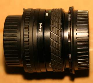
Sigma 28mm f/2.8 Reverse Macro

This is more of a fun little toy than a serious lens. It is a Sigma 28mm f/2.8 that mounts backwards so the part that would normally be pointing out and away from your camera is pointing right into the sensor. This causes a large magnification effect in the area of 1.25x actual size. With this lens I will be able to take larger than life macro shots which is trickier than it appears.

In order to focus the front of the lens (really the back because it is reversed) needs to be one or two inches away from the subject. You can scratch bug photography with this lens off of my subject list. In addition to a close proximity to the subject, a lot of strong light needs to be available. I was using an old 200 watt A/C plug in to the wall light that I had laying around and it seemed to do a pretty good job.

The first instinct of a photographer is to seek out lenses with a large aperture (smaller number, f/2.8 is bigger than f/22). But with a reverse macro there is no real benefit to an f/2.8 aperture due to the paper thin depth of field. When taking some test macro shots I found using the largest aperture yielded the best results. The Sigma 28mm lens has an old Canon FD mount which means it has a physical aperture built right in. This gives me a good idea of what the depth of field will look like before I take the shot.

Here is a macro shot of the back of a dime.

Reverse Macro of Back of Dime

Tamron 28-75mm f/2.8

Tamron 28-75mm f/2.8

This is my new walk around lens for general photography. Before this I was using the Canon 50mm f/1.8, mainly for its large aperture. I feel limited by a prime because I am stuck with a single focal length which dictates my composition choices. I tend to like to zoom in close to things in my images and the Tamron gives me a wide range of options. The large aperture is another favorable aspect which will come in handy for dimly lit scenes. If I am shooting indoors and it is really dim I may just revert back to the 50mm f/1.8 for the extra f/stop of light.

Most people in Internet forums seem to be uneasy about going with off brand lenses, but what really pushed me over the edge for this one is the ranting and raving about the sharpness. Every review I read clamored on about how sharp this lens was and how it went beyond their wildest expectations. And because it is not a Canon brand name lens it is significantly lower in price. How is that for a good deal?

Construnction Equipment

As an added bonus, the Tamron 28-75mm lens lets me get real close physically to my subjects (though not as close as the reverse macro lens) so I can do some outdoor macro shots. Large aperture, extreme sharpness, and macro capabilities: I think this lens is a keeper.

Sigma 70-200mm f/2.8

Sigma 70-200mm f/2.8

Now we are on to the big one. This 70-200mm f/2.8 is meant for action photography. The large aperture allows for really high shutter speeds on bright sunny days so I can capture the clumps of grass that fly up from a football game or a chilling glance from a hawk just before swooping down on it’s next meal. What you can’t tell from the photo is this thing is big with a 77mm filter thread (circumference) and weighing in at 2.8 pounds. After a couple of hours with this thing on the front of my camera my arm begins to get sore. But it is all worth it to capture some great shots. This new telephoto is replacing my beginner telephoto lens, a Sigma 70-300mm f/4-f/5.6 (talk about slow).

Dom throwing football

As a bonus, the seller who sold the Sigma 70-200mm threw in a Sigma 28-70mm f/2.8 for free. The catch is it doesn’t work; when I attach the lens my camera won’t even power up. It just sits there like there is no battery even after checking the battery and checking other lenses. Weird.

Sigma 28-70mm f/2.8

I need to talk to Sigma to see about the possibility of getting it re-chipped to work with my Digital Rebel. Besides, I really like my Tamron version and see myself sticking with it. The Sigma 28-70mm will probably end up back on eBay in due time.

I now feel as though I have a complete lens collection. Sure there may be other great deals that tempt me but I think I have the resistance to turn them down. eBay can be a great place for deals, and all of these lens came from the online auction house for a lot less than it would cost to buy them new. My next step is to take some pictures that I can sell to counteract my case of lens fever.

eBay Countdown Brings Real-Time Bid Tracking

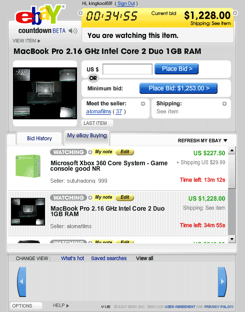
Finally, after all of these years eBay is moving ever so slowly to real time auction tracking. eBay Countdown is the company’s latest feature which uses a slick flash interface to help you track the auctions you are watching in My eBay or have previously bid on. The real-time countdown lets you know how much time is left on your auction down to the second. The biggest benefit is you don’t have to keep constantly refreshing during those heart-pounding final moments. The auction price updates in real-time and shoots up an audio and visual warning to let you know if you are still winning or were just outbid. This can get pretty exciting if you are following a popular auction in the final minutes! If you need to put in a quick bid at the last minute to stay on top you can use the minimum bid button for a one click bid snipe at the next increment allowed. Quick access to photos and shipping information also comes in handy when you are on the fence about a fast-approaching auction.

eBay Countdown Screenshot

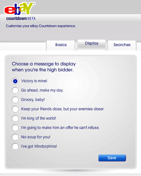
One of the more stranger options is the ability to choose a character to represent you and a victory message for when you are the high bidder. While fun, I’m still left scratching my head about why you would want to create a virtual facade for yourself. They also include desktop shortcut links which come in the form of exe files whose sole job is to add an icon link to the eBay Countdown pop up window. Couldn’t detailed drag and drop instructions work just as well? Downloading an executable file to put an icon on my desktop seems rather silly. And where is no Adobe AIR support so I can’t launch this as a separate application. The ability to bypass my already crowded browser tab-bar would make this a killer app.

eBay Countdown High Bidder Message

The eBay Countdown web application is a great addition to the online auction giants toolkit for bidders. If you weren’t constantly looking up items to try and scoop up a sweet deal, like I do, you probably will now. The real-time information is a joy to have for serious auction tracking making eBay that much more addictive.

If you want to open the countdown app in a seperate tab rather than an annoying pop up window, just use this link http://countdown.ebay.com/countdown/start.jsp

YAML Builder Is Great For Quick CSS Layouts

Most web designs use a classic header, columns, and footer layout, so there is no point in slaving over the details of the basic structure when you are starting a new design from scratch. YAML Builder makes the process quick and easy with a simple WYSIWYG online tool to build out your starting point.

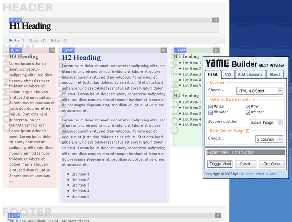
YAML Builder Visual Layout Tool Screenshot

You start out with a basic three column layout and from there you can customize it to fit your specific needs. Choose the doc type (I prefer HTML 4.0 Strict), optional base elements, and the number of columns to start out with. You can specify the widths of various elements choosing between a static width or liquid layout and the source order of the columns. Finally, the fun can begin by adding specific elements like headings, paragraphs, and lists to complete your basic web page. It should be noted that adding the specific content is not as straight forward as I would have expected. You need to click on the ‘Add +’ toggle in the upper left corner of the element before you can drop in child elements. Throughout the whole process you can click the ‘Toggle View’ button to see a real time preview of the final rendered code. When you are all done click the ‘Get Code’ button and the builder will display the HTML code, the base CSS code, and even an Internet Explorer bug fix CSS in a slick modal pop up so you can be off to a great cross-browser start.

YAML (Yet Another Multicolumn Layout) is an open source CSS framework meant to get you up and coding quickly while reducing the tedious detail work associated with CSS design. Download Squad recently reviewed the Yahoo CSS Grid Builder tool which does a similar thing but is much less polished. The YAML builder also offers a greater flexibility with your design as well as using less code in the end.

If CSS has left you a bit dizzy in the head or you simply want a quick place to start, the YAML builder is the best place to go to.

Inspiration: Srown Design Group

Srown.com Screenshot

Srown.com is the home of the stylish Srown Design Group. If you are a design group you most certainly have to look good and the team has pulled it off with this slick black and pink website. I like how the background draws the attention to the middle of the page where all of the content is as well as use of the upper corners for the most important navigation: Home and Contact. Srown has even used a bit of pizazz by fading up new content after you click a link.

Looks aside though, and this site has two big problems. For one, the site doesn’t use separate web pages for each section, instead everything is loaded up front and using JavaScript, Srown replaces the middle container with the content. This is bad design as it prevents linking to specific content. There are ways to incorporate a bookmarkable history of pages using JavaScript like the jQuery history plugin. Also, users with scripting disabled will be limited to the first screen of content since the navigation relies entirely on JavaScript.

Ultimately Srown used the wrong technology for the job. Instead, the team should have used Flash which would be more flexible in developing visual effects. There is also a higher chance of a user having Flash installed compared to having JavaScript enabled since the Adobe plugin is installed in 99% of computers worldwide. Instead, Srown settled for the middle of usability (and the middle is the worst) without taking advantage of the extra benefits Flash had to offer.

As you can see a site can be visually stellar but utter crap in usability. Before ever starting a project it is important to sit down and think things through from a technical stand point to see what different technologies have to offer. So while Srown looks awesome it suffers in usability which brings up the important point that substance beats style out any day.