Posts tagged 'Web'

Pinterest Vs. Gimmiebar

I’ve been on an inspiration curation kick lately. At the end of September, 2011, I signed up for Gimmiebar, a more niche-focused curation site akin to the web 2.0 social bookmarking site del.icio.us. The idea behind the service is when you stumble upon something awesome, be it an image, text, or most videos, you can save it to your gimmiebar using their handy browser extension or bookmarklet. You can find your friends and follow them like any social network and see what they add to their collections in the Discovery section. I must not be following the right people as now and then I will see what others are finding only to come up uninspired. There’s no sitewide search but there is a Notable section that you can peruse.
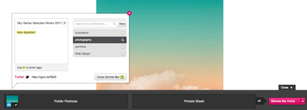
The gimmiebar extension for Chrome or bookmarklet for other browsers (both do the same thing) is slick. Activating your gimmiebar gives you two drop zones for dragging images into: your Public Firehose and Private Stash. Once you add your image you can add it to one or more collections or create a new collection on the fly. You’re given the option to give a description and tagging is done inline by adding a # before a word.

Gimmiebar does a really good job of being quick and painless. I also like how they save a copy of the image or website incase the original source should go offline. You can even hook up your Dropbox account and have your saved images saved to the cloud as another backup.

Overall Gimmiebar has good tools for personal curation but lacks in the social aspect. I’m sure this will get better over time as more and more people start using it.

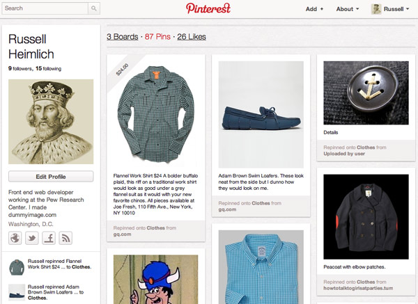
Pinterest, on the other hand, has a huge focus on socially sharing interesting things found on the web. You create boards which you pin different things to. Your friends can see what you have pinned and even repin it to their boards. Repinning is just like reposting on Tumblr or re-tweeting on Twitter.
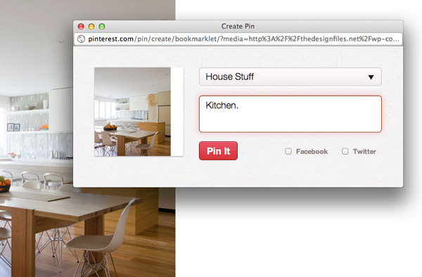
My favorite feature of Pinterest is their search feature, which works well. Just enter a term and you get back a large swath of different images to pore over. Since the community is so active, you will want to keep checking your favorite searches for new inspiration. Commenting is also there but I don’t see much conversation occurring on pins.

Pinterests audience is heavily female oriented. There is a lot of fashion, do-it-yourself crafts, wedding, recipes and decorating pins going through my stream. But that’s ok because there is also a lot of robots.

With all the buzz surrounding Pinterest and their traffic numbers going up and up every month, it’s no wonder the site can slow down to a crawl from time to time. Ingesting and searching through all of those images is a tough job for any systems engineer at Pinterest’s scale. Hopefully that $27 million in funding will ease some of their growing pains.

So while both invite-only services are based around the same concept, curating inspiration, I’ve found myself using both for different purposes. Gimmiebar is more for my design/photography/art inspiration while Pinterest is for collecting fashion and home ideas. Kristina is also on Pinterest and we share a board which is fun to pin stuff to when I find interesting stuff for her. It’s also neat to learn about your friends based on what things they collect.

Be sure to give both sites a try. I have plenty of invites for both. You can find me on Gimmiebar and on Pinterest.

List Of Dummy Image Generators

Ordered by when the domain name was registered.

  1. http://dummyimage.com (2007-07-20)
  2. http://fpoimg.com (2010-01-26)
  3. http://www.ipsumimage.com (2010-02-03)
  4. http://nosrc.net (2010-02-04)
  5. http://placehold.it (2010-02-04)
  6. http://placekitten.com (2010-11-22)
  7. http://placehold.us (2011-01-14)
  8. http://placedog.com (2011-03-01)
  9. http://flickholdr.com (2011-03-05)
  10. http://placesheen.com (2011-03-07)
  11. http://lorempixum.com (2011-03-23)
  12. http://placepuppy.it (2011-04-11)

Other Dummy Image Generators that I couldn’t figure out when they were created

I’m glad dummyimage.com inspired others to build a placeholder image service and expand upon my original idea. You can download my source code and do whatever you want with it.

Thanks to Web Resource Depot for the round-up where I first heard about many of these sites.

CloudFlare Can Boost Sites Performance For Free

Website performance is a big deal. Experiments conducted by the biggest websites on the net conclude page performance is directly related to revenue. Bing.com found a 2 second slow down equals a 4.3% reduction in revenue per user. A 400 millisecond delay on Google search pages led to 0.59% fewer searches per user. Aol found users who experience the fastest Web page load times view 50% more pages per visit than users experiencing the slowest page load times.

Content Delivery Networks (CDN) can be a big boost in page speed by 1) saving a copy of the fully-rendered page and 2) serving that copy from a server as close to the user as possible. Big CDNs like Akamai and CacheFly charge hundreds of dollars a month at the minimum. CloudFlare, a new  start-up, is hoping to change that by offering a CDN for free. I tried it out with two of my sites, this blog and dummyimage.com, and below are my findings.

Setting up CloudFlare with my sites was a breeze. All you have to do is change some DNS settings to route your traffic through their servers. Since I use Dreamhost as a host, CloudFlare made it even easier by hooking into Dreamhost’s system to make the changes for me. An e-mail with the original DNS settings was also sent as a backup in case I wanted to revert back. Within 5 minutes, I was up and running.

Dummyimage.com saw the most benefit from CloudFlare as it serves up dynamically generated images. Once that image was cached, any subsequent requests for that URL would be for a static image without needing PHP to create it. Dummyimage is popular and the reduced load on my measly shared servers was noticeable.

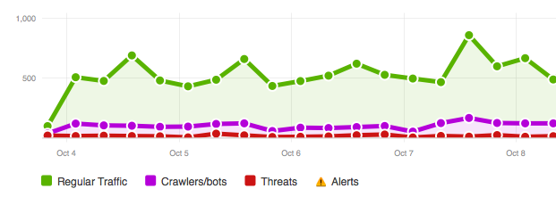
CloudFlare provides a bunch of stats for monitoring the amount of traffic going through their network as well as the bandwidth saved.  In my case, for both of my sites, I’ve saved 11.5 gigbytes of bandwidth on 23,985,639 requests in 14 days.

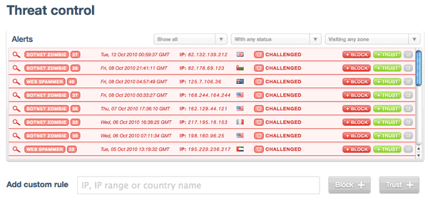
Another advantage of CloudFlare is the security aspect. The network will identify and block threats ranging from botnet zombies to web spammers. CloudFlare presents suspected threats with a captcha and a chance for the user to leave a message if they might have been falsely accused. Part of their stats lets you see all of the threats including ones that passed the captcha and/or left a message. So far I have seen no false positives.

So while things have been mostly great, there are a couple of drawbacks. For one, the service is still figuring things out. There was about 50 minutes of downtime when all sites running through CloudFlare were inaccessible. It didn’t irk me too much. I figure I can’t really complain when the price is free. Another issue is the stats take forever to load. The stats for the free version are delayed 24 hours on purpose, but several times when trying to access the statistics dashboard the site would timeout.

Because all of the traffic is now coming from the CloudFlare servers, any code on your end that relies on the IP address of the end user will need to tweak their code. CloudFlare has a simple guide for how to do this on their wiki.

So if you’ve made it this far you’re probably wondering, “should I run my site through CloudFlare?” If you run a personal site and can live with a little downtime here and there, then absolutely. If your site is your sole means of income and any downtime causes your blood to boil, then you should probably find a more trusted CDN (and expect to pay for it). You could always experiment with it over the weekend for a couple of days and then switch back if you run into problems.

Content Delivery Networks bring a big performance boost to a site and with a free one out there like CloudFlare, there’s no excuse to not be using one.

Custom Clothing Makes A Comeback

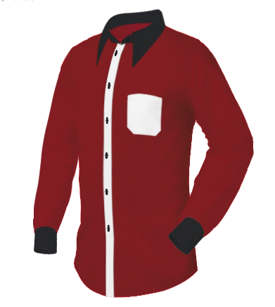
CrunchGear recently opened my eyes to ShirtsMyWay.com, a site that lets anyone customize a dress shirt to their exact specifications. The minutia of details that one can pick and choose from is dizzying including the type of fabric; the design of the collar, cuffs, yoke, back, bottom, and pocket; type of buttons, button holes, collar stays, or a monogram; and, of course, the size of the shirt. Coming in at $75 per custom shirt at least, ShirtsMyWay.com is too rich for my blood. Besides, I’m not that great of a shirt designer.

But the site took me back to the days of the dotcom boom where I would spend hours on Customatix.com. The company was started by four Adidas executives in 2000 with the aim of letting anyone create a completely customized shoe. You could pick from a bunch of different styles, choose the colors of various pieces, have your name stitched on the back, pick the laces, and even add a logo from their huge library. I remember making a whole virtual closet full of shoe designs that I had no intention of actually purchasing. I guess that’s why they’re no longer around. Though I did get a friend a gift certificate to the site for her birthday and she did design and order her own custom-made shoes.

On the brighter side, it looks like Customatix inspired the wave of hideous MySpace profiles later in the decade.

5 Links Of Interestingness

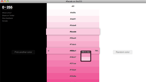
http://0to255.com/ – “0to255 cures your color manipulation woes. Simply pick the color that you want to start with and 0to255 gives you a range of colors from black to white using an interval optimized for web design. Then, just click the variation you want to use and the hex code is automatically copied to your clipboard.” My favorite part is that it uses a RESTful API so you can do things like http://0to255.com/0099ff You know I just love things that you can manipulate with a url.

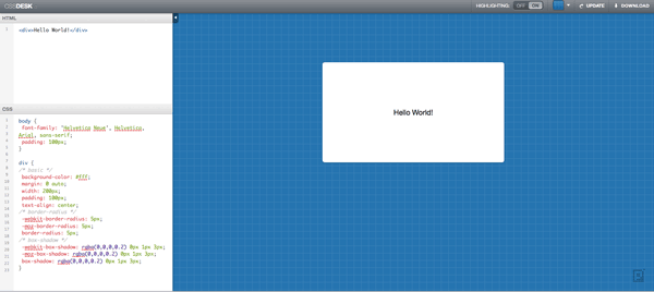
http://cssdesk.com/ – A tool for quickly mocking up snippets of HTML/CSS. I would prefer to just create a new HTML file in Dreamweaver and play with it using Firebug, but this could work too. I found the cursor in the HTML/CSS box to be a little off when hitting return. CSSdesk has a nice interface which is almost like a desktop application. And since you can download it and run it locally, I guess it qualifies as a genuine application.


Please Do Not Change Your Password – Alot of security’s best practices cause more problems than they solve. “At countless conferences and seminars, experts have consistently called for more education and outreach as the answer to user apathy or ignorance. But the research of Herley and others is causing many to realize most of the blame for noncompliance rests not with users, but with the experts themselves — the pros aren’t able to make a strong case for all their recommendations.”

Holistic Web Browsing: Trends Of The Future – “The future of the Web is not at your desk. It’s not necessarily in your pocket, either. It’s everywhere.” How do we design for a Web that was only intended to be used in a single context?

WTF? (Video) – “This clip comes from Hard Ticket to Hawaii, possibly the worst 1980’s movie made (though to be fair, it’s tagline of Bombs, Babes, and Beaches is quite… radical).” At first I thought the acting was WTF, then I saw the ending.

“How many SEO copywriters does it take to change a lightbulb, light bulb, light, bulb, lamp, bulbs, flowers, flour…?” — Chris Rowe

A List Of Weird Song-Site Memes

trololololololololololo.com has been making the rounds around Twitter the past couple days. The site shows a Russian man singing a cheery song in what I assume to be Russian. How could you not listen to it over and over? Justin Erik Halldór Smith has a good write-up about the background of this video on his blog if you want to read all about its history.

Seeing this site reminded me of a few other wacky-song memes that made their way across the Internet. If you like trololololololololololo.com, you’ll like these similiar sites. All of them are songs and most of them loop infinitely. Enjoy!

http://www.lalalalalalalalalalalalalalalalalala.com/

http://www.iiiiiiii.com/

http://www.ooooiiii.com/

http://www.dabadabadab.com/

http://www.lalalaa.com/

http://www.leekspin.com/

http://www.manamanadoodoodoodoodoo.com/

http://breadfish.co.uk/

http://www.getonmyhorse.com/ & http://shutupwomangetonmyhorse.com/

http://www.hristu.net/

All of these sites descend from badgerbadgerbadger.com which first launched in September, 2003.

Dummyimage.com Sees A Surge In Interest

Way back in August of 2007 I built a simple PHP tool that generates place-holder images at different size by simply changing the URL. The idea came to me when I was working on a redesign for USNews.com. I hated opening up Photoshop, creating a new document,  filling the background layer, and exporting for web just to make a simple placeholder image. That is why I made dummyimage.com.

I figured it would be useful to other people which is why I also released the complete source code, documented and including instructions for setting it up on your own server. But like most new things, few gave it any notice.

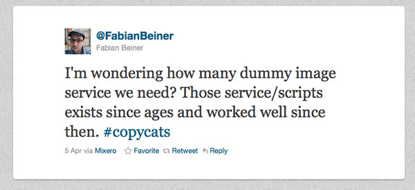
The other day my friend Charlie Park (founder of Pear Budget) found it when doing some in-browser wire-framing and sent out a tweet to all of his followers. But he didn’t stop there. Charlie also posted it to Hacker News, a simple news aggregator aimed at geeks. It was obvious that my little tool was resonating with other developers with the tagline “Lorem ipsom for images.” In 24 hours, the Hacker News story got 161 votes with 77 comments, 513 people bookmarked it on del.icio.us, and 337 tweets.

What really struck me was how dummyimage.com was crossing the language barrier. I saw tweets mentioning in SpanishJapanese, Russian, German, Dutch, even Latvian. I’m glad my idea was simple enough that foreign speakers could easily pick it up without any translation help.

All of this sudden attention also produced helpful feedback and new feature ideas. I started working on an update this past December for a few additions I wanted to see but this recent surge of interest has lit a fire under my butt to continue developing. As is the nature of opensource software, people don’t have to wait for me; they can adapt the code to their own needs. Here are some iterations that have already been made:

And somewhere down the line I would like to give it an attractive homepage. Hooray for side projects!

AOL Goes MTV With Latest Rebranding

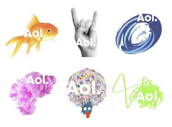
Aol rebranding logos

AOL offered a glimpse into their re-branding today and most of the web was left dazed and confused (55% of the respondents to a RedWriteWeb poll hated it). AOL simply decapitalized the “O” and the “L” and added a dot at the end. While the logo itself will stay the same, the background will change continuously foregoing a traditional mark.

It’s certainly an off-kilter strategy but a good fit for a company trying to reinvent itself. I’m a fan of the new look.

The dot part wasn’t really explained well in the media coverage. Aol. plans to brand their various properties like Aol.Shopping and Aol.Mapquest. It’s meant to tie all of Aol.’s vast content together.

As for the random background images, I think it is fun and keeps things interesting. Bing is doing the same thing with their background images on the main search page and Google’s doodle logos are in a similiar vein. MTV, a company outside of the Internet space, is famous for the many variations of it’s logo. Aol.’s re-branding strategy certainly isn’t anything new and in fact feels more like the front end of a trend.

Various MTV logos

While Aol.’s re-branding efforts are modern and edgy now, I doubt it will have the lasting power of their previous branding.  It’s not perfect but it’s just what the company needs as it prepares to go alone as it spins off from Time Warner. Besides, look how many people are talking about the company after so many years of media obscurity.

Grooveshark 2.0 Keeps Getting Better

My favorite online streaming music service just keeps on getting better. Today Grooveshark gave their VIP members a peek at their new 2.0 release.

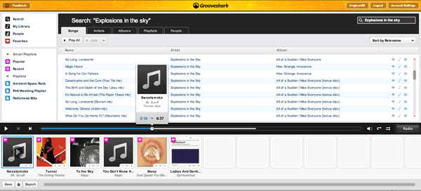
Grooveshark 2.0 Screenshot

According to their blog post these are a few of the major enhancements.

  1. A brand new interface: almost everything has changed in the visual look and feel
  2. Add any song on Grooveshark to your library without uploading
  3. Sorting: You can now sort lists by Song Name, Artist Name or Album Name
  4. Drag-and-drop playlist editing
  5. Themes: Make Grooveshark look the way you want
  6. Improved player: more room for your songs
  7. Better caching: back and next should be much faster now
  8. Seeking: now you can skip to your favorite part of a song with the click of a mouse.

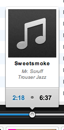
Seeking in Grooveshark 2.0
The seek bar lets you jump to any point in a song.

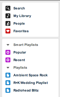
Left side navigation Grooveshark 2.0
The left side navigation lets you seperate different groups of music for easy access.

Bigger album art Grooveshark 2.0
Bigger album art puts the current playlist front and center.

The new interface is a joy to use. The new sorting options and the ability to jump around to any point in the song make Grooveshark like an online version of iTunes that has an Internet-wide shared library. Bigger album art is a nice upgrade over the thumbnails used in the old interface. It used to be a pain going through your favorite songs but now you can add them to your library (which has much more robust sorting options) with the click of the music note icon. New themes are interesting to keep things fresh. I imagine there will be dozens more added over the next few months.

One of the new features I stumbled on that wasn’t mentioned everywhere were RSS feeds. Right now there are three: Songs I Favorite, Songs I Listen to, My Zeitgeist (which is empty at the moment). It would be nice to see Grooveshark automatically send song info to your Last.fm account.

The only other feature really missing from Grooveshark is a hook in the player for controlling it with global shortcuts. I would really love to set up a key combo to play/pause, skip tracks, and favorite tracks without ever bringing the app into focus. The best part is how Grooveshark listens to their community through Get Satisfaction.

I’m confident this is only the beginning of improvements and I’m glad I plunked down my $30 for a year of VIP membership.

Perhaps The Greatest T-Shirt Ever Made

Threadless.com, the user submitted/public chosen t-shirt store, is my favorite source for shirts. I’ve built up quite a collection over the years; 19 to be exact. But this shirt tops them all…


Three Keyboard Cat Moon T-shirt from Threadless.com

Now if you’re not up to date with the latest Internet meme’s you might be a bit perplexed right about now. Allow me to explain. This shirt is a combination of two viral Internet sensations.

The first is a YouTube video of a cat playing the electronic keyboard dubbed “Keyboard Cat

The video has nearly two-million views and has become even more popular by people splicing it to the end of blooper clips as if to “play” that person offstage after a goof or follie. These have become known as Play Him Off, Keyboard Cat videos and PlayHimOffKeyboardCat.com has the best collection of all of them.

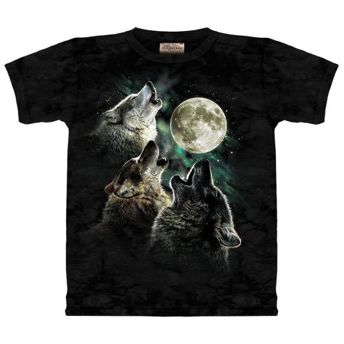
The second meme in this shirt is from the Three Wolf Moon t-shirt

Three Wolf Moon T-shirt

The shirt became popular for it’s sarcastic reviews promoting the great things that have happened to the people who bought the shirt. Hundres of comments were posted like this one, making the shirt an Amazon best seller

“I admit it, I’m a ladies’ man. And when you put this shirt on a ladies’ man, it’s like giving an AK-47 to a ninja.”
– T. Huynh “photo bum”, Amazon reviewer

The shirt managed to get over 9,000 diggs and a dedicated song thanks to CollegeHumor.com.

So now you can see how that is one of the best t-shirts ever made. But this shirt also made history of it’s own by being the fastest trending t-shirt in Threadless.com’s 9 years of operation.

“This design was submitted, and before we even noticed we saw it start to trend on Reddit. We put it up for scoring and it started gathering up 5’s faster than we could ever imagine. Over just one weekend Three Keyboard Cat Moon accumulated more scores than any other design in 9 years of Threadless history and the highest average score to boot. We listened and put it up for sale immediately. This is the first time we’ve actually ended scoring early in favor of printing the design.”
– Jake Nickell, Threadless founder

The shirt is $20 and I just ordered mine using a gift certificate from a former colleague. Don’t be surprised if they sell out faster than the keyboard cat can play you off. Satirical irony FTW!