Posts tagged 'Web'

YOUZ CAN HAS JOB?

No Jobs For Kitteh!

A New York web design start up put a want ad on Craigslist.org for a LOLCode developer. LOLCode is the humorous programming language inspired by the grammatically-discombobulated LOLCats.

YOU CAN HAS CHEEZEBURGER?
YOU HAS A FLAVUR?
If so, you may be the right fit for this Midtown Manhattan Web Design Startup! We are a small company looking for a Senior LOLCode Developer, preferably with at least 1 month experience developing LOLapps. Please send a resume, along with links to any web-based LOLapps you have developed.

KTHXBYE

LOLCat This Is Mah Job

As the creator of LOL translator, TXT2LOL.com, I had to send a response:

Hiya!
i’s a web developer wif excellent LOLCode skillz. I builded a lolcat trahnslatah which currently resides at txt2lol.com doan youz think iz cool?
bai

I imagine the are getting a large number of responses considering it was featured on BoingBoing and the original ad is now gone.

I’m In Your Office Earning Your Salary

Ebay Vs. Amazon: Which Is Best To Unload Your Junk

Ebay Vs. Amazon: Which Is Best To Unload Your Junk
The Internet is great for connecting people across the world and exchanging junk that is usually sitting in the corner collecting dust. eBay and Amazon are the premier online trading centers but which one should you use? I’ve used both over the past month and here are my thoughts.

eBay

eBay is great for special, rare, or unique items; everything else is usually goes for a a bargain price. People go to eBay looking for a steal and mass items are hard to compete with against the pro eBayers who get their stuff at wholesale. But if you’re goal is simply to get rid of your clutter with any money being a bonus, then eBay will work for you.

In order to make a thorough auction posting, be prepared to set aside some time for research during the listing process. eBay buyers want lots of information and clear pictures so they know what they are getting in to. When I listed some auctions at the beginning of October it was taking me about an hour and a half per auction including taking and processing pictures, writing a clear and concise description, and researching similar auctions for comparison. Mike Panic guest posted at GetRichSlowly.org with tips to maximize the profits of your eBay auctions.

eBay charges a fee
to list your item and a final value fee when your item sells. On top of that, if you use PayPal to receive payment, you will get a fee tacked on to that to. There are extra fees for special upgrades like boldening your item in the search results and extra super size pictures. These upgrades eat up your profit and do not provide any extra value. The only extra that should be considered is adding a gallery image which shows a thumbnail of your item in the search result.

Amazon

When talking about Amazon, I am not talking about their auctions product, but rather the sellers marketplace. Amazon made it’s name selling books which it trumps eBay over. The process of listing a book is a simple three steps including searching for the book, entering the condition and your price, and hitting submit. Then you’re thrown into the mix with other sellers vying to list the lowest price. When you get a sale, Amazon emails you a reminder to ship it in 2 business days and provides a shipping credit. There is less flexibility to differentiate yourself compared to eBay but the listing process is much, much quicker.

Amazon lets you choose three shipping options to offer for your item: the standard shipping rate of $3.99, an expedited shipping rate of $6.99, and an international shipping rate of $12.99. I suggest offering all three as it broadens your possible audience. You might think the shipping credits are a little low, but for standard shipping use media mail/parcel post, and for expedited and international use a priority flat rate envelope. Then your shipping costs will be below the issued shipping credit!

Amazon Marketplace fees are more straight forward compared to eBay. There is no fee to list your item. Fees are only collected when your item sells where Amazon takes 6-15% of the sale price, a $0.99 transaction fee, and a variable closing fee. Before you list your item Amazon lets you know how much profit you can expect if your item sells and you are free to make changes at any time.

Conclusion

In the end I use Amazon Marketplace for media items like books, movies, and video games with eBay for everything else. To help you figure out which option is better for your stuff check out these useful fee calculators:

Survey Results About The Web Industry

The popular online web magazine, A List Apart, conducted a survey of web professionals in April 2007 via their website. This week they finally released the results in a massive, though well designed, 80+ page PDF.

Being the first major survey of the web industry, I, and many others I’m sure, was anxious to see how I stacked up. The survey focused on the core areas of classification (gender, ethnicity, location etc.), education, work and job titles, and money. There are too many findings to even begin listing here but the PDF does a great job at explaining their conclusions with many, many graphs. Speaking of data, A List Apart is giving away all of the anonymized raw data for people to dig through and reach their own conclusions.

A List Apart 2007 Web Survey

I can’t wait to see the results from the next survey to compare the changes in the industry from this year.

Two Website Makeovers: Barnes & Noble And Newsweek

Watch out web world, two big brands recently gave their sites a new look. Book hawking company Barnes & Noble added some web 2.0 niceties while Newsweek cleaned itself up under the hood and added a bit of polish to the front end.

Barnes & Noble

The old Barnes & Noble site was cramped and flat although not terribly hideous. A little design tweaking and a couple of new features later and what we are left with is a more presentable homepage with large, soft buttons and a larger but better organized navigation bar. The top 10 book list on the right side of the homepage sports an interesting cut-off styling that is pretty cool. The featured books have more information available up front making a more compelling reason to buy them as browsers scroll over them. They even added a tag cloud which is a neat web 2.0 gimmick that lasts about 5 minutes as very few actually navigate that way.

Why anyone buys books online at anywhere except Amazon.com is beyond me, but for those that like to venture off the beaten path, Barnes & Noble is a breath of fresh air.

Barnes and Noble Redesign Screenshot

Newsweek

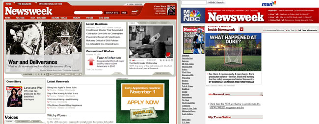
The popular weekly news magazine pushed out it’s new look a couple of days ago and boy did it need it. The old site was table based with tables inside tables inside tables. The redesign introduced clean modern HTML code that is nicely formatted to boot. On the front end, content on the homepage is easier to navigate when skimming through headlines without feeling cluttered by a boxy table layout like before. Newsweek is using a lot more Flash and multimedia components. Those extra touches of sparkle come at a cost though as the site relies on 14 external JavaScript files which surely slow down the loading of the page.

The web wasn’t the only thing getting a face lift, the magazine saw a touch up as well. Newsweek editor Jon Meacham called the magazine redesign a refinement rather than a revolution featuring a cleaner visual presentation with more room for content. Meacham believes the magazine should be less like web content which is generally delivered in short bites with the print edition featuring lengthier columns with more in depth coverage. It will be interesting to see what happens in the print world over the next 18 months as more people become accustomed to getting their news online rather than in a weekly dead tree sent to their mailbox.

Newsweek Redesign Screenshot

Redesigns for big sites is an even bigger challenge but Barnes and Noble and Newsweek did a fine job. Enhancing the user experience is crucial as the web becomes more crowded with competitors biting at the tooth to win away unhappy patrons. So now that they have made the leap to the modern era of websites, it’s time they get cracking on their next iteration which will surely be due sooner rather than later as the web moves on at its blistering pace.

Hide The Pink Shirt Guy

The Internet seems love photos of seemingly normal things in a weird context. For example, take the tourist of death image that made its way around the Internet via e-mail a couple of years ago.

Tourist Of Death

Many believed this photo was legitimate but according to online urban legend debunking site Snopes.com, there were too many physical and logistical errors with the image. Hence forth, the Internet began making mashups putting the tourist image into various other situations.

The pink shirt guy is the same sort of meme. Take a look at the original photo…

The Pink Shirt Guy

The scene looks rather serious and yet pink shirt guy breaks up the drama with his calm demeanor and smooth yet refreshing attire. No one seems to know who pink shirt guy is but it certainly has sparked a series of mashups with his image popping up in a variety of places.

HidePinkShirtGuy.com hopes to take the fad offline by providing various printable versions that people can use to hide in the real world. The site accepts submissions of the pink shirt guy blended into the real world with the best rated photos featured on the homepage. That’s about all there is to the site but it was mentioned on TechCrunch in a post about web 2.0 bubble indicators.

So like the site says, join the revolution by making your own pink shirt guy and hiding him somewhere in the real world.
Pink Shirt Guy Vector

eBay Countdown Brings Real-Time Bid Tracking

Finally, after all of these years eBay is moving ever so slowly to real time auction tracking. eBay Countdown is the company’s latest feature which uses a slick flash interface to help you track the auctions you are watching in My eBay or have previously bid on. The real-time countdown lets you know how much time is left on your auction down to the second. The biggest benefit is you don’t have to keep constantly refreshing during those heart-pounding final moments. The auction price updates in real-time and shoots up an audio and visual warning to let you know if you are still winning or were just outbid. This can get pretty exciting if you are following a popular auction in the final minutes! If you need to put in a quick bid at the last minute to stay on top you can use the minimum bid button for a one click bid snipe at the next increment allowed. Quick access to photos and shipping information also comes in handy when you are on the fence about a fast-approaching auction.

eBay Countdown Screenshot

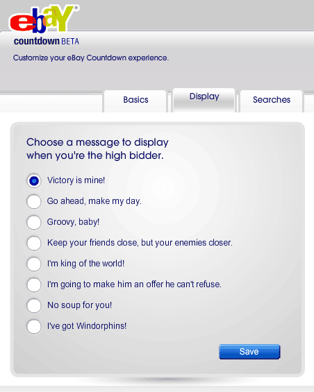
One of the more stranger options is the ability to choose a character to represent you and a victory message for when you are the high bidder. While fun, I’m still left scratching my head about why you would want to create a virtual facade for yourself. They also include desktop shortcut links which come in the form of exe files whose sole job is to add an icon link to the eBay Countdown pop up window. Couldn’t detailed drag and drop instructions work just as well? Downloading an executable file to put an icon on my desktop seems rather silly. And where is no Adobe AIR support so I can’t launch this as a separate application. The ability to bypass my already crowded browser tab-bar would make this a killer app.

eBay Countdown High Bidder Message

The eBay Countdown web application is a great addition to the online auction giants toolkit for bidders. If you weren’t constantly looking up items to try and scoop up a sweet deal, like I do, you probably will now. The real-time information is a joy to have for serious auction tracking making eBay that much more addictive.

If you want to open the countdown app in a seperate tab rather than an annoying pop up window, just use this link http://countdown.ebay.com/countdown/start.jsp

Adobe.com Had A Security Hole

Adobe.com Gave Anyone Server Access
Earlier this morning a friend sent me a link he found on Reddit that pointed to a very large security hole on the Adobe.com website. It has since been patched but I thought I would take some time to explain a little bit about how it worked and how it could have been exploited further. The problem was due to a lack of sanitizing a URL path passed as a query string from the Shockwave download page to a Perl script for back end processing.

A hacker could use this flaw to enter a local server path in the query string and get the server to spit back information about itself like file directories, usernames and passwords, and even important encryption keys. The following URL used to return a long string of what appears to be garbled text.

http://www.adobe.com/shockwave/download/download.cgi?P1_Prod_Version=
../../../../../../../../../usr/local/apache/conf/ssl.key/www.adobe.com.key%00

What was happening was the path goes up to the root level of the server (the series of ../’s) and then into the local apache configuration files. Here the private encryption key used to encrypt SSL traffic would be exposed.

Whenever you conduct a secure transaction over the web, like giving a website your credit card information for a purchase, the traffic gets encrypted so it cannot be intercepted between the server and your computer. This keeps your confidential information safe and prevents a third party from sniffing your traffic to see what you are sending or receiving. You can tell you are using a secure connection by the yellow lock icon used in most browsers and the https:// instead of http:// in your address bar.

For this connection to work the server needs to have two keys; a public key and a private key. The public key is sent to your computer which it uses to encrypt a random number to send back to the server. A private key is kept on the server which is the only key that can decrypt the random numbers sent from your computer. From this transaction, both parties can generate key material used in encrypting and decrypting data. When an attacker looks at traffic over an SSL connection it looks like completely random and garbled text with no discernable pattern to it. The server and client can easily decrypt the garbled text putting it back to the original plain text.

Releasing the private encryption key of a web server into the wild compromises security allowing a 3rd party to easily decrypt SSL traffic or impersonate the server to perform a phishing attack. Adobe’s security hole wouldn’t directly break anything right away but a malicious user could use the flaw to probe for other weak spots and conduct an attack on those. Such attacks could expose personal data or intercepting sensitive traffic.

When coding a web application it is a good idea to build in a sanitize function that will strip out any non-alphanumeric characters like backslashes and periods. This can be done easily with a regular expression like replace(/\W/ig,””) that is common to most any programming language. This regular expression would change this ../../../../../../../../../usr/local/apache/conf/ssl.key/www.adobe.com.key%00 to this usrlocalapacheconfsslkeywwwadobecomkey00 . For more help with regular expressions check out this great tool I found.

For more information about SSL and Public Key Cryptogaphy check out Security Now Episode #34 Public Key Cryptography and Episode #85 Intro to Web Code Injection.

UPDATE: The Register has a complete write up about the security leak.

YAML Builder Is Great For Quick CSS Layouts

Most web designs use a classic header, columns, and footer layout, so there is no point in slaving over the details of the basic structure when you are starting a new design from scratch. YAML Builder makes the process quick and easy with a simple WYSIWYG online tool to build out your starting point.

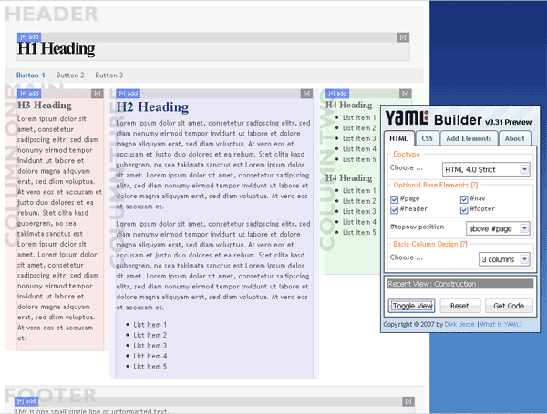
YAML Builder Visual Layout Tool Screenshot

You start out with a basic three column layout and from there you can customize it to fit your specific needs. Choose the doc type (I prefer HTML 4.0 Strict), optional base elements, and the number of columns to start out with. You can specify the widths of various elements choosing between a static width or liquid layout and the source order of the columns. Finally, the fun can begin by adding specific elements like headings, paragraphs, and lists to complete your basic web page. It should be noted that adding the specific content is not as straight forward as I would have expected. You need to click on the ‘Add +’ toggle in the upper left corner of the element before you can drop in child elements. Throughout the whole process you can click the ‘Toggle View’ button to see a real time preview of the final rendered code. When you are all done click the ‘Get Code’ button and the builder will display the HTML code, the base CSS code, and even an Internet Explorer bug fix CSS in a slick modal pop up so you can be off to a great cross-browser start.

YAML (Yet Another Multicolumn Layout) is an open source CSS framework meant to get you up and coding quickly while reducing the tedious detail work associated with CSS design. Download Squad recently reviewed the Yahoo CSS Grid Builder tool which does a similar thing but is much less polished. The YAML builder also offers a greater flexibility with your design as well as using less code in the end.

If CSS has left you a bit dizzy in the head or you simply want a quick place to start, the YAML builder is the best place to go to.

A Summary Of The MediaDefender Events

MediaDefender is a company that provides services for large media companies in an effort to stifle peer-to-peer and BitTorrent transfers. The main method used by MediaDefender is to flood the network with fake files of the alleged copyrighted work making a downloaded version worthless to the downloadee as well as wasting their time and bandwidth.

In February, MediaDefender launched a fake video sharing site called Miivi.com. The site was created solely to trap users who uploaded copyrighted material of MediaDefenders clients. Once the news leaked of MediaDefenders honeypot project, Miivi.com was shut down and displays a placeholder page to this day.

On September 14th, internal e-mails of the company were leaked onto BitTorrent by a group called MediaDefender Defenders. The e-mails include various FTP and database logins as well as lists of their decoy/entrapment trackers, decoy strategies, the effectiveness of their fake torrents (in many cases with a breakdown of success, title specific), high and low priority sites, .torrent watchlists, and information on their monitoring of competitors. There was even reaction to TorrentFreak breaking the news about MiiVi.

From: Ben Grodsky
Sent: Tue 03-Jul-07 20:19
To: MIIVI; Randy Saaf; Octavio Herrera; Steve Lyons
Subject: MiiVi got Dugg

Looks like the domain transfer has screwed us over:
http://torrentfreak.com/anti-piracy-gang-launches-their-own
-video-download-site-to-trap-people/
http://digg.com/users/AcePup/news/dugg

-Ben

This is really fucked.
Let’s pull miivi offline.

The 700Mb worth of e-mails were acquired by guessing the password to a Gmail account used as a backup for the company e-mails.

With MediaDefender’s internal e-mails spread out all over the Internet, groups of peer-to-peer loyalists poured over every detail. With various servers exposed MediaDefender Defenders managed to leak the source code of the anti-piracy tool used by MediaDefender to spread their fake files across many peer-to-peer networks. This is a huge blow to the company’s efforts to protect the intellectual property of large media companies as p2p hosts can fortify their systems against floods of fake media and torrent files.

This is a firm warning to any other p2p media protection companies. If you mess with the technologically savy peer to peer groups be prepared for some harsh retaliation. I still believe that there is no effective way to fight piracy on the Internet once it is leaked. Fighting the pirates will only make them multiply and mock you like the Pirate Bay is doing tight now.

(X)HTML Elements Best Practice Chart

With so many HTML elements at our coding disposal it can be a daunting task to make sure we are using the right ones for the right task. For example do you use the <abbr> tag for abbreviations? Or <del> for deleted text (If it’s deleted then why do you need to mark it up anyway?)

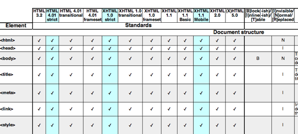
Keryx Table Info

Keryx has the mother of all semantic-info tables. Details include which standard the element is a part of, block/inline/table display, semantic meaning, usability & accessibility, best practice, SEO notes, notable browser issues, and unstyled appearance. PDF and Open Office downloads are included so you can print it out for reference. Make sure you’ve got plenty of ink and paper as this reference stacks up to 11 pages. Well, maybe it isn’t that big of a deal, but it is nice to have close at hand when you are marking up a page.