I Survived The 2009 Silver Spring Zombie Walk

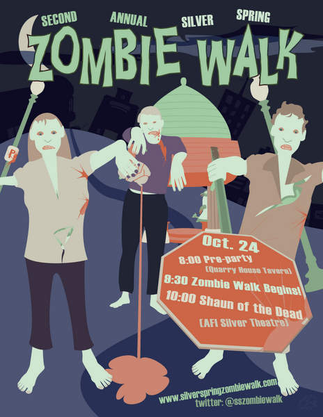
Silver Spring Zombie Walk Poster

The 2nd annual Silver Spring Zombie Walk took place last night. Hundreds of people got dressed up in ghastly zombie outfits and proceeded to lurch from the Quary House Tavern to the AFI Theater for the 10pm showing of Shaun of the Dead. I ventured out among the crowd purely for the photo opportunities though I did wear my zombie shirt from Threadless underneath of my jacket to keep with the theme.

Throngs of zombies taking to the streets of Silver Spring, Maryland.

Traffic came to a stand still as the large group maneuvered through downtown Silver Spring. I’m sure most motorist didn’t mind gazing at the group of walking undead.

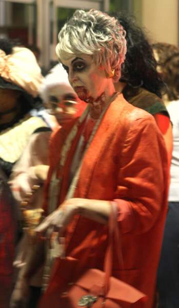
Zombie in search of brains and supporting death panels.

There were no two zombies alike and a wide range of ages. The participants would lunge at onlookers and bang against store windows all while moaning “Brraaaaaains!”

Bloody zombie giving me the evil eye.

Zombies carry outfitted-coordinated accessories.

Some of the costumes that stuck out at me (but I failed to get a photo of, luckily others did) were an Abraham Lincoln zombie, a Where’s Waldo zombie, and an MC zombie.

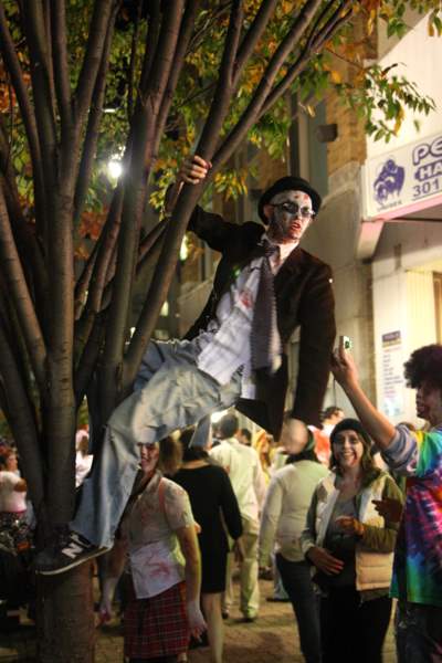
Zombie hanging from a tree.

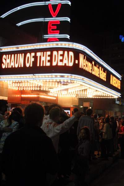
Once everyone got to the theater, tickets for the 10pm showing were long gone. Lucky for them there was an 11:45 showing. I didn’t come for the movie so I didn’t mind. I got some good pictures under the bright lights of the AFI Theater.

Shaun of the Dead playing at the AFI Theater after the 2009 Silver Spring Zombie Walk

More of my photos can be found on

Of course there were copious numbers of cameras covering the festivities from every angle and medium. Below are links to other media coverage.

At The Strathmore All Decked Out

0_IMAGE_691.jpeg

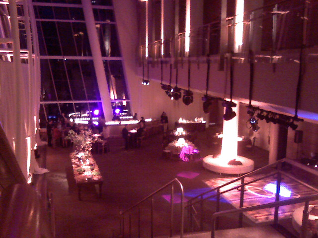
Tonight was Strathmore’s showcase night where they set everything up like a wedding reception. We got to sample the food and talk to a few vendors. It was way beyond gorgeous!

Which Android Phone Is For Me?

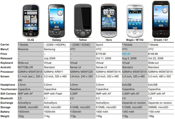
Android has been really gaining steam these past couple of months. Yesterday, Techcrunch posted a thorough list of Android phones covering everything current through the rumored ones.  It’s great to see everything laid out in one place which highlights one of the platforms strengths: diversity. Some are big, some are small, some have keyboards, some are all screen. The downside is finding the right phone which encompasses everything I want.

Android Comparison Chart

Nearly a year ago I said all I wanted was “a Dash form factor running the Android OS with 3G support.” A lot has changed since then, including my expectations of phones. It is clear the Dash form factor won’t be coming with Android anytime soon. Rectangular screens are the norm which is better for web browsing and typing messages. Every Android phone being released from now on has 3G support since smartphones are built with higher-margin data plans in mind. Carriers like that. So it should be no problem finding an Android phone for me, right?

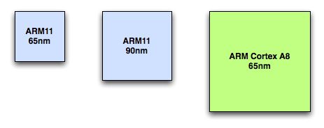
Wrong. The only Android phones available as of this writing are the G1 and the myTouch3G, both of which are on T-mobile. They both have been labeled as “slow” and somewhat clunky. I played with the myTouch3G for a bit and realized the screen is too small for a phone with no keyboard. The upcoming Motorola Cliq looks like it could be the phone for me. Reviewers deem the keyboard quite good, solid build quality, and great social networking integration. The biggest problem I see? It uses the same Qualcomm 528MHz ARM11 processor the other two Android phones use. Engadget has an excellent overview of mobile processors powering all these Android devices which sheds some light as to why this processor is less than ideal.

Comparison of ARM chips

If I get the Cliq, I’ll be locked into a 2 year contract based on current plans offered by T-mobile (this could change soon thanks to Project Dark.) Between now and then I expect to see a heck of a lot more powerful phones come to market and I would have to pay a lot more to get out of my contract in order to upgrade. As phones get more powerful, widgets will start to become more demanding as they take advantage of this power. I just don’t think now is the time to commit to a phone being pushed out with past-prime tech that barely runs now. Perhaps I’m just being a bit too critical.

But alas the Verizon Droid is being touted as the first real iPhone competition from the Android camp. It uses a newer processor design, comes with a huge display, includes a physical keyboard, and it will be the first phone to come out with Android 2.0 and all the new features that come with it. This phone should be available to the public in November. The downside to this is Verizon plans are expensive, especially their data plans.

So in the end, I’ll continue to sit out of the Android game and squeeze more life out of my T-Mobile Dash running on the ancient Windows Mobile 5. As soon as I’m about to make a decision rumors swirl that something better is just around the corner. Sure it will always be like that, but Android is still in it’s infancy and competition is starting to heat up.  One of these days, some company will find the right combination.

Picasa People Tagging / Facial Detection Guide

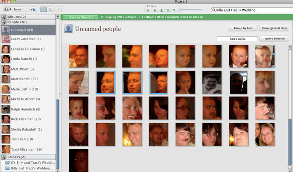
Picasa 3.5 brings a new feature that scans your photo library looking for faces so you can tag people in your photos. This walkthrough video embedded below from Google covers the basics of people tagging. There is also this written guide.

First Impressions

The face detection technology built into Picasa 3.5 works ok. The scanning processes is slow but Google is aware of this problem. When it works, Picasa can group together common faces making tagging people a breeze. But when it doesn’t work you can get all kinds of wrong matches which are tedious to go through and correct. It’s certainly not something you can set and forget as you will need to spend some time double checking the suggested matches.

With that said there are a few tips and tricks to make the process a little easier. Most of the following info was culled from a help forum post.

Tips for better tagging

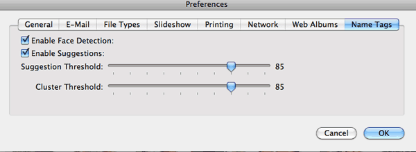
Set the suggestion and cluster threshold to 85. By default both of these values are set at 80. You can change this in the following locations:

Windows: Tools->Options->Name Tags
Mac: Picasa->Preferences->Name Tags

I found a noticeable decrease in false positives by bumping this setting up a notch, especially if your photo library is greater than about 10,000 photos.

Picasa Suggestion and Cluster Threshold

Be careful tagging blurry faced photos. When you have a bunch of blurry faces attributed to a person, the number of false positives goes way up as Picasa struggles to make a vague connection.

To see the unknown faces for only one folder at a time just do a search for the name of the folder and select it from the auto suggest list that drops down from the search box. Now you can easily go through the unnamed people for that folder alone cutting out the noise of unnamed people from other photos.

Picasa Filtering Unnamed People Using Search

When you’re combing through a bunch of faces, turn on the Faces filter at the top of the Picasa window. This will hide any photos that don’t have any faces in them saving you a bit of time when moving from picture to picture.

Picasa Show Only Photos with Faces button

How does Picasa’s facial recognition work?

Picasa scans the photo looking for facial patterns. When it finds a match, Picasa adds two pieces of information to a picasa.ini file (hidden by default) in the folder holding the picture. The face data is stored like this:

faces=rect64(907574589cc58a78),a30bebdb5c1a778d;

The first part, enclosed in rect64(…), is the relative coordinates for the rectangle around the face. The second set of characters after the comma is a unique identifier linking the face with a name in Picasa’s contact database which is stored in the following locations on your computer:

Windows: /Users/%USERNAME%/AppData/Local/Google/Picasa2/db3/
Mac: /Users/%USERNAME%/Library/Application Support/Google/Picasa3/db3/

(Source: Mye)

The 16 characters enclosed in rect64(…) is a 64-bit hexadecimal number which can be broken up into four 16-bit numbers used to identify the position of the rectangle used to mark the face. If you divide each of the four 16-bit numbers by the maximum unsigned 16-bit number (65535), you’ll get four numbers between 0 and 1 which give the relative coordinates for the face rectangle in the order: left, top, right, bottom.  To calculate the absolute coordinates, multiply the left and right relative coordinates by the width of the image and multiply the top and bottom relative coordinates by the height of the image.  This way the faces will always be identified even when the image is re-sized.

(Source: Oedious)

Embedding tagged people data in picture files

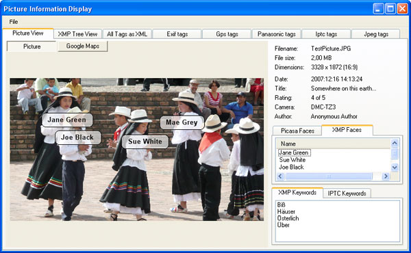
The fact that Picasa stores the tagged people data in an external data is less than ideal for some. The .NET program AvPicFaceXmpTagger reads Picasa 3.5 face definitions for a given list of pictures and writes them as XMP metadata tags inside the picture files. It can also add the person’s name as XMP keywords and/or IPTC keywords which can be read by other photo programs.

I haven’t tried it out myself but it is worth mentioning as a workaround until Google addresses this problem.

avpicfacexmptagger Main Picture Display

(Source: Andreas Vogel)

Conclusion

Overall the people tagging features introduced in Picasa 3.5 are a nice start but there is still a lot of work to be done. Hopefully the future improvements will be frequent and steady as this is an exciting new vector of information to make digging through photo collections a joy. Things will really get interesting when it will be able to talk to other photo services (like Facebook) to gather and sync and kinds of metadata.

Toilet Paper Survey FAIL

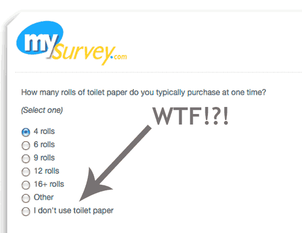
I just took a survey and one of the questions was about toilet paper. These were the answers to choose from…

I don't use toilet paper FAIL!

I feel sorry for whoever falls into that last category.

Frosted Snow Bomb

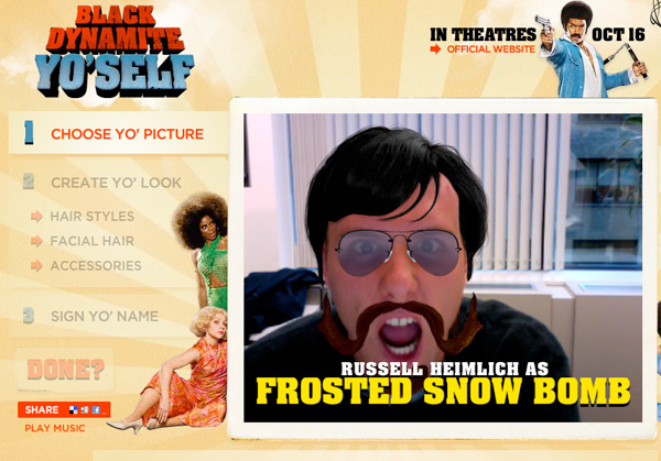
Russell-Heimlich-Frosted-Snow-Bomb.jpg

I decided to Black Dynamite My ‘Self (blackdynamiteyoself.com) since everyone else on the Internet is doing it. The image wouldn’t save, so I just took a screenshot and shared it around! What do you look like when you Black Dynamite yourself?

Accessibility Camp DC Recap

The schedule as determined by participants of Accessibility Camp DC.

Accessibility Camp really opened my eyes to how people with disabilities experience the web. The Martin Luther King Library in downtown DC was the perfect venue for this barcamp style event. The adaptive services department has all sorts of assistive technology that anyone can use and learn more about.

A braile printout using a special printer at the Martin Luther King Library in Washington, DC.

I met a lot of diverse people like Patrick Timony (Adaptive Technology Librarian at MLK library), Jennison Asuncion (IT Accessibility Consultant from Toronto), Jamal Mazrui (a visually impaired software developer) and about 100 others who were passionate about sharing what they know to make the web a better, and more accessible, place. Here are some of my take aways.

Carolyn Klinger reviews tips for making PDFs more accessible at Accessibility Camp DC

Carolyn Kelley Klinger talked about making PDFs more accessible (PDF) by structuring documents with headers (using Headline 1, Headline 2 etc. styles instead of making the text bold and bumping up the font), adding column/row headers for data tables, supplying alternative text to describe images, and making sure anyone links are within context (no “Click Here” or “Read More” links). I was surprised at how similar preparing an accessible PDF is to preparing an accessible website.

Jamal Mazrui is a blind software developer who wants to make sure accessibility isn't forgotten in emerging technology.

Jamal Mazrui wants to build web apps to benefit disabled netizens. He’s afraid that as broadband speeds increase over the next few years we will see an influx of visually oriented interfaces with no accessibility in mind. The same thing happened in the mid 90’s with the move from an entirely text based DOS operating system, to a graphical interface driven OS like Windows. Today, emerging technologies like Adobe Air, Adobe Flash, Microsoft Silverlight, Google Wave, Google Android, Second Life, and the Amazon Kindle have little to help handicapped users. Apple’s iPhone is fairly good when it comes to accessibility as evident by all the people who had one at Accessibility Camp. Hopefully the tech industry will learn from its prior mistake of ignoring the needs of handicapped users.

All of the Accessibility Camp DC participants got a hearty lunch free of charge.

For lunch everyone got as many Potbelly sandwiches as they could fit in their bellies. Thanks to the generous sponsors who made the event not only possible, but free for everyone we were able to enjoy a scrumptious meal.

Jennison Asuncion demonstrates surfing the web with JAWS.

After lunch I got to see a live demonstration of Jennison using the screen reading application, JAWS, to navigate the web. Holy Cow! I can’t believe how different the web is when you can’t see where you’re browsing. It takes a while for a visually impaired user to get acquainted with a new website since every site has a different set of pitfalls. The source-order of your website, that is the order of your content with no styles applied, makes a huge difference to the experience of a blind user. If you’re fortunate enough to be able to user test your project, make sure to get feedback from a visually impaired person using a screen reader too.

Other events that were going on throughout the day included Practical Ways to make Your Site More Accessible, Making Mapping More Accessible, eLearning Tools, and Online Gaming for Persons with Disabilities. It seems like everyone there had something to share.

Accessibility Camp DC was the brainchild of John F. Croston, a web developer for the US Army.

A big thank you goes out to John Croston and Patrick Timony for organizing, the staff at the MLK library for providing an awesome venue, all of the sponsors who made the event even possible, and everyone who attended with something to share. This event really opened my eyes to accessibility and the web.

Other Accessibility Camp DC links:

Next up is Bar Camp DC 3 on November 14th.

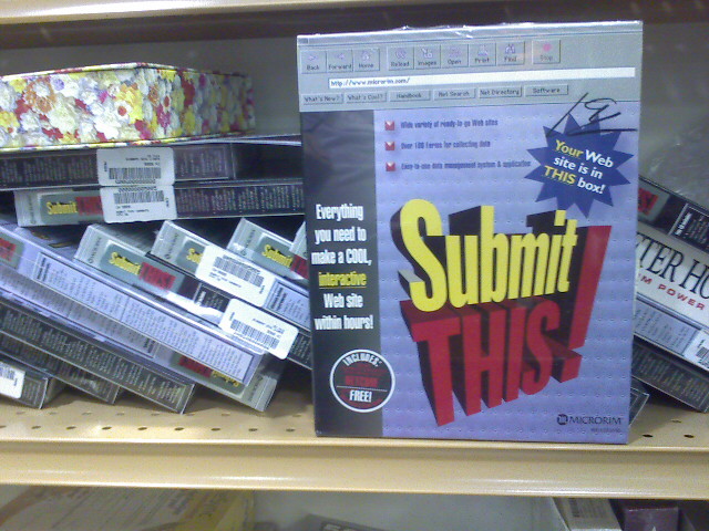
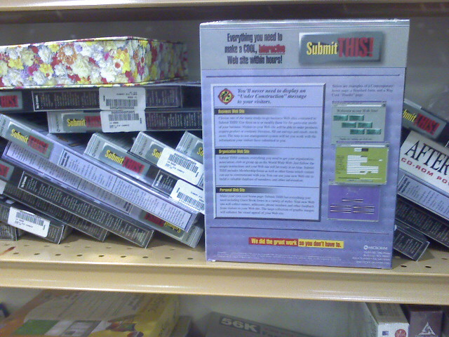
Submit This! Website Software

IMAGE_689.jpeg

0_IMAGE_690.jpeg

I found this old software program stil in it’s original shrink wrap in a thrift store today. From around 1996, this package promised to have everything you needed to make “a COOL, interactive Web site within hours” Check out the “way cool” screenshots on the back cover. There were 17 more pristine copies on the shelf next to a 56K modem still in it’s original shrink wrap.

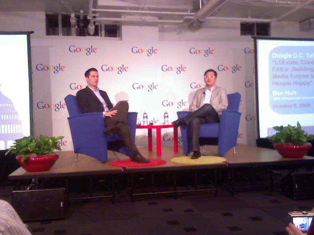
Google DC Talk With Ben Huh

0_IMAGE_688.jpeg

I’m at the DC Google offices for the talk with Ben Huh, CEO of ICanHasCheezeburger.com, Fail Blog, and Graph Jam. Below are my notes:

He negotiated the sale of I Can Has Cheeseburger site with the original owners over IM.

Cats have many more emotional expressions than dogs kind of like a box of chocolate.

Ben is ironicaly allergic to cats.

Neiman Brothers brought the concept of fail mainstream. Traffic to FailBlog went through the roof.

Talk rickrolled by Rick Astley Graph Jam.

Photobombing used to involve people accidentally intruding on photos making funny faces. Now it is a sport.

Editorial team runs 25 sites, 10,000 submissions a day. Aims to launch a site a week and experiment to see what sticks.

More people vote on lolcats per day than in a congressional election.

Audience demographics: Seatle Mariners sponsored cheezeburger event. Sold 1200 tickets with people of all types from across the country attending. Sites get 11.5 million visits a month

Business model: Profitable. Goal is to make people happy for 5 minutes a day.

Lolcats are all culture, not high, low etc. Lolcats show up everywhere from random blogs to Wall Street Journal

Ben Huh would love to see internet culture accepted in the mainstream.

Copyright issues: Network stands behind the idea of fair use. Images not depriving copyright holders from making money. For the sake of culture, copyright needs to be reformed.

DMCA is too complicated. Needs to better support/protect remixing of content.

Will the sites eventual become old and fail (haha)? Community drives the sites. As popular culture changes so do the sites. Human screw ups will never cease to exist.

Creating merchandise takes the pressure off of online advertising.

How wel to your humor sites export to other countries? 60% of traffic comes from US.

Lolcat of food is fud which = genitals in another language.

Get people involved in smaller decisions to help build community.

Creating easy to use tools makes it easier for others to get involved and surfaces many more great ideas.

Print = higher revenues than online. Easier to start online then go to print rather than the other way.

Reason for sucess of sites: They keep it simple.

They have general data but ignore obtrusive, long term cookies and analytics.

A meme is not a viral idea, memes are a framework.

Ben Huh would love to explain internet tubez/dump truck meme to congress people.

5 people at company figure out which memes should have dedicated sites. They prefer steady growth of niches, like thereIfixedit.com

2 weeks to a year for a site to build stedy traffic. Those that don’t make it fail (haha)

Relies on community to weed out fake photos. Hard to find definitive answer on the Internet.

Talked about my three keyboard cat shirt. I stood up and modled it for everyone. Lots of people wearing casual business wear.

Building out a platform to let people build out there own humor to pick images from the different sites.

Newest site is text based called itmademyday.com kind of like FML (eff my life)

That’s it.

Union Station Train Yard

0_IMAGE_687.jpeg

It’s a slow commute this morning. I’m stuck here outside of Union Station due to an emergency situation at the Gallery Place/Chinatown station. Good thing I have a bunch of podcasts to get through so I am happy.