Posts tagged 'Design'

Red Wine Design Play

Tonight while sitting in front of the TV I decided to play around in Photoshop. The graphic design process has always been a mystery to me so I wanted to experiment and come up with new ideas. The result of about an hour worth of work is this:
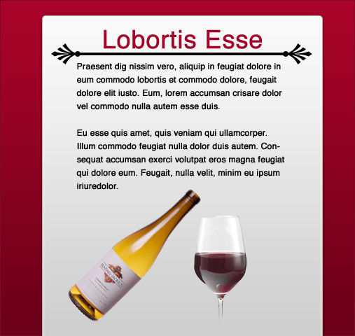
An experimental design composition.

The whole process was off-the-cuff with no real goal in mind but here are the steps I took to get to the end result.

First, I started with dummy text from LoremIpscream.com and created a headline and body text. I wanted to keep things simple so I used black Helvetica text against a pure white background. My focus was on some sort of divider between the headline and body text. I had the idea for more decorative, curly ornament ends for the divider but after looking through the built-in custom shapes I came across the palm leaves. After spacing them out I drew a 4 pixel tall black line to connect them.

The title needed something else to make it stand out so I changed the color to a deep, moody red color. I took great care in lining up the elements in the composition and adjusting line heights, or leading as they call it in the graphic design world, to make the text more readable. Up until this point I was just playing with type but now I figured I could turn it into a basic web page layout.

I added a vertical rectangle with rounded corners that is oh so popular these days as a background. Thanks to the web 2.0 layer styles pack I could play around with different gradients to see their effect on the page. I settled for a white-light gray vertical gradient.

Things were starting to come together and to help set the mood even more I used a dark red gradient for the background. This also made the main content stick out by creating some depth. I also made sure both the background and foreground were lighter at the top and faded to a darker color at the bottom for consistency. At this point the title color and background color were slightly different so I used the eye dropper tool to grab a color from the background gradient in roughly the same spot as the title.

Finally I did a quick Google search for wine bottles and glasses to give my imaginary page some visuals. The deep red color reminded me of red wine so I figured it would be a good fit.

You can download my final PSD and have a poke around yourself. Even though it isn’t much to look at I had a lot of fun exploring design techniques and just playing around. Let me know what you think by leaving a comment.

2 Minute Design Experiment: RED Alert

RED Alert Typography Experiment

Just opened up Photoshop and banged out this little experiment. Nothing much too it.

Microsoft’s InkSeine Offers An Intuitive Tablet Interface

I was churning through my array of video podcasts this morning on my commute when I came across this 3 minute demo of InkSeine which stopped me dead in my tracks. InkSeine is a prototype ink application designed from the ground up to completely rethink how people interact with tablet computers. Gone are the menus that run across the top and instead are replaced with contextual gestures that can appear anywhere on the screen. Take a look at the video to see what I mean.

Technology like this would be really useful on a touch-screen mobile device, say maybe like an iPhone? At any rate it is interesting to see new interactions with a computer minus the mouse and keyboard.

Presents Opening Children

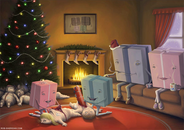
Presents Opening Children by Rob Sheridan

by Rob-Sheridan. A wallpaper version is also available. His painting titled Cereal Mascot Reunion is also worth a look.

Inspiration: The Perfect Use Of Flash

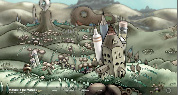
Mauricio Guimaraes is a web designer and illustrator from Brazil. His online portfolio at mauricio.art.br demonstrates this in a unique way by creating an immersible environment that shows off his world.

Mauricio Guimaraes’s Flash Website

It is not a very complex site, only having 4 sections in total, but it more than makes up for depth with rich visuals. The drawings are detailed, animations smooth, and overall is just down right fun to explore and poke around. Flash is the perfect medium for a site of this nature as the non-linear layout is hard to translate in HTML. Plus, Mauricio avoided many of the things that depress the user experience of a Flash site like music blaring, lengthy load times, and an non-interactive intro screen.

So if you are ever thinking about doing a pure Flash website, take a good hard look at your requirements and make sure the medium supports the desired user experience.

Redesigned Comments

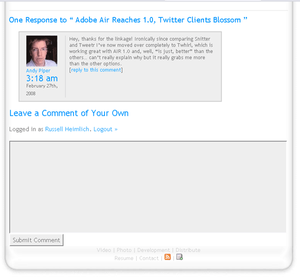
Screenshot of new comments

I spent a good chunk of today re-jiggering the look and functionality of the comment system here on my blog. Using the WordPress Thread Comment plugin readers and myself can respond directly to other comments complete with e-mail notification. Gravatar is a globally recognizable avatar plugin giving everyone who posts their thoughts to my blog the option to show an icon representing themselves. If you don’t have a Gravatar account head on over to Gravatar.com to register your e-mail address. Finally, I installed WP-Chunk which simply minimizes long URLs posted in comments and prevents them from breaking my layout.

But most importantly I re-designed the look of comments making them easier to read. I hope this will encourage more discussion on my blog and if you have any feedback, please leave a comment!

P.S. If you need a smattering of comment designs for inspiration check out the comment design showcase at SmileyCat.com.

Inspiration: Scrapzilla By Andy Council

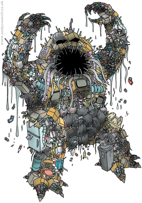
Stumbled upon Andy Council’s portfolio today where I saw this…

Scrapzilla by Andy Council

The title is Scrapzilla, appropriately enough. He has other similar pieces like Rail Rooster and Junk Robot.

Andy has lots of other intricate illustrations in his complete portfolio. It blows my mind how someone can think up something like this.

(via DesignFlavr)

Hot Or Not Meets Webdesign

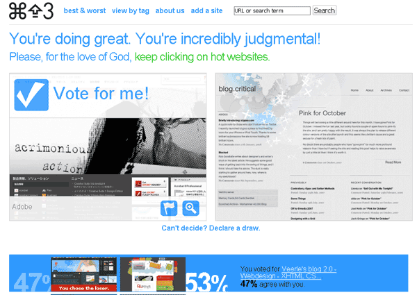
Hot or Not is an iconic web 1.0 site with a basic concept: Look at a picture of a person and mark on a scale of 1-10 how hot they are. Command Shift 3 takes the same concept and applies it to web design. Frankly I find the web design implementation far more interesting than the original Hot or Not concept. But judging a website on a scale of 1-10 sounds overly-complicated. CommandShift3.com instead puts two websites side by side and it is your job as the all-knowing visitor to click on which one you like best.

Command Shift 3 Screenshot

The cool thing is you can see if you picked the crowd favorite and what percentage of people agree with you. If you like a site so much you can click through and leave a comment about it or visit the actual page. Too lazy to wade through the thousands of contenders? Then check out the Best & Worst sites in a variety of time frames. And if you are looking for something specific you can search by keyword or browse their tags.

While the concept is super simple to grasp, the impact of a site like this is a lot more compelling than the loads of CSS galleries that litter the net. The interaction and side by side comparison really set it apart in the showcase arena. I enjoy the simplicity of the site, showing me only two designs at a time instead of bombarding me with thumbnails like some other sites do. In conclusion, this site is a great way to get a taste of some great web design that is out there on the net while keeping it fun and engaging. I added my blog to the fray to see how it would stand up. Wish me luck, and we’ll see if my design chops can rise above the crowd.

Cmd + Shift + 3 = Screenshot!

Oh and in case you didn’t know, Command Shift 3 is the keyboard shortcut to take a picture of the screen in Mac OS X.

Behind The Scenes Of Revision3’s Website

The people behind Revision3.com’s new look took a step into the limelight for the latest episode of the Revision3 Gazette.

Stephanie Chu, Mark Rebec and Ron Richards are the dedicated web team at Revision3 who have been laboring for months to bring the new Revision3.com to life and took some time out of their busy schedules to share with the Revision3 audience the answers to many burning questions.

They didn’t answer any of my burning questions as the three sat in front of a greenscreen with the new website scrolling in the background. If you agree with me that the new look is bland you will probably think the same thing about the 3-person team explaining the going-ons behind the browser.

Twittertale And Politweets: Two Twitter Mashups

Four local area DC Developers (Doug, Gabe, Jason, and Min) got together and created two excellent Twitter mashups that were released this week.

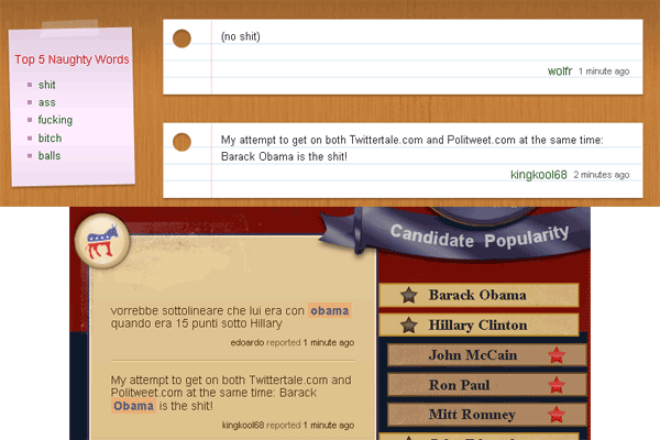
Twittertale.com weeds out public tweets that have swear words and then highlights them on their school room inspired site. It also keeps track of the top 5 naughty words as well as the users who indulge in the most sailor talk. As of this posting, @bumblebunny looks to be an interesting person to follow. As an extra twist, I think the swear words should be censored with *’s leaving the audience to guess what swear words were being used.

Politweets.com takes the same concept from Twittertale but applied to U.S. Presidential candidates. The two major political parties are seperated out and the political candidates are ranked in the middle based on the number of mentions on Twitter. This is a neat way to extract data from such a large body of political commentary and the guys certainly nailed the design with a gorgeous yet simple layout.

I decided to contribute a tweet to both sites at the exact same time…

One Tweet To Twittertale.com And Politweets.com