Posts tagged 'Web'

Adobe Air Reaches 1.0, Twitter Clients Blossom

Adobe Air Logo
Adobe released it’s Air product today making it official and peeling off the cliche` beta title. Adobe Air allows developers to build desktop applications using web technologies like HTML for structure, CSS for presentation, and JavaScript for behavior. Flash and Flex, Adobe’s own web technologies, are also rolled up in the mix. Professional authoring tools like Flash CS3 and Dreamweaver CS3 saw updates today to allow development within the popular tools. Aptana also offers a free plugin for their open-source development tool Aptana Studio.

I have been playing with Air apps for the last couple of months while the product was still in beta. There are a lot of clever applications that are more like widgets then conventional full-blown desktop programs. For example, the Adobe sample app PixelPerfect was a simple ruler overlay letting you measure anything on your screen. This little tool comes in handy for web development where there aren’t any rulers on the side or measuring tools like in Photoshop. Powerhouse auction site eBay created their own Air app that banishes the concept of refreshing the page so bidders can watch their auctions in real time. But perhaps the biggest crowd of Air apps belongs to Twitter clients. Thwirl, Spaz, Tweetr, and Snitter are just a handful.

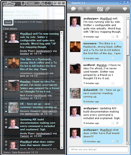
Snitter Next To Tweetr Couresy of Andy Piper

I thought John Ballinger had let his Twitter client, Tweetr, go to pasture without an update since the end of November. With each new Air beta release more functionality would break edging me towards Jonathan Snook’s Snitter. But alas, Tweetr is alive again with version 3.0 launching today to coincide with the official Air release. I’m happy as a clam to have my favorite Twitter client back and to see so many great ideas that have seemingly sprung out of Air.

Hot Or Not For XHTML Code

Valentin Agachi’s XHTML Challenge takes the rating meme under the hood letting users compare websites based on their (X)HTML markup. When a challenge is set up between two sites, a PHP script from XHTMLChallege.com slurps up the source code and begins a detailed analysis. Facets for competition include which doctype was declared, validation, content length in bytes, a ratio of content/markup/ and whitespace, use of conditional comments, and the number of table tags used.

XHTML Challenge Screenshot

As I have written about before, there is more than just HTML that goes into making a sexy source. I think XHTML Challenge could expand their analysis to include the number and positioning of CSS and JavaScript files, use of microformats (which results in more semantic, though bulkier, markup), and total file size of all components. This would paint a better overall picture of all the necessary components that go into a modern design.

Frontend web developers, like myself, take a lot of pride in how we structure our code. HTML coding is all about semantic, well-organized markup that is as small as possible while providing a solid structure for the content. It is good to see that there are others out there like myself that can appreciate the thought and planning that goes in to the under pinnings of a modern website.

XHTML Challenge should not be confused with Command Shift 3 which rates the aesthetics of a site not its code. Maybe the two sites should get together producing the ultimate website rating tool!

via (Web Designer Wall)

Kingkool68.com Aggregates All Of My Web Activity

I finally finished kingkool68.com this weekend. The purpose of the site is to aggregate all of my activity on the web into one single stream, commonly referred to as a lifestream. To mash all of my RSS feeds of activity together I used SimpleLife, a WordPress adaption of the SimplePie PHP script. For the front end I used jQuery, a JavaScript library, as well as standard HTML and CSS.

Screenshot of kingkool68.com

Most lifestreams I saw didn’t include a way to for end users to filter out certain items, so I built one into my lifestream application. Using the power of CSS selectors built in to jQuery, I wrote a function to grab the list items with a certain class and then toggle a fade effect. If the item was hidden the script would fade them in, otherwise it would fade them out. You can see the 13 lines of code I wrote to do this for yourself.

Once I finished writing the filter code I noticed it didn’t work in Safari browsers even though it performed flawlessly in Firefox. After debugging and digging around on the net for possible solutions I stumbled upon the Safari Developer FAQ. Did you know you can unlock a debugging menu in Safari? The FAQ provides details on how to reveal it and then by holding Apple+Shift+J shows a JavaScript console alerting you to any errors. I used this to figure out that you can’t use ‘class’ as a variable name even though Firefox doesn’t seem to mind. I haven’t tested the site on any version of Microsoft’s Internet Explorer which is notorious for choking on standard code.

So if you ever wanted to see everything I do on the web, checkout kingkool68.com. And if you want to add me as a friend on any of these popular sites, click the small icons associated with each item to take you directly to my profile for that site. The next step would be to package my modifications up into a WordPress plugin so anyone could run a lifestream just like mine. In the meantime if you have any problems implementing a lifestream on your own, leave a question in the comments of this post and I’ll do the best I can to help out. Happy lifestreaming!

Will Diet Coke Kill Us?

Beats me, but according to willdietcokekill.us it will. Pretty self explanatory site with a clever domain. I wish it would link to some information supporting its stance as I drink Diet Coke every Tuesday for the most part.

Diet Coke Spewing

Kudos Jon Maxfield of Saint George, Utah!

Re: Why Social Applications Will Thrive In A Recession

Josh Bernoff wrote about how social applications will thrive during a recession. He noted advertising facts and figures from the 2001 recession to backup his claims, which all seem perfectly valid. But poor Josh seems to be missing the most important reason for social apps to keep on chugging. When massive layoffs hit companies needing to cut the fat for survival, ex-employees will be left with an abundance of time. And what can they fill that time with? Poking their friends virtually or starting a massive vampire/zombie war.

Now I don’t want to say social networks are a complete waste of time. They are kind of like a mullet: business in the front and party in the back. People will flock to social networks looking for job openings, utilizing connections, and otherwise use it for strictly business. But once the practicality runs dry they will turn to socializing and in turn pointless applications. This overload of free time is what will get social networks through the economic slump. As logical as it sounds for advertisers to keep pumping money into online advertising because it is more targeted providing a greater return on investment, social advertising is still an unproven experiment.

Targeting ads based on what people are searching for is safe. Sneaking a recommendation into a users news feed hoping they will share it with their friends, not so much.

eBay Updates Fees With Mixed Results

Old-fashioned auction dynamo, eBay, sent an e-mail to it’s members today detailing changes in their fee structure. Starting February 20th the fees to initially list an item regardless if it sells or not will be reduced.

Starting or Reserve Price Current Insertion Fee Insertion Fee (effective 02/20/2008)
$0.01 – $0.99 $0.20 $0.15 Lower fee!
$1.00 – $9.99 $0.40 $0.35 Lower fee!
$10.00 – $24.99 $0.60 $0.55 Lower fee!
$25.00 – $49.99 $1.20 $1.00 Lower fee!
$50.00 – $199.99 $2.40 $2.00 Lower fee!
$200.00 – $499.99 $3.60 $3.00 Lower fee!
$500.00 or more $4.80 $4.00 Lower fee!

As an added bonus the $0.35 gallery fee has now been dropped meaning eBay will include a picture of every item in the search results. The price cuts up front came with an increase of the final value fees assessed at the end of successful auctions.

Closing Price Final Value Fee Final Value Fee (effective 02/20/2008)
Item not sold No fee No change
$0.01-$25.00 5.25% of the closing value 8.75% of the closing value
$25.01 – $1,000.00 5.25% of the initial $25.00, plus 3.25% of the remaining closing value balance ($25.01 to $1,000.00) 8.75% of the initial $25.00, plus 3.50% of the remaining closing value balance ($25.01 to $1,000.00)
Over $1,000.01 5.25% of the initial $25.00, plus 3.25% of the initial $25.00 – $1,000.00 plus 1.50% of the remaining closing value balance ($1,000.01 – closing value) 8.75% of the initial $25.00, plus 3.50% of the initial $25.00 – $1,000.00 plus 1.50% of the remaining closing value balance ($1,000.01 – closing value)

To put this final value increase into perspective here is a sample of fees for a range of final auction prices.

Final Value Old Fee New Fee Difference
$4.99 $0.26 $0.44 $0.18
$9.99 $0.52 $0.87 $0.35
$19.99 $1.05 $1.75 $0.70
$49.99 $2.12 $3.06 $0.94
$99.99 $3.75 $4.81 $1.06
$199.99 $7.00 $8.31 $1.31
$499.99 $16.75 $18.81 $2.06
$999.99 $33.00 $36.31 $3.31

All calculations were done at http://www.ebcalc.com which allows you to change fee values.

Auctions that sell for under a dollar benefit the most with these latest changes as the lower insertion fee plus the free gallery upgrade outweigh the increased final value fee. Sellers who do a high volume of business will be hit hard as more of their earnings will come out of the already slim margins and go toward more fees.

eBay has been on the decline for the past couple of years. They are already the dominant auction site with a virtual monopoly on the industry. Computers have been getting more efficient as technology advances but apparently eBay can’t lower its costs fast enough. And let’s not mention that billion dollar Skype purchase which has done absolutely nothing to eBay’s auction business.

eBay has become a victim of it’s own success. In the beginning people went to eBay to find rare collectibles or heavily discounted items. Some even considered eBay to have the perfect business model as a middle-man connecting buyers to sellers with no inventory to keep on it’s own. Now eBay is littered with suspicious listings, outrageously high shipping prices, and generally more distractions to wade through in search of the desired item. The selling process is a laborious one requiring lots of time to specify all of the necessary options to help auctions stand out from the crowd. What eBay needs to do is simplify everything as much as possible starting with the listing process. They also need to focus on helping it’s biggest asset: the buyers and sellers. Buyers want a safe, friendly environment to do business in and sellers want the least amount of obstacles to selling their goods. More fees result in less incentive for sellers to consider eBay which results in a less lucrative market for buyers to enter. eBay should take a page from the Amazon Marketplace which provides a much better experience for both buyers and sellers.

That improved experience is why when I need to sell something to a stranger I turn to the efficient book dealer rather than the decrepit auctioneer.

Bland Revisions For Revision3.com

New Revision3.com Design

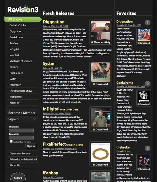
Kevin Rose’s Internet video startup, Revision3.com, unveiled its new look today. The homepage has been simplified providing an immediate focus with a large feature box that rotates through different site promotions. Each show now has it’s own section which is easily accessible from the “Shows” drop down menu along the top of every page. Streaming video flash players on each episode page have been bumped up to 555×337 which really draws viewers in. Each show has a plethora of different subscription formats which are only a tab away from the recent episode list. The overall restructuring is a welcome improvement, but unfortunately it came at the expense of visual design.

The new color scheme is drab and bland with a “corporate” feeling that first comes to mind. I suppose this is to appeal to advertisers that Revision3 is trying to attract to buy ad inventory but it feels like something from early 2000. The old design (pictured below) felt slick and cutting edge just like the network itself. But the worst offender of this new look is the typography. For one, it is a light gray (hex code #666666) and could stand to be darker (like #333333) for increased contrast and thus increased readability. The line-height is also not set leaving lines scrunched together making it harder to read. In short, the new design is missing the final polish which used to set it apart from other media websites on the net.

Old Revision3.com Design

Daniel Burka has been the lead designer on most of Kevin Rose’s web projects but it looks like he didn’t have a hand in the new Revision3.com. He must be too busy working on Digg and Pownce, two sites I really admire from a design perspective. Luckily I have no reason to visit the Revision3 site on a regular basis except to subscribe to new shows. I hope they take a second look at things and update the style to match the new functionality.

Twittertale And Politweets: Two Twitter Mashups

Four local area DC Developers (Doug, Gabe, Jason, and Min) got together and created two excellent Twitter mashups that were released this week.

Twittertale.com weeds out public tweets that have swear words and then highlights them on their school room inspired site. It also keeps track of the top 5 naughty words as well as the users who indulge in the most sailor talk. As of this posting, @bumblebunny looks to be an interesting person to follow. As an extra twist, I think the swear words should be censored with *’s leaving the audience to guess what swear words were being used.

Politweets.com takes the same concept from Twittertale but applied to U.S. Presidential candidates. The two major political parties are seperated out and the political candidates are ranked in the middle based on the number of mentions on Twitter. This is a neat way to extract data from such a large body of political commentary and the guys certainly nailed the design with a gorgeous yet simple layout.

I decided to contribute a tweet to both sites at the exact same time…

One Tweet To Twittertale.com And Politweets.com

No Browser For Surfing? Get Some Help

It’s hard to imagine being somewhere that locks down the web browser so much that you have to resort this nifty trick I read on DownloadSquad.com, but desperate times call for desperate measures. If you can’t reach the web through Internet Explorer due settings beyond your control and forgot your portable Firefox thumbdrive then simply open up the calculator or MS Paint and click “Help”. From there go to “Help Topics,” which will bring up a help window. Now all that is left is to right click on the title bar and select “Jump To URL.” Type in any web address you like, but make sure to include “http://” at the beginning and you should be good to go.

Browse The Web In The Help Menu

What you are basically looking at is a stripped-down, basic version of Internet Explorer which is built into Windows and used to display CHM files, or Microsoft Compiled HTML Help files. Sure there are no niceties like bookmarks or your comfy, cozy Firefox extensions, but if you need to check your e-mail or Twitter account and this is your only resort, you will put up with a little cruft in order to get your stuff. Besides there are back and forward buttons, what else do you need in a browser?

CoinCalc.com Guesstimates Spare Change

CoinCalc.com is a simple and straight forward site aiming to estimate how much moola you have stashed away in your change jar. All you need to do is weigh your jar of coins, grab a handful as a sample and enter the quantity of each coin you pulled out into the CoinCalc form. The site does a little math and guesses how much money is in the jar based on your sample.

Coin Cup

I just happened to have a jar full of coins that needed to be tallied and wrapped up so I though I would give CoinCalc.com a run for it’s money (pun intended). I took 5 samples of various sizes from the same cup of coins. After counting the number of coins I would put them all back in the cup and shake them around to keep it as fair of a test as possible. I happen to have a small postal scale at hand so calculating the weight of the coins was a snap. My first weighing included the weight of the cup which came to a total of 3.375 pounds. After running all of the numbers through CoinCalc.com, I realized the weight of the cup was inflating the estimate. I weighed the empty cup and subtracted that weight from the previous weight resulting in 2.8625 pounds of pure coinage. The results are summarized in the table below:

Sample Pennies Nickels Dimes Quarters Estimated Total Estimated Total
w/o Cup
1 36 0 10 20 $43.07 $36.53
2 23 4 3 9 $33.71 $28.59
3 16 3 5 7 $36.96 $31.35
4 31 3 14 11 $37.82 $32.07
5 13 2 6 11 $46.26 $39.23

The total value of my coin-collection was $28.91 which came out to the following:

Coin Quantity Value
Pennies 211 $2.11
Nickels 33 $1.65
Dimes 59 $5.90
Quarters 77 $19.25
Total 380 $28.91

CoinCalc.com came within $10 at most of the actual value after correcting for the weight of the cup. CoinCalc’s estimation was more accurate than I thought it would be. The site gives you a good ballpark range of the value of your coins without having to dump them all over the floor and count them out one by one or paying a fee to have Coinstar count them for you.

Speaking of counting, I like to wrap my own coins and I use this little device from MMF Industries pictured below to tally them up before wrapping.

Plastic Coin Counter

You simply dump your sorted coins into their respective slot and the plastic container will keep them stacked until they reach the top. At that point there is a slit where surplus coins fall out leaving you with the exact quantity for the roll. I think I got this from my parents a couple of Christmas’ ago.

(via BoingBoing)