Posts tagged 'Web'

Name That Color

Name That Color

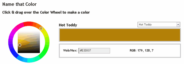
Every color has a name but up until now it has been quite a task to separate the Periwinkles from the Mischkas from the Thistle Green. Name That Color lets you select the a color via RGB value, HEX number, or a simple color picker. From there, the handy little web app will let you know the appropriate name for that certain hue. Feeling a bit lazy? Then use the drop down menu to sort through the zillions of names and find ones like Rangitoto, Wattle, or Hot Toddy. Seriously those are all valid color names.

Apparently this guy has been spending way too much time over at COLOURlovers.

(via DownloadSquad)

Twitter Launches Blocks… And I Am Confused

Twitter has been pumping out new features these past couple of weeks. Their latest, which just launched this evening, is Blocks.

Twitter Blocks

This is what it looks like and so far all I can figure out is blue squares are you, orange are your friends, and gray are um.. gray. You can click on squares to see the tweets of others. What is the point? Beats me.

Twitter Blocks was created by Stamen Design, the same folks who brought us those neat Digg visualizations.

Twitter also launched something a little more useful. Have you ever wanted to see a list of all the third party twitter apps in existence all in one spot? Then check out the Twitter Fan Wiki which categorizes apps into distinct categories for your exploration. I guess that is why they launched everything mentioned in this post at http://explore.twitter.com

The iPhone Is Not The Only Mobile Web Device

Bi-weekly web magazine A List Apart (ALA) launched two fresh new articles. Unfortunately I was saddened that Erin Kissane, editor at ALA, approved an entire article about designing specifically for the iPhone. I know the iPhone is amazing to many geeks out there but it is no where near as prevalent as the number of web enabled mobile devices.

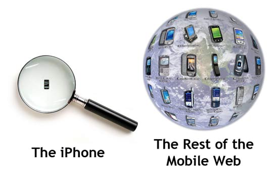
According to market researcher iSuppli, the number of mobile phone subscribers topped 2.6 billion globally last year. Since I couldn’t find any statistics on mobile web devices, let us assume only a quarter of those can access the web on their phone. That works out to 650 million potential mobile web users. Apple reported it sold 270,000 iPhones over it’s launch weekend but let’s assume they sold 30,000 more shiny devices between now and then. Using the above statistics, the iPhone accounts for only 0.046% of all web-accessible mobile devices; a drop in the proverbial bucket. And I am supposed to be excited to specifically tweak my site for it?

iPhone Vs Mobile Web

The web design world has standards with the goal of being able to code once and access the content in any browser or on any device. Standards arose because in the late 90’s and early 2000 websites were often designed for one browser at a certain resolution. You may remember seeing such terms as “Best viewed in Internet Explorer 5+ with a resolution of 1024×768.” One of the founders of the web, Tim Berners-Lee, even expressed his displeasure of the trend in Technology Review (July 1996):

“Anyone who slaps a ‘this page is best viewed with Browser X’ label on a Web page appears to be yearning for the bad old days, before the Web, when you had very little chance of reading a document written on another computer, another word processor, or another network.”

By designing for a single device, you are essentially jumping back to the dark ages of the web while cutting out a large chunk of the global audience. I agree that mobile web standards leave a lot to be desired but by essentially ignoring the rest of the world (remember iPhones are U.S. only for now) you are only making things worse.

Web technologies like Apple’s mobile Safari and Microsoft’s Deepfish show great promise in fulfilling the web standard utopia. These tools don’t require separate coding for mobile devices which in turn will speed up the adoption of the Internet on-the-go. But it will be several more years before they are in a majority of devices and until then we have to remember that there are other phones out there other than Apple’s precious iPhone.

30 Half-Ass Web Development Extensions

Mashable.com created a list of 30 Firefox extensions for web developers and designers. To be honest, you really only need two: Firebug and the Web Developer Toolbar. These two extensions incorporate nearly every other extension listed, and who wants to manage 28 separate extensions when they could just use two.
Firebug Logo
If you are still digging through source code by hand, then do yourself a favor and get to know Firebug. You’re job will never be the same again.

How Google Can Turn YouTube Into Another AdSense

I have previously discussed how the current InVideo ads on YouTube will ultimately fail. What can Google do to turn the most popular video distribution hub on the net into a money maker like text ads? Here are a few of my own ideas.

Google Turning YouTube Into Cash

Related Video Clicks

Create a cost per click model on the recommended videos users face at the end of a clip and right side viewer. Mixing in a few relevant videos from sponsors ensures YouTube has the viewers full attention since they initiated the action rather than having the ad forced upon them. By charging advertisers for every click that comes off of other videos, similar to links from sponsored ads on AdSense, Google can leverage what they know best: connecting people with the content they are looking for. While any advertiser can post their own clip now, Google could offer more specific statistics and demographics such as how long people watched the video, age and gender breakdown of viewers, and even what keywords or actions brought the user to the video. All of this information will help advertisers hone their message for their specific audience.

Video Owner Controls Ads

The overlay ads currently in use by YouTube would be more effective if it wasn’t competing with the content. If publishers who wanted to monetize their content had more control over the ad insertion, than everyone would be a winner. For example, someone who does a weekly video blog might design their show to have a commercial break in the middle. The vlogger would mark where the commercial break is and Youtube could automatically splice in a dynamic ad on playback to fit the desired duration of their inventory. The content of the ad can be determined by a multitude of different information on the page including the title and description of the clip, user comments, tags, and even an audio to text conversion. Google would already be interested in transcribing audio in order to add to their huge search database so they can better index video contnet (Remember they did this with Google Video when it first launched). Different positions could be awarded different impression and click through rates. A quick ad in front, say less than 5 seconds, might be worth the least amount. An ad inserted at the end would be worth slightly more while the most coveted ad space would be in the middle of the clip where the user is the most engaged. Google limits the number of ad units that appear on a web page which could be applied to video based on length.

The YouTube AdSense model could go beyond click throughs and instead focus more on actions. For instance, clicking an ad would take the user to the advertisers web page. If the user clicked on another targeted area of that web page, the video owner who reffered the viewer to the advertiser could earn a little bit more money. These actions could be more than just clicking through to a web page, including subscribing to a channel, watching another video, or even leaving a comment! There are many interactions that occur on YouTube that Google can track and profit on.

Who Says It Has To Be Ads?

Content creators go to YouTube because that is where all the people are. Offering premium services is another route YouTube could take, appealing to the more serious video producers. Such perks to being a paid member might include offering your content in a higher quality, download options, highlighted attention in search results/related videos, or click through ads at the tail end of a video. People are desperate to stand out in the massive video community, so much so they would be willing to pay for special benefits similiar to Pro accounts on Flickr. Imagine a small movie maker is trying to sell his movie by soliciting the trailer on YouTube. At the end of a trailer could be a special interactive insert that would take the viewer to the movie makers store to buy the DVD or subscribe to the RSS feed for further updates. Google would then take a small fee for connecting a publisher with an audience member via an action.

In conclusion, there are many ways YouTube could be transformed from a money bleeder to a money maker. The online video site isn’t a colossal hit because it mimics television, but because it offers something different to the viewer. The InVideo ads are just a copy-cat idea from a current trend currently being exploited on regular TV channels. By focusing more on the unique strengths of online video, (interactivity, more precise feedback, and greater control of the user experience), YouTube could begin roping the advertisers in and paving the way for another high-flying success like AdSense.

How “Dugg” Are You?

Digg is the center of the universe for tech geeks like myself, which should come as no surprise that there is a Digg Test for determining your loyalty to the epicenter of the Internet. DiggTest.com asks you various questions all about Digg and your digging habits. According to the test I am “sickly in love with Digg” ranking in the 93rd percentile compared to other quiz takers. It should be no surprsise since I signed up with the site back in July 2005.

At the end of the test you get a nifty button that you could post on your blog to help promote the test as well as strut your impressive web-nerd knowledge to the rest of the blogosphere. See…

DiggTest.com says I'm 93% Dugg! How Do You Digg? Click here!

Why YouTube Video Ads Will Ultimately Fail

Google announced what everyone expected with the addition of video advertisements to YouTube appropriately called InVideo ads earlier this week. The blogosphere has mixed results about the new feature; publishers are eager to make money off of their video offerings and users want a clean, uninterrupted experience.

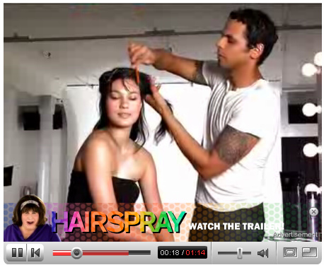
Fortunately YouTube has decided against pre or post-roll ads citing evidence that viewers just don’t respond. Instead, as the name implies, the ads pop up in-video and only take up the bottom 20% of the player screen. Clicking on the ad will pause the video and open another mini video player inside the one you are watching. Ad metrics are based on the percentage of the ad you get through and if you should leave within the first 15 seconds that doesn’t count as an impression.

YouTube InVideo Ad

Many think video ads will be another big business for Google but video ads are a far different beast compared to text ads. For one, InVideo ads are only shown on the content of trusted partners for obvious legal reasons. Unlike text ads that require no screening process, video owners must have all of the legal clearances to engage in commercial activity. This bottleneck greatly reduces the potential pool of advertisers unlike the ubiquity and ease of AdSense.

Second, in order to prevent “saturation” or dampening the user experience, video ads will have to be deliberately limited. Text ad units are splattered across the web on millions of blogs taking advantage of the Long Tail of niche content. While this means higher costs per click and per thousand impressions the amount of ad inventory is inherently limited.

Finally, ads that pop up in the middle of video, even if for a brief 10 seconds, are distracting. Text ads are successful because they blend in with the content; obvious to the reader when they need them and not a distraction when they are uninterested. Watching video is a concentrative task. Anything that intrudes on the message, stealing the users attention, takes them away from the story and lowers the experience. Think about how annoying it is at a public theater when someone is talking next to you or a cell phone goes off. TBS has been running ads like YouTube’s in the middle of shows like Everybody Loves Raymond however Youtube has a leg up by giving the viewer the freedom to close the ad display right away. See an InVideo ad in action.

Ads in the middle of YouTube videos may be all the buzz now but I feel those enthusiastic of the new feature will eventually grow tired of it like the rest of us. YouTube user fardousha sums it up best with the following comment…

If ads invade youtube, i will desert it.
What attracted me in the first place is ads free quality time. Long story short, it ain’t a good idea.

There is already a Firefox extension called TubeStop to stop YouTube ads from even showing up, protecting the users patience as they take in all that YouTube has to offer. There is only a certain amount of aggravation one can take in regards to advertising and InVideo ads certainly cross that threshold. This is why the YouTube ad experiment will ultimately be a failure.

The Skeletor Show Hits It Big

While we are still on the topic of the power in YouTube, one of my favorite video mash-ups has catapulted its creator to success. The Skeletor Show is a simple remix of old He-Man episodes redubbed and edited in a comedic way (as if the original He-Man cartoons weren’t funny enough). Take a look at the trailer for a better idea…

The Skeletor Show was created by Daniel Geduld, originally from Indiana but he later moved to Los Angeles in hopes of some kind of acting career. As you might imagine, he didn’t get hired for very much and used his free time and voice-over talent to remix Skeletor. Apparently it was time well spent as CNN recently ran an article about him where he is now making a living doing other voice over work. In the credits of each show Daniel added his e-mail address along with the line “Please hire me” and as the show took off, via several popular blogging mentions, sites like Heavy.com came a knocking.

I was shocked to see The Skeletor Show mentioned on CNN. I don’t recall how I stumbled onto it but it was one of the only YouTube series I actually subscribed to and checked for updates. There hasn’t been a new episode in nearly four months, a bittersweet triumph of Daniel’s new found lack of free time. But this is just another example of how a new medium is creating opportunities for up and coming amateurs to be seen by the world. I wonder where we will see Mr. Geduld next.

Dancing Teens Capture The Attention Of Millions

Incase you didn’t know, this YouTube clip has been viewed just under 9 million times. It appears the Internet is a great tool for sharing your own imitation of what you see on TV. Oh, the power of the Long Tail.

I find the SpongeBob SquarePants remix highly amusing!

Digg Has Had A Picture Section All Along

Many grumbling tech nerds complain that Digg.com should really implement a picture section judging from the number of submissions with [pic] in the title. But what they don’t know is that Digg already has a picture section! Don’t believe me, look for yourself. Here is the most popular pictures of the day and here are the upcoming ones. So why is everyone so up in a huff?

Angry At Digg For Lack Of Picture Section

I kind of like the mixture of stories which I will never see much of if they create a new section similar to what they have done for videos. What they really need is an “All” section so videos and news stories can mingle together for the benefit of nerd kind. Oh and while we are wishing, Digg might as well throw in a “Digg” category for all of the self-absorbed Digg news that seems to make it to the front page. That is a section I would not include in my filter.

Update: I wrote this last night before Kevin Rose published this entry on the Digg blog. Apparently an “All” section is coming in the near future and a true picture section will hit the scene sometimes around October. My psychic diggness has been off the charts recently.