Posts tagged 'Coding'

Super Mario Kart JavaScript Version

In case the JavaScript version of the original Super Mario game got a bit boring, Nihilogic has redone Super Mario Kart in much the same way. Weighing in at a mere 11Kb this proof concept lets you choose your driver (Mario, Luigi, or the Princess) and one of two courses. There is no collecting coins, knocking out opponents with turtle shells, or even counting laps. You can use the arrow keys of your keyboard to steer around a simple loop course over and over again until the end of time. The computer controlled drivers help keep up the pace though you can pass right through them as there is no collision detection.

Music is included to add to the nostalgia of the old SNES days. There’s not much else to this except to prove what can be done with modern JavaScript when applied to interactive games.

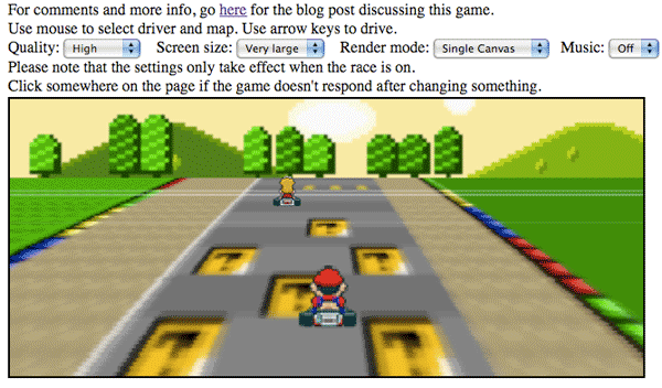
Play a JavaScript version of Super Mario Kart

Homer Simpson In Pure HTML/CSS

Román Cortés managed to create a dead-on recreation of Homer Simpson using nothing but HTML/CSS. To boot it is essentially a vector image that will scale if you increase the text size of your browser. Go to the page and press the control and the ‘+’ key at the same time to see what I mean.


Homer Simpson in HTML/CSS

The source code isn’t too pretty but for this spectacle it is certainly understandable. It just makes a good case that open technologies like SVG, which will make it easier to construct vector graphics out of XML code, need to be adopted much faster.

Super Mario Done In JavaScript And A Weird Flash Game

The guy behind the blog nihilogic.dk decided to partake in an exercise of game design using JavaScript. Choosing the classic Super Mario Brothers game, his proof of concept is considered a success. The whole thing weighs in at 14Kb and the entire game is contained in one JavaScript file.

“There are no external image files or anything, everything is rendered with Javascript using either canvas elements or old fashioned div-making tactics (for IE). The sprites are stored in custom encoded strings in a format that only allows 4 colors for each sprite but in turn only takes up around 40-60 bytes per sprite.”

Super Mario Done in JavaScript

Granted it is very brief and not entirely true to the original gameplay, it is still downright impressive that something like this can even be accomplished with a web-based scripting language.

If you are interested in seeing how the whole thing works, you can sneak a peek at the uncompressed code.

Keeping with the 8-bit video game theme of this post, Tetrageddon.com is an odd Flash site. The style of the music and graphics is in homage to the 8-bit videogames of years past but there are no explicit directions about what to do. Instead you are left to fend for yourself exploring the site and uncovering the wacky consequences of your voyage. The whole thing is “CENTALLY MHALLENGED” to borrow from the sites page title.

Tetrageddon

Tip: on the main page hold the up arrow key and make sure you allow pop-ups for the site.

If anyone can figure out something interesting to do at Tetrageddon.com let me know in the comments.

Best Grad Schools: What A Difference A Year Makes

For the past month I have been working feverishly on the latest release of America’s Best Graduate Schools put out by U.S.News and World Report. Today we finally launched it to the public and I wanted to show the difference between last year’s release and this years.

The old Best Graduate pages were constructed with several year old PHP code and hosted on a couple of Apache servers. Much of the layout was done with tables (spacer .gifs ugh…) which became very difficult to manage after many annual revisions.

Old Best Graduate Schools Screenshot

This year we decided to re-do the whole thing with a new look and a new Zope backend. The HTML and CSS code was completely modular for maximum efficiency. It was actually a lot of fun seeing the whole thing come together.

New Best Graduate Schools Screenshot

So have a look around the new site and let me know what you think. You can see the official blog post about all of the new features and functionality here. If you want to know some of the technical details, leave a comment. There was a lot of mental energy that went into the design of the site. But now I’m beat from the pre-launch stress and look forward to getting to bed before midnight.

Redesigned Comments

Screenshot of new comments

I spent a good chunk of today re-jiggering the look and functionality of the comment system here on my blog. Using the WordPress Thread Comment plugin readers and myself can respond directly to other comments complete with e-mail notification. Gravatar is a globally recognizable avatar plugin giving everyone who posts their thoughts to my blog the option to show an icon representing themselves. If you don’t have a Gravatar account head on over to Gravatar.com to register your e-mail address. Finally, I installed WP-Chunk which simply minimizes long URLs posted in comments and prevents them from breaking my layout.

But most importantly I re-designed the look of comments making them easier to read. I hope this will encourage more discussion on my blog and if you have any feedback, please leave a comment!

P.S. If you need a smattering of comment designs for inspiration check out the comment design showcase at SmileyCat.com.

Adobe Air Reaches 1.0, Twitter Clients Blossom

Adobe Air Logo
Adobe released it’s Air product today making it official and peeling off the cliche` beta title. Adobe Air allows developers to build desktop applications using web technologies like HTML for structure, CSS for presentation, and JavaScript for behavior. Flash and Flex, Adobe’s own web technologies, are also rolled up in the mix. Professional authoring tools like Flash CS3 and Dreamweaver CS3 saw updates today to allow development within the popular tools. Aptana also offers a free plugin for their open-source development tool Aptana Studio.

I have been playing with Air apps for the last couple of months while the product was still in beta. There are a lot of clever applications that are more like widgets then conventional full-blown desktop programs. For example, the Adobe sample app PixelPerfect was a simple ruler overlay letting you measure anything on your screen. This little tool comes in handy for web development where there aren’t any rulers on the side or measuring tools like in Photoshop. Powerhouse auction site eBay created their own Air app that banishes the concept of refreshing the page so bidders can watch their auctions in real time. But perhaps the biggest crowd of Air apps belongs to Twitter clients. Thwirl, Spaz, Tweetr, and Snitter are just a handful.

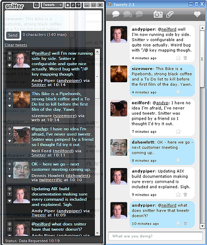
Snitter Next To Tweetr Couresy of Andy Piper

I thought John Ballinger had let his Twitter client, Tweetr, go to pasture without an update since the end of November. With each new Air beta release more functionality would break edging me towards Jonathan Snook’s Snitter. But alas, Tweetr is alive again with version 3.0 launching today to coincide with the official Air release. I’m happy as a clam to have my favorite Twitter client back and to see so many great ideas that have seemingly sprung out of Air.

Hot Or Not For XHTML Code

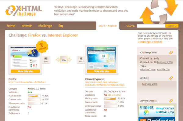
Valentin Agachi’s XHTML Challenge takes the rating meme under the hood letting users compare websites based on their (X)HTML markup. When a challenge is set up between two sites, a PHP script from XHTMLChallege.com slurps up the source code and begins a detailed analysis. Facets for competition include which doctype was declared, validation, content length in bytes, a ratio of content/markup/ and whitespace, use of conditional comments, and the number of table tags used.

XHTML Challenge Screenshot

As I have written about before, there is more than just HTML that goes into making a sexy source. I think XHTML Challenge could expand their analysis to include the number and positioning of CSS and JavaScript files, use of microformats (which results in more semantic, though bulkier, markup), and total file size of all components. This would paint a better overall picture of all the necessary components that go into a modern design.

Frontend web developers, like myself, take a lot of pride in how we structure our code. HTML coding is all about semantic, well-organized markup that is as small as possible while providing a solid structure for the content. It is good to see that there are others out there like myself that can appreciate the thought and planning that goes in to the under pinnings of a modern website.

XHTML Challenge should not be confused with Command Shift 3 which rates the aesthetics of a site not its code. Maybe the two sites should get together producing the ultimate website rating tool!

via (Web Designer Wall)

Kingkool68.com Aggregates All Of My Web Activity

I finally finished kingkool68.com this weekend. The purpose of the site is to aggregate all of my activity on the web into one single stream, commonly referred to as a lifestream. To mash all of my RSS feeds of activity together I used SimpleLife, a WordPress adaption of the SimplePie PHP script. For the front end I used jQuery, a JavaScript library, as well as standard HTML and CSS.

Screenshot of kingkool68.com

Most lifestreams I saw didn’t include a way to for end users to filter out certain items, so I built one into my lifestream application. Using the power of CSS selectors built in to jQuery, I wrote a function to grab the list items with a certain class and then toggle a fade effect. If the item was hidden the script would fade them in, otherwise it would fade them out. You can see the 13 lines of code I wrote to do this for yourself.

Once I finished writing the filter code I noticed it didn’t work in Safari browsers even though it performed flawlessly in Firefox. After debugging and digging around on the net for possible solutions I stumbled upon the Safari Developer FAQ. Did you know you can unlock a debugging menu in Safari? The FAQ provides details on how to reveal it and then by holding Apple+Shift+J shows a JavaScript console alerting you to any errors. I used this to figure out that you can’t use ‘class’ as a variable name even though Firefox doesn’t seem to mind. I haven’t tested the site on any version of Microsoft’s Internet Explorer which is notorious for choking on standard code.

So if you ever wanted to see everything I do on the web, checkout kingkool68.com. And if you want to add me as a friend on any of these popular sites, click the small icons associated with each item to take you directly to my profile for that site. The next step would be to package my modifications up into a WordPress plugin so anyone could run a lifestream just like mine. In the meantime if you have any problems implementing a lifestream on your own, leave a question in the comments of this post and I’ll do the best I can to help out. Happy lifestreaming!

Server Details Of The Candidates

With Super Tuesday right around the corner, what is an undecided web geek to do? Why break a decision down into technical specs, like any other decision they have ever had to make.

Robert Accettura did a little survey of the presidential-hopefuls websites and noted what technologies were used on the front and backend. If you were to vote solely on who is using the best web technologies, your best bet would be Barack Obama. His site is run on an open source operating system, uses a CSS based design, as well as HTTP compression. Hillary Clinton and half of the Republican candidates are running Microsoft IIS; surprise, surprise! This survey also showed how web standards has come a long way as all of the candidates but one (Mike Gravel) neglected using a table-based layout.

HTML LOLcat

Does a well-built website architecture make for a great leader? Probably not. But if you are a web geek you will probably get a kick out of these stats, just like me. Check out Roberts page for the complete breakdown.

Hot Or Not Meets Webdesign

Hot or Not is an iconic web 1.0 site with a basic concept: Look at a picture of a person and mark on a scale of 1-10 how hot they are. Command Shift 3 takes the same concept and applies it to web design. Frankly I find the web design implementation far more interesting than the original Hot or Not concept. But judging a website on a scale of 1-10 sounds overly-complicated. CommandShift3.com instead puts two websites side by side and it is your job as the all-knowing visitor to click on which one you like best.

Command Shift 3 Screenshot

The cool thing is you can see if you picked the crowd favorite and what percentage of people agree with you. If you like a site so much you can click through and leave a comment about it or visit the actual page. Too lazy to wade through the thousands of contenders? Then check out the Best & Worst sites in a variety of time frames. And if you are looking for something specific you can search by keyword or browse their tags.

While the concept is super simple to grasp, the impact of a site like this is a lot more compelling than the loads of CSS galleries that litter the net. The interaction and side by side comparison really set it apart in the showcase arena. I enjoy the simplicity of the site, showing me only two designs at a time instead of bombarding me with thumbnails like some other sites do. In conclusion, this site is a great way to get a taste of some great web design that is out there on the net while keeping it fun and engaging. I added my blog to the fray to see how it would stand up. Wish me luck, and we’ll see if my design chops can rise above the crowd.

Cmd + Shift + 3 = Screenshot!

Oh and in case you didn’t know, Command Shift 3 is the keyboard shortcut to take a picture of the screen in Mac OS X.